

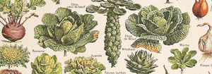
- Oignons Poster
- Radis Poster
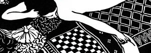
- Couple dansant dans la neige Poster
- Clipper à réaction à destination d'Hawaii Poster
- Campari Soda Poster
- Bec-Kina Poster
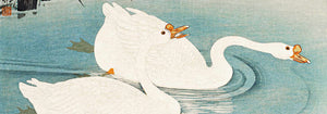
- Strawberry Thief Poster
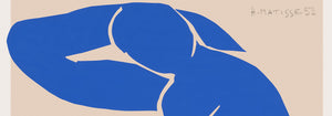
- Matisse Figures dansantes Poster
- Tom Krojer Poster d'exposition
- Scène de rue de Berlin Poster
- Exposition Ernst Kirchner Poster
- Parc près de Lu Poster
- El Comienzo Poster
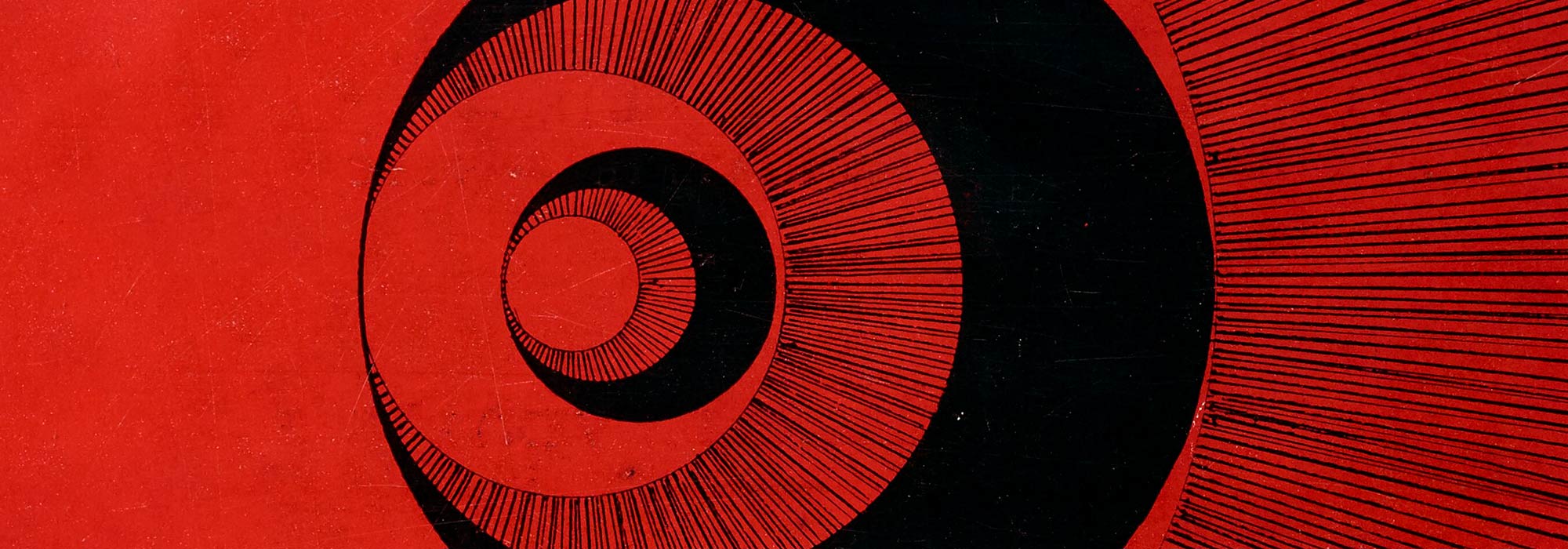
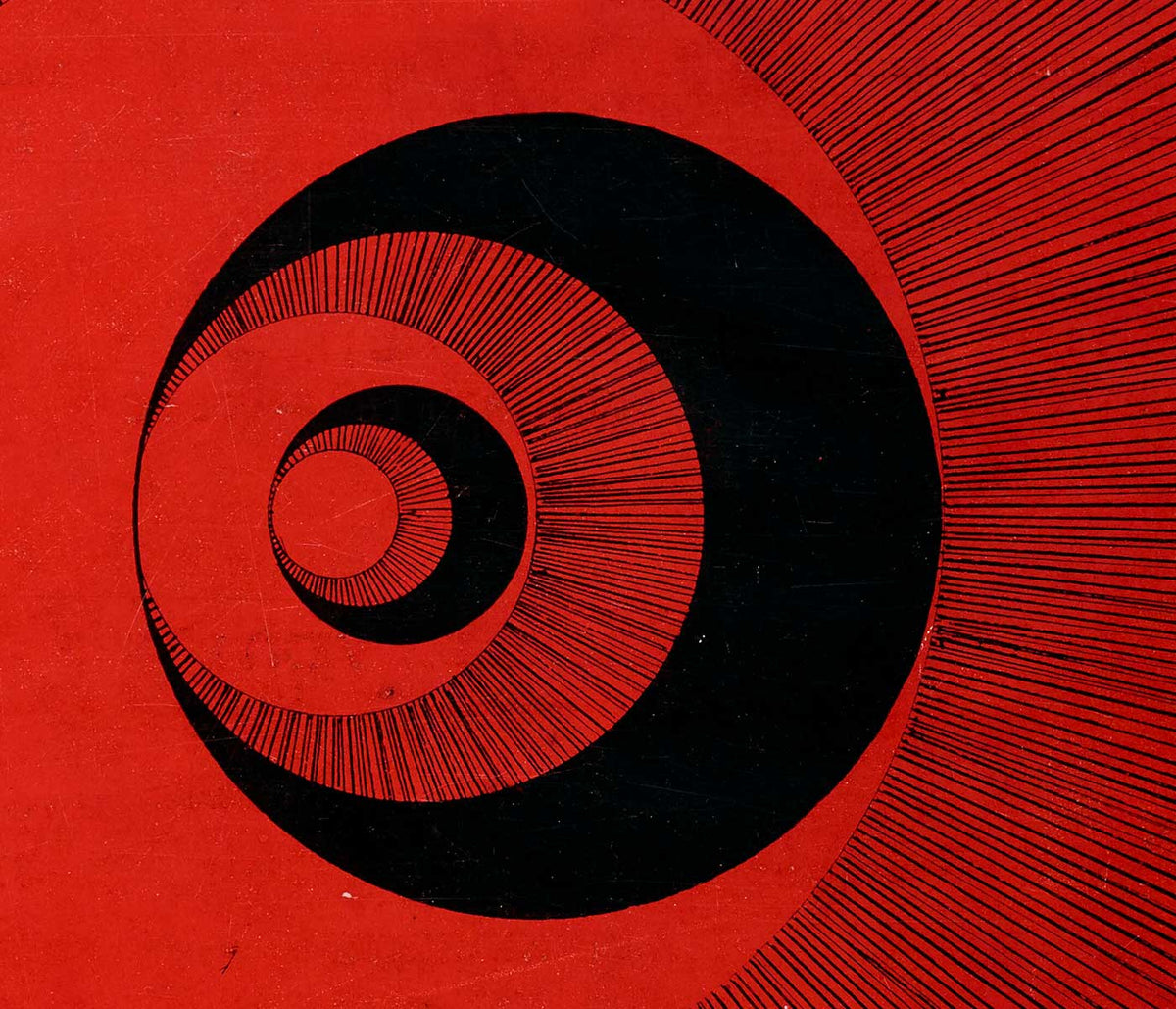
- Twilight's Ring Poster
- Parler Seul Poster
- Faune et Nymphe Poster
- Le Rêve Poster
- Le Concert Poster
- Femme et oiseau la nuit Poster
- Bauhaus 20 Poster
- Bauhaus 21 Poster
- Mangez plus de fruits Poster
- Snoopy Come Home Poster
- Vers Londres en Jet Clipper Poster
- Kyushu-Okinawa Poster
- Xerez Pedro Domecq Poster
- Balsam Aperitif Poster
- Beurre Poster
- Crans-sur-Sierre Poster
- Monte Carlo Poster
- Pacific Vibrations Poster
- Continental Hawaï Airline Surfeur Poster
- Chat noir 4 Poster
- Chat noir 3 Poster
- Bière et Cigarette Poster
-
Deutliche Verbindung Poster
Wassily Kandinsky · 1925 · Impression d'art géométrique équilibrant cercles et angles avec accents vifs de couleurs primaires et violet
Poster dès €9 · Encadré dès €16
Prix habituel À partir de €6,00Prix habituel -
Klänge Pl.19 Poster
Wassily Kandinsky · 1913 · poster abstrait rythme de formes évoquant la musique sur un fond beige chaud
Poster dès €9 · Encadré dès €16
Prix habituel À partir de €6,00Prix habituel -
Lyrisches Poster
Wassily Kandinsky · 1911 · Impression d'art abstraite et lyrique aux lignes noires énergiques et accents rouges bleu et jaune
Poster dès €9 · Encadré dès €16
Prix habituel À partir de €6,00Prix habituel -
Ascension joyeuse Poster
Wassily Kandinsky · 1923 · Poster géométrique dynamique à diagonales montantes et accents primaires
Poster dès €9 · Encadré dès €16
Prix habituel À partir de €6,00Prix habituel -
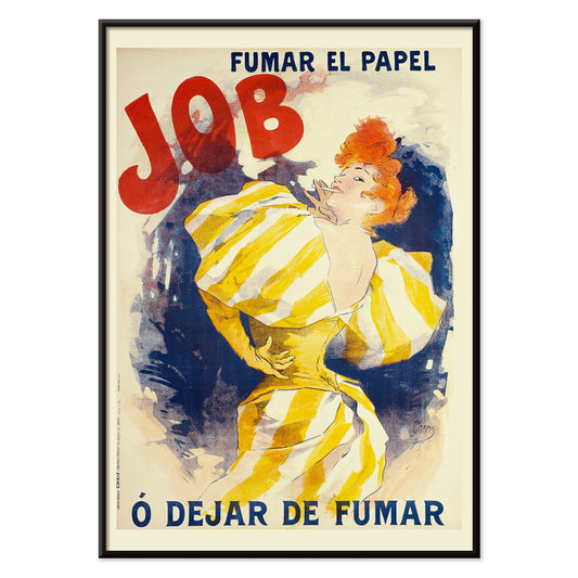
Fumer le papier Job ou Arrêter de fumer Poster
Jules Chéret · 1895 · poster publicitaire vivant montrant une femme rousse dans une robe jaune tourbillonnante
Poster dès €9 · Encadré dès €16
Prix habituel À partir de €6,00Prix habituel -
Manufacture Royale de Corsets Poster
Alphonse Mucha · 1897 · Poster Art Nouveau de corseterie aux lignes fluides et motifs botaniques chauds
Poster dès €9 · Encadré dès €16
Prix habituel À partir de €6,00Prix habituel -
Redoute des étudiants Poster
Jules Chéret · 1897 · poster Belle Époque animé montrant des danseurs d'un bal étudiant, rubans virevoltants et lettrage lumineux
Poster dès €9 · Encadré dès €16
Prix habituel À partir de €6,00Prix habituel -
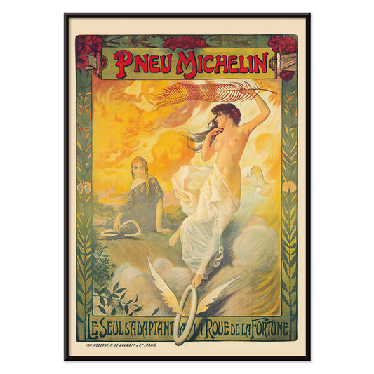
Pneu Michelin Poster
Édouard Michelin · 1895 · Poster Belle Époque avec pneu ailé et figure élégante sur fond jaune vif
Poster dès €9 · Encadré dès €16
Prix habituel À partir de €6,00Prix habituel -
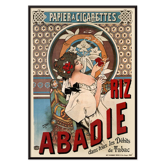
Riz Abadie Poster
Alphonse Mucha · 1898 · Élégant poster Art nouveau avec une femme gracieuse encadrée par un ornement floral
Poster dès €9 · Encadré dès €16
Prix habituel À partir de €6,00Prix habituel -
Chocolat Idéal Poster
Alphonse Mucha · 1897 · Élégant poster Art Nouveau montrant une muse sereine dans un encadrement floral orné
Poster dès €9 · Encadré dès €16
Prix habituel À partir de €6,00Prix habituel -
Bicyclette Clément Poster
Arthur Foache · 1900 · Poster Art Nouveau montrant une cycliste élégante en robe vaporeuse aux tons lumineux
Poster dès €9 · Encadré dès €16
Prix habituel À partir de €6,00Prix habituel -
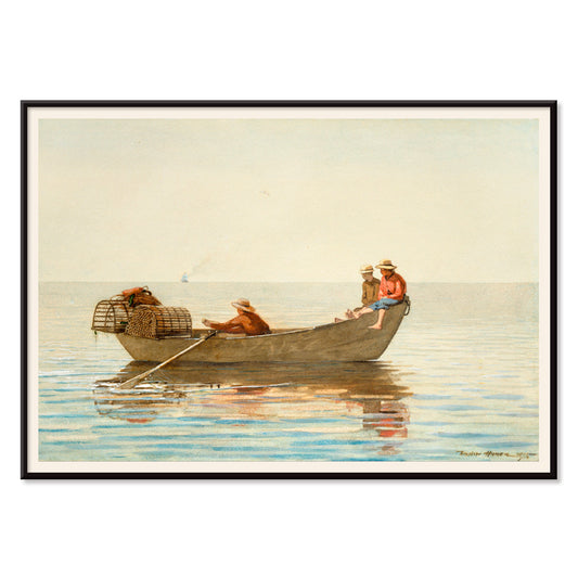
Trois garçons dans une dory avec casiers à homard Poster
Winslow Homer · 1872 · Impression d'art côtière sereine représentant trois garçons dans une dory avec casiers à homard
Poster dès €9 · Encadré dès €16
Prix habituel À partir de €6,00Prix habituel -
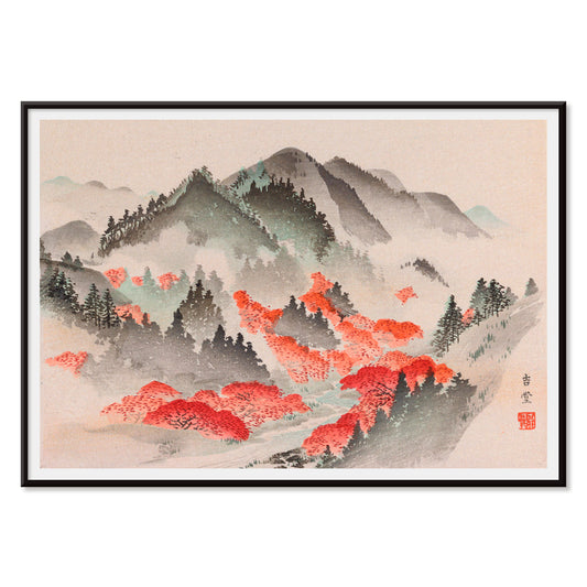
Heian meishō Pl.09 Poster
Artiste inconnu · 1890 · Impression vintage japonaise et sereine de montagnes brumeuses et feuillage automnal rouge
Poster dès €9 · Encadré dès €16
Prix habituel À partir de €6,00Prix habituel -
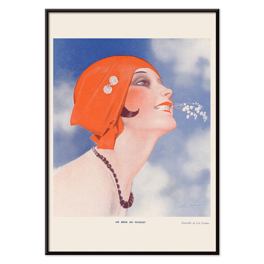
Un Brin de Muguet Poster
Léo Fontan · 1905 · Élégant poster Art Nouveau de muguet avec figure gracieuse et lettrage net
Poster dès €9 · Encadré dès €16
Prix habituel À partir de €6,00Prix habituel -
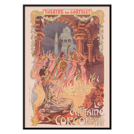
Le Capitaine Corcoran Poster
Vincent Lorant-Heilbronn · 1902 · Affiche de théâtre festive montrant danseuses autour d'un brasier aux floraux Art Nouveau
Poster dès €9 · Encadré dès €16
Prix habituel À partir de €6,00Prix habituel -
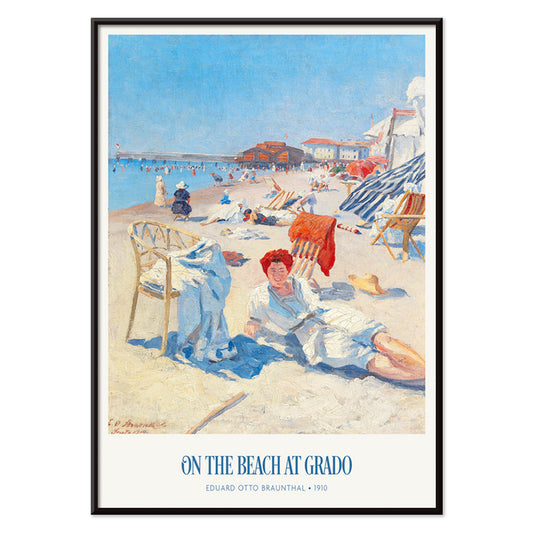
Sur la plage de Grado Poster
Eduard Otto Braunthal · 1910 · Poster ensoleillé de la plage de Grado avec baigneurs détendus, bleus marins nets et rouges chauds
Poster dès €9 · Encadré dès €16
Prix habituel À partir de €6,00Prix habituel -
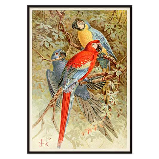
Aras Poster
Artiste inconnu · 1893 · Impression d'aras vive avec feuillage de forêt tropicale et précision naturaliste
Poster dès €9 · Encadré dès €16
Prix habituel À partir de €6,00Prix habituel -
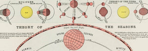
Système planétaire Poster
The Institute Of Liepzig · 1988 · Poster vintage du système solaire aux tons verts et beiges avec orbites détaillées
Poster dès €9 · Encadré dès €16
Prix habituel À partir de €6,00Prix habituel -
Ciel étoilé du Nord Poster
The Institute of Liepzig · 1910 · Poster du ciel du Nord montrant constellations en lignes noires et accents rouges
Poster dès €9 · Encadré dès €16
Prix habituel À partir de €6,00Prix habituel -
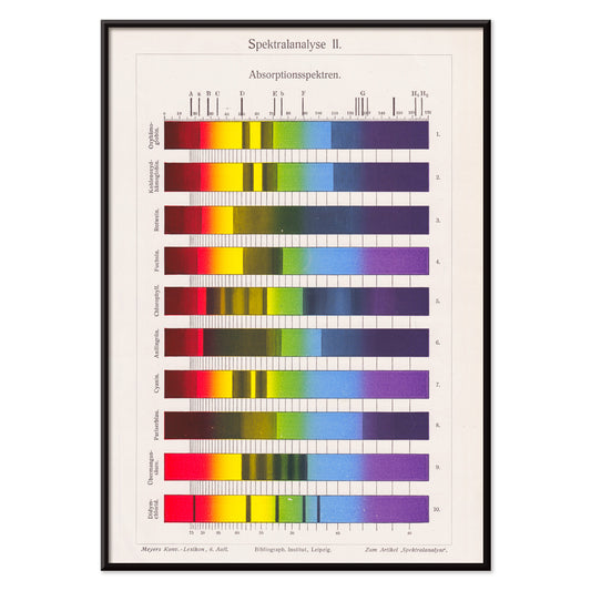
Analyse spectrale Poster
The Institute of Liepzig · 1973 · Poster spectral vif avec bandes colorées et géométrie scientifique nette
Poster dès €9 · Encadré dès €16
Prix habituel À partir de €6,00Prix habituel -
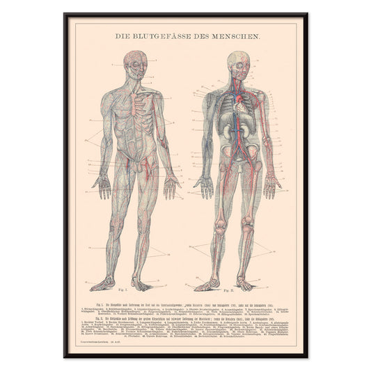
Système sanguin humain Poster
Institute of Leipzig · 1906 · Affiche anatomique détaillée de la circulation sanguine avec vaisseaux rouges et bleus sur beige
Poster dès €9 · Encadré dès €16
Prix habituel À partir de €6,00Prix habituel -
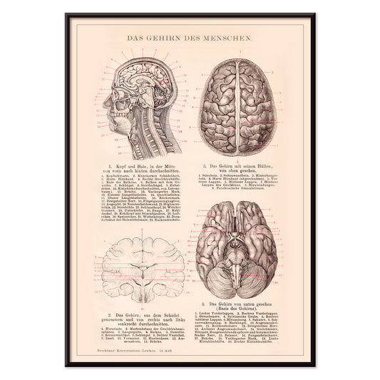
Cerveau humain Poster
Institute of Liepzig · 1869 · Impression scientifique détaillée du cerveau humain avec anatomie légendée sur papier beige chaud
Poster dès €9 · Encadré dès €16
Prix habituel À partir de €6,00Prix habituel -
Billets de bus Barcelona 2 Poster
Artiste inconnu · 1978 · Colorée impression vintage de tickets de transport de Barcelone avec chiffres et accents graphiques
Poster dès €9 · Encadré dès €16
Prix habituel À partir de €6,00Prix habituel -
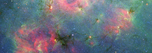
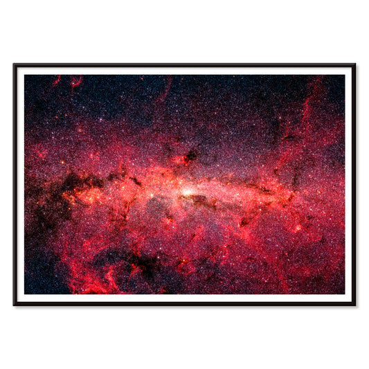
Des centaines de milliers d'étoiles Poster
NASA · 2008 · poster immersif de la Voie lactée avec lueurs stellaires cramoisies et nappes de poussière ombrées
Poster dès €9 · Encadré dès €16
Prix habituel À partir de €6,00Prix habituel -
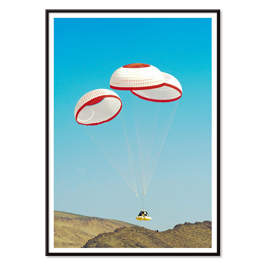
Capsule d'équipage CST-100 Poster
NASA · 2012 · Poster rétro-futuriste montrant la capsule en descente sous parachute vers une zone désertique d'atterrissage
Poster dès €9 · Encadré dès €16
Prix habituel À partir de €6,00Prix habituel -
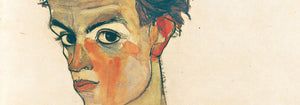
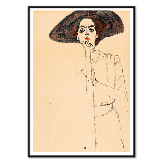
Frauenbildnis II Poster
Egon Schiele · 1912 · Portrait expressif en impression d'art d'une femme posée au grand chapeau noir
Poster dès €9 · Encadré dès €16
Prix habituel À partir de €6,00Prix habituel -
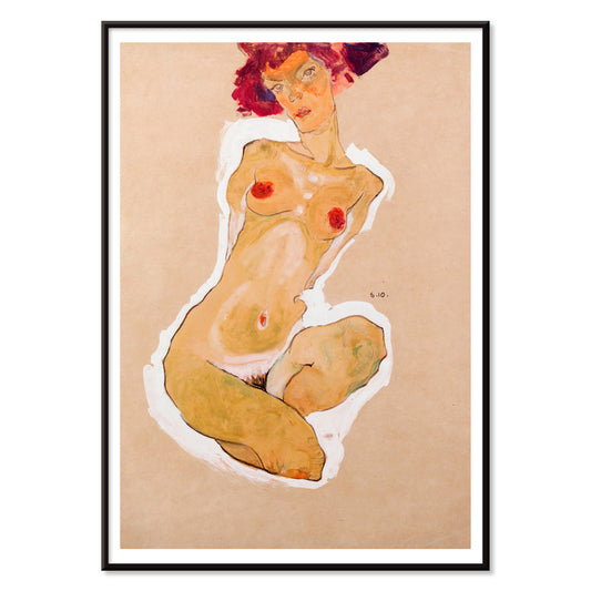
Femme nue accroupie Poster
Egon Schiele · 1910 · Impression d'art d'une femme nue accroupie au trait anguleux et à l'espace négatif épuré
Poster dès €9 · Encadré dès €16
Prix habituel À partir de €6,00Prix habituel -
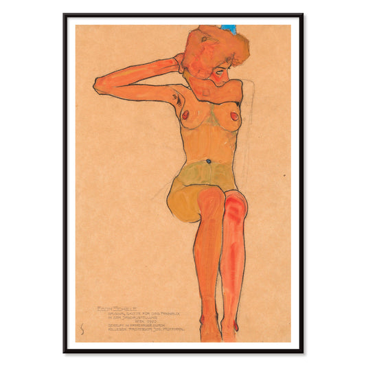
Nu féminin Gertrude Poster
Egon Schiele · 1910 · Impression d'art expressive d'un nu aux lignes épurées et tons chauds terreux
Poster dès €9 · Encadré dès €16
Prix habituel À partir de €6,00Prix habituel -
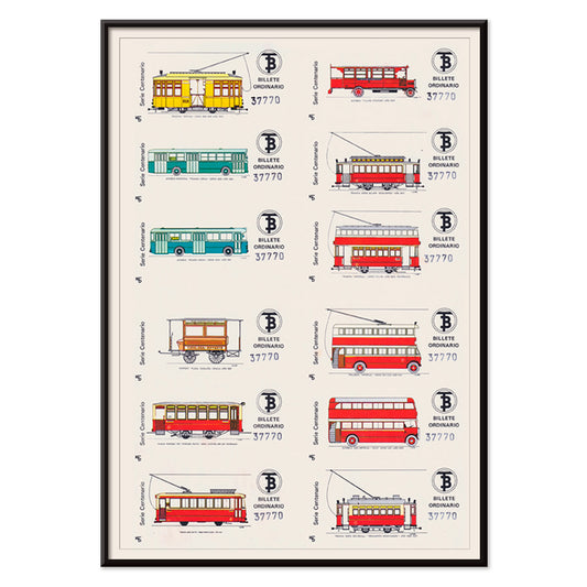
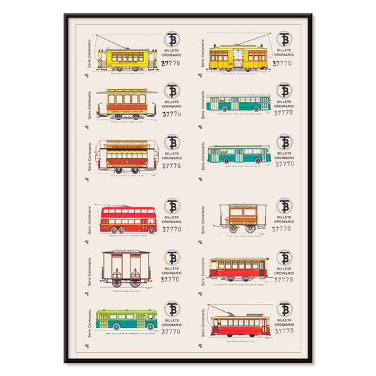
Billets de bus de Barcelone Poster
Artiste inconnu · 1972 · Poster coloré présentant une grille de tickets de bus de Barcelone évoquant le transit urbain
Poster dès €9 · Encadré dès €16
Prix habituel À partir de €6,00Prix habituel -
Les Boucaniers Poster
Winslow Homer · 1885 · Impression d'art tropicale au bord de mer avec jeunes boucaniers sous palmiers
Poster dès €9 · Encadré dès €16
Prix habituel À partir de €6,00Prix habituel -
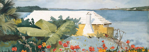
Jardin fleuri et bungalow Poster
Winslow Homer · 1899 · Impression d'art de jardin ensoleillé des Bermudes avec fleurs vives menant à un bungalow paisible
Poster dès €9 · Encadré dès €16
Prix habituel À partir de €6,00Prix habituel -
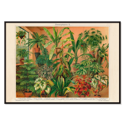
Plantes d'intérieur II Poster
Institute of Liepzig · 2016 · Impression d'art botanique moderne de plantes en pot sur fond terre cuite
Poster dès €9 · Encadré dès €16
Prix habituel À partir de €6,00Prix habituel -
Siphonophorae Poster
Ernst Haeckel · 1866 · Impression scientifique détaillée de siphonophores aux formes flottantes en bleus et rouges nets
Poster dès €9 · Encadré dès €16
Prix habituel À partir de €6,00Prix habituel -
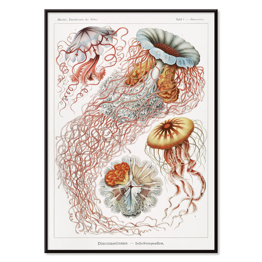
Discomedusae Poster
Ernst Haeckel · 1904 · Impression scientifique radieuse de méduses aux cloches translucides et tentacules fluides
Poster dès €9 · Encadré dès €16
Prix habituel À partir de €6,00Prix habituel -
Cycles Terrot Dijon 2 Poster
Nicolas Tamagno · 1900 · Poster français classique représentant un cycliste de tourisme sous un coucher de soleil radieux
Poster dès €9 · Encadré dès €16
Prix habituel À partir de €6,00Prix habituel -
Cycles Perfecta Poster
Alphonse Mucha · 1897 · Poster Art Nouveau avec muse radieuse, halo floral et lettrage ornemental
Poster dès €9 · Encadré dès €16
Prix habituel À partir de €6,00Prix habituel


36/761 items
- Klänge Pl.19 Poster
- Lyrisches Poster
- Ascension joyeuse Poster
- Fumer le papier Job ou Arrêter de fumer Poster
- Manufacture Royale de Corsets Poster
- Redoute des étudiants Poster
- Pneu Michelin Poster
- Riz Abadie Poster
- Chocolat Idéal Poster
- Bicyclette Clément Poster
- Trois garçons dans une dory avec casiers à homard Poster
- Heian meishō Pl.09 Poster
- Sur la plage de Grado Poster
- Analyse spectrale Poster
- Des centaines de milliers d'étoiles Poster
- Capsule d'équipage CST-100 Poster
- Femme nue accroupie Poster
- Nu féminin Gertrude Poster
- Jardin fleuri et bungalow Poster
- Discomedusae Poster
- Cycles Terrot Dijon 2 Poster
- Cycles Perfecta Poster
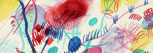
Le rouge, l'accent le plus délibéré
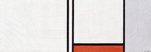
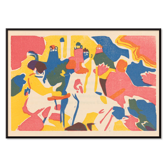
Dans la collection Rouge, la couleur agit moins comme sujet que comme signal: un timbre coquelicot, un bandeau laqué, une touche chaude sur le papier. Ces posters naviguent entre illustration, modernisme, graphisme de voyage et estampes schématiques, et chacun s'appuie sur le rouge pour orienter l'attention. Le vermillon sur crème, la brique face au graphite, ou une unique forme écarlate dans un espace calme peuvent changer la lecture d'une pièce. Comme art mural, le rouge se comporte comme un assaisonnement en décoration: un petit accent dynamise un mur de cadres, tandis qu'un grand champ établit un point focal et une direction dans la décoration.
Artisanat, pigments et art de la persuasion
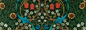
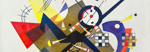
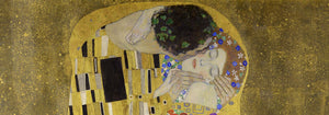
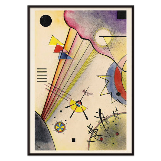
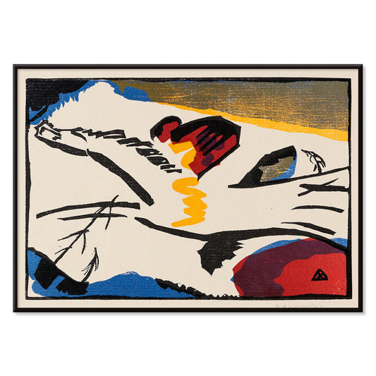
Le rouge porte un poids technique et culturel tout au long de l'histoire de l'impression. Les premiers colorants et pigments comme la cochenille et la garance ont nourri textiles et arts décoratifs, tandis que la lithographie a rendu les lettrages rouges audacieux et les aplats centraux dans la culture visuelle publique. William Morris Strawberry Thief (1883) par William Morris emploie le rouge comme note structurelle à l'intérieur du motif répété, maintenant oiseaux et fruits en tension rythmique. Dans Hygieia (1907) par Gustav Klimt, le manteau se lit à la fois comme emblème et avertissement, le cramoisi jouant le rôle d'une frontière autour de la figure. Le Heavy Red (1924) par Wassily Kandinsky montre le rouge en masse: un plan qui pousse les formes voisines en mouvement et rend la géométrie tangible.
Où les posters rouges trouvent leur place
Les accents rouges s'accordent naturellement avec des matériaux honnêtes: noyer, terre cuite, laiton, lin et pierre patinée. En cuisine ou coin repas, les études de fruits et les images végétales font écho aux couleurs de la table et de la céramique, ce qui rend les estampes de la collection Botanical un compagnon évident pour une décoration menée par le rouge. Dans les couloirs et entrées, un élément rouge audacieux aide à guider le regard à travers un espace étroit; la logique graphique de la collection Advertising fonctionne bien avec miroirs, patères et planchers sombres. Pour les chambres, privilégiez de plus petites touches chaudes, vers la brique ou le rose ancien plutôt que l'écarlate primaire, et équilibre avec literie pâle et lumière ambrée douce. Si la pièce ouvre sur de la verdure, le rouge devient un contrepoint lisible; des scènes plus calmes de Landscape aident à ancrer la palette.
Accords, encadrements et composition d'un mur de cadres
Pour empêcher le rouge de dominer, traitez-le comme une voix dans une palette mesurée. Un passe-partout blanc offre de l'air au rouge, tandis qu'un cadre noir fin aiguise les zones saturées et renvoie à la discipline des images Black & White. Pour des accords structurés, placez un poster mené par le rouge à côté d'une œuvre géométrique de Bauhaus, où le rouge apparaît souvent comme un bloc contrôlé plutôt qu'une fantaisie. Pour un registre plus théâtral, le Cachou Lajaunie (1920) par Leonetto Cappiello joue comme un réverbère contre des bois foncés et des murs assourdis. En disposant un mur de cadres, répétez le rouge deux fois — une grande surface et un petit accent — pour que le regard trouve un chemin clair entre les impressions.
Une note finale sur le rouge
Le rouge est aussi un indice utile pour lire les images: dans les affiches de voyage il signale la chaleur, la nuit et l'appétit; dans la composition moderniste il marque le point où le regard errant se fige. C'est pourquoi cette sélection peut sauter du motif à la figure symboliste puis à l'abstraction tranchante sans perdre de cohérence. Laissez de l'espace autour du champ rouge le plus intense et laissez les estampes voisines porter des tons plus discrets comme le sable, l'encre ou le vert verre de mer. Utilisé ainsi, le rouge devient rythme plutôt que bruit, et la décoration paraît volontaire sans devenir rigide.