


- Female Artist Poster
- La Paresse Poster
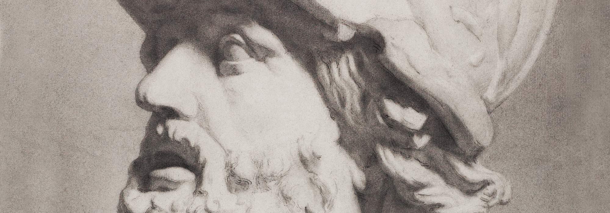
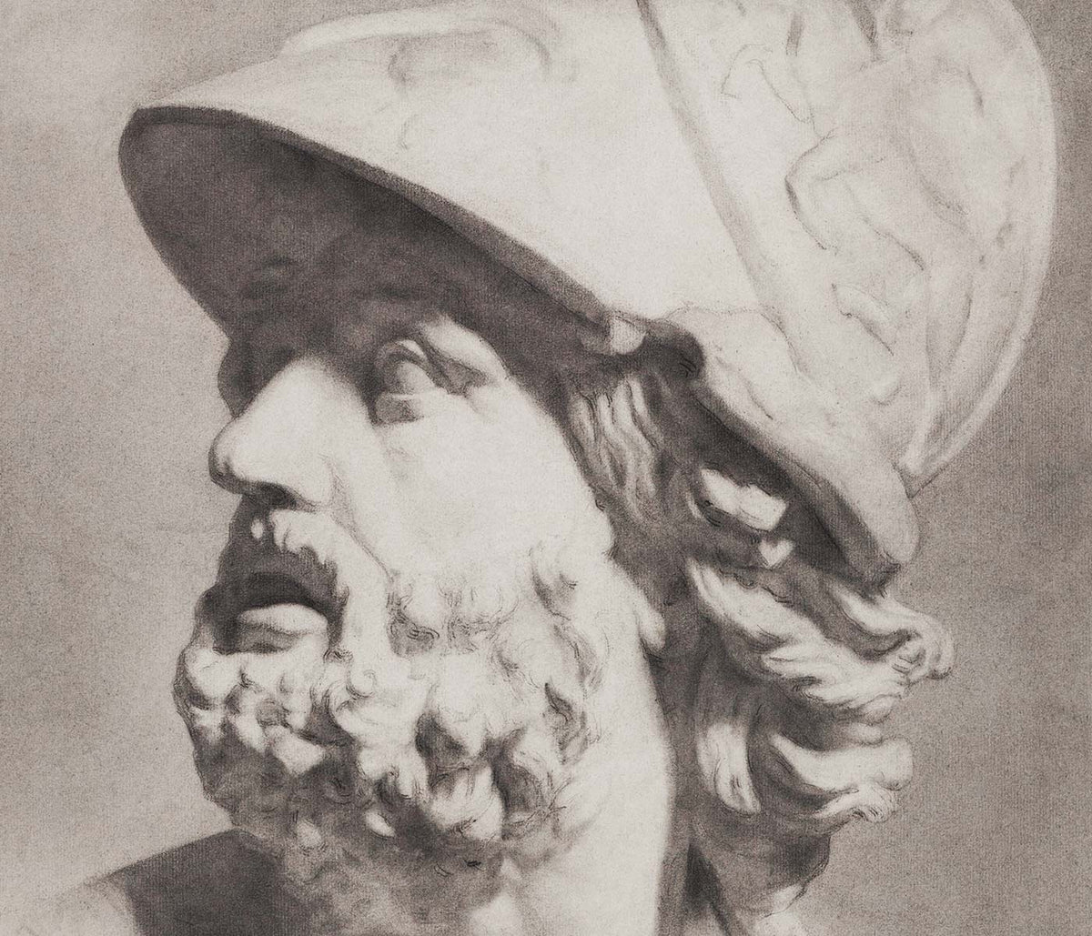
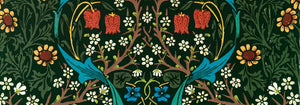
- Beethoven Frieze Poster
- Lisbon Azulejo 1 Poster
- Lisbon Azulejo 2 Poster
- Red and green tomatoes Poster
- Tiger in a Cave Poster
- Tarot: The Fool Poster
- Tarot: The Star Poster
- Le rêve Poster
- Faust , tragédie de Goethe Poster
- Female in Orange-Red Dress Poster
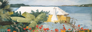
- The Island Garden Poster
- Roses Poster
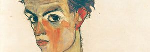
- Self-Portrait Poster
- Irises Poster
- Portrait of Joseph Roulin Poster
- View of Verona Poster
- Nu Bleu III Poster
- Nu Bleu II Poster
-
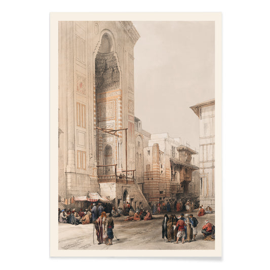
Grand entrance to the Mosque of the Sultan Hassan Poster
David Roberts · 1842 · Monumental Cairo mosque entrance poster with bustling figures rendered in warm stone tones
Poster from €9 · Framed from €16
Regular price From €6,00Regular price -
Bullack Cairo Poster
David Roberts · 1838 · Atmospheric Cairo riverfront poster with domes, minarets, and bustling dockside figures
Poster from €9 · Framed from €16
Regular price From €6,00Regular price -
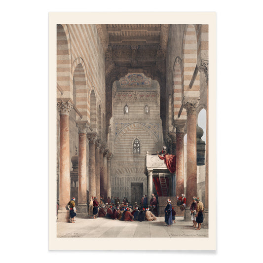
Interior of the mosque of the Metwalys Poster
David Roberts · 1839 · Atmospheric mosque interior art print with soaring arches, worshippers, and warm desert tones
Poster from €9 · Framed from €16
Regular price From €6,00Regular price -
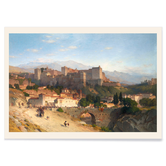
The Hill of the Alhambra Poster
Samuel Colman · 1865 · Serene Alhambra hillside art print with soft sky and sunlit earth tones
Poster from €9 · Framed from €16
Regular price From €6,00Regular price -
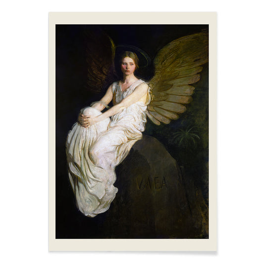
Stevenson Memorial Poster
Abbott Handerson Thayer · 1903 · Serene angel art print with soft wings and a contemplative memorial atmosphere
Poster from €9 · Framed from €16
Regular price From €6,00Regular price -
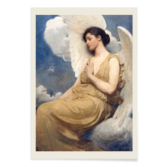
Winged Figure Poster
Abbott Handerson Thayer · 1889 · Ethereal winged figure art print with soft blue-white tones and quiet, protective mood
Poster from €9 · Framed from €16
Regular price From €6,00Regular price -
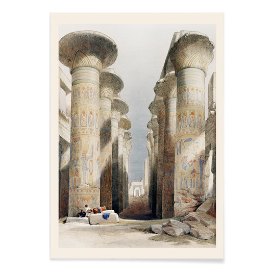
Great Hall at Karnak temple Poster
David Roberts · 1849 · Majestic Karnak temple poster with soaring columns and sunlit visitors in the ancient hall
Poster from €9 · Framed from €16
Regular price From €6,00Regular price -
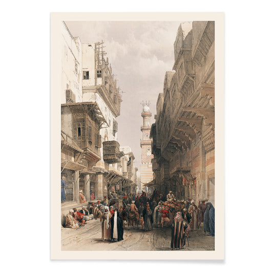
Mosque The Mooristan Poster
David Roberts · 1842 · Atmospheric Cairo art print featuring monumental mosque architecture with small figures for scale
Poster from €9 · Framed from €16
Regular price From €6,00Regular price -
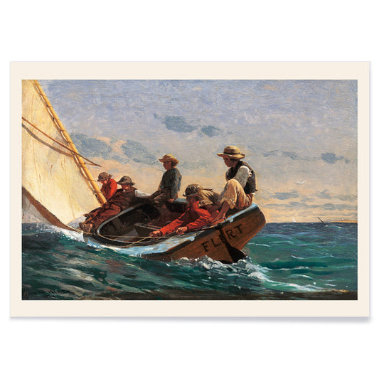
The Flirt Poster
Winslow Homer · 1874 · Breezy sailboat scene poster capturing seaside flirtation and 19th-century leisure
Poster from €9 · Framed from €16
Regular price From €6,00Regular price -
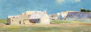
Breton Village Poster
Odilon Redon · 1890 · Dreamlike village art print with blue green fields and softly blurred rooftops
Poster from €9 · Framed from €16
Regular price From €6,00Regular price -
Gardanne Poster
Paul Cézanne · 1886 · Structured Provençal village art print with terracotta roofs and cool blue sky
Poster from €9 · Framed from €16
Regular price From €6,00Regular price -
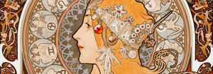
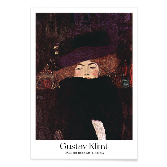
Lady with hat and feather boa Poster
Gustav Klimt · 1909 · Elegant fashion portrait art print with dramatic hat and feathery boa
Poster from €9 · Framed from €16
Regular price From €6,00Regular price -
Clipper Ship Poster
Charles Parsons · 1875 · Classic maritime vintage print of a clipper ship racing under full sail
Poster from €9 · Framed from €16
Regular price From €6,00Regular price -
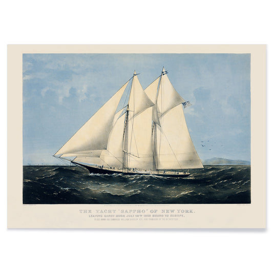
Yacht Sappho of New York Poster
Nathaniel Currier · 1870 · Classic sailing yacht poster featuring crisp rigging details and sweeping ocean backdrop
Poster from €9 · Framed from €16
Regular price From €6,00Regular price -
Yachts on a summer cruise Poster
Charles Parsons · 1876 · Lively sailing poster featuring multiple yachts gliding across blue water under a bright sky
Poster from €9 · Framed from €16
Regular price From €6,00Regular price -
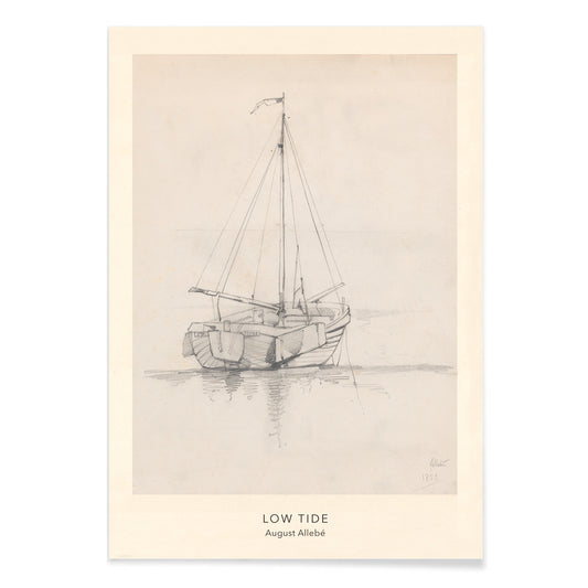
Low Tide Poster
August Allebé · 1870 · Quiet sailboat art print drawn in soft graphite tones with open coastal air
Poster from €9 · Framed from €16
Regular price From €6,00Regular price -
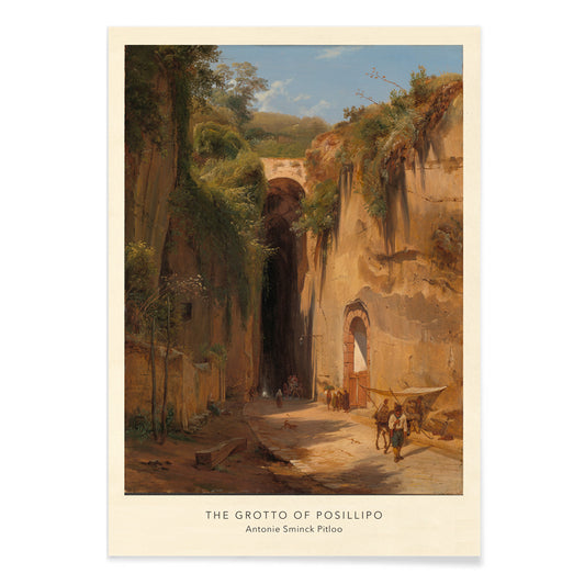
The Grotto of Posillipo Poster
Antonie Sminck Pitloo · 1824 · Atmospheric art print of travelers and animals beneath sunlit Neapolitan grotto
Poster from €9 · Framed from €16
Regular price From €6,00Regular price -
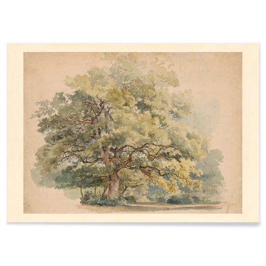
Lonely tree Poster
George Andries Roth · 1849 · Quiet landscape art print centered on a solitary tree in soft green light
Poster from €9 · Framed from €16
Regular price From €6,00Regular price -
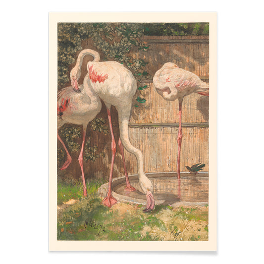
Three Flamingos Poster
August Allebé · 1878 · Graceful flamingo poster with three birds poised by water amid soft greenery
Poster from €9 · Framed from €16
Regular price From €6,00Regular price -
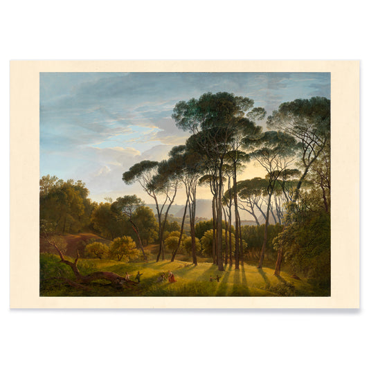
Umbrella Pines Poster
Hendrik Voogd · 1816 · Serene Italian landscape art print featuring umbrella pines, warm light, and distant blue hills
Poster from €9 · Framed from €16
Regular price From €6,00Regular price -
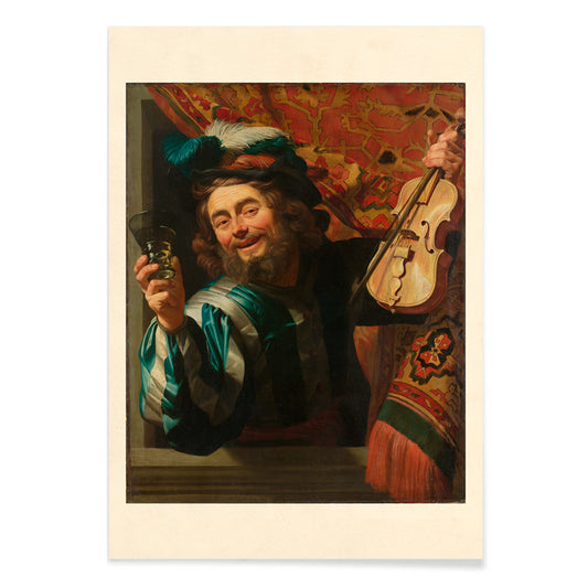
The Merry Fiddler Poster
Gerard van Honthorst · 1623 · Dramatic Baroque art print of a laughing fiddler holding violin and raised glass
Poster from €9 · Framed from €16
Regular price From €6,00Regular price -
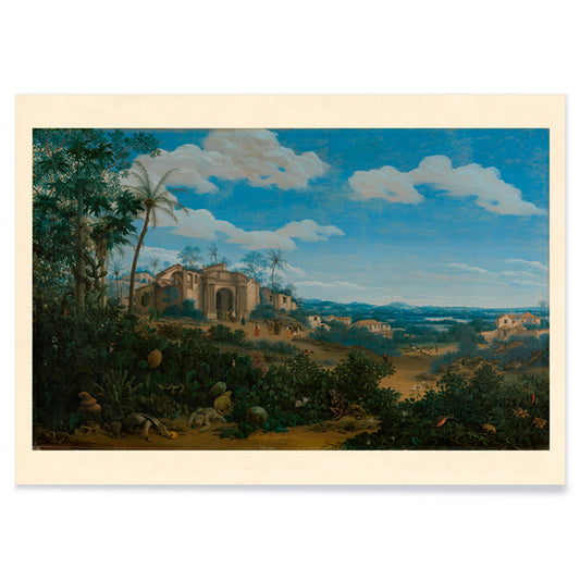
Olinda Poster
Frans Jansz Post · 1662 · Serene Olinda coastal panorama art print blending tropical greens with airy blue sky
Poster from €9 · Framed from €16
Regular price From €6,00Regular price -
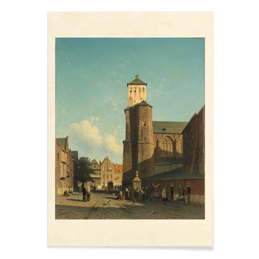
St Denis Church Poster
Jan Weissenbruch · 1846 · Sunlit city-square art print centered on St Denis Church with blue sky and warm stone
Poster from €9 · Framed from €16
Regular price From €6,00Regular price -
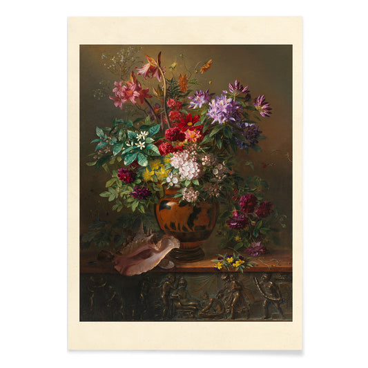
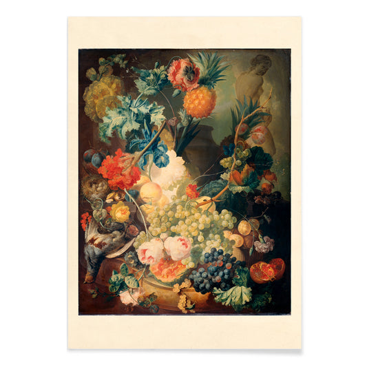
Flowers in a Greek Vase Poster
Georgius Jacobus Johannes van Os · 1817 · Lush floral still life art print in a classical vase with warm spring tones
Poster from €9 · Framed from €16
Regular price From €6,00Regular price -
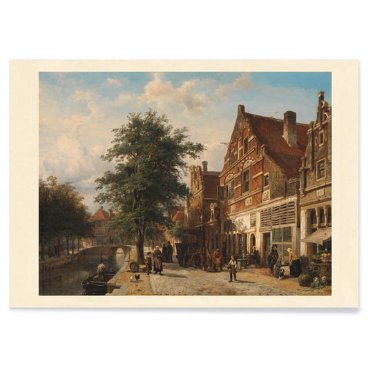
Town View Poster
Cornelis Springer · 1850 · Luminous Dutch cityscape art print with crisp façades, canal reflections, and strolling figures
Poster from €9 · Framed from €16
Regular price From €6,00Regular price -
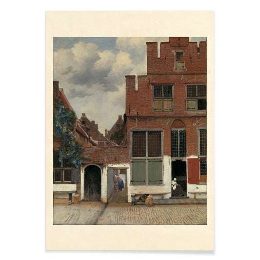
The Little Street Poster
Johannes Vermeer · 1658 · Quiet Delft street art print with brick facades, doorway shadows, and daily life
Poster from €9 · Framed from €16
Regular price From €6,00Regular price -
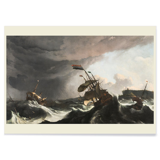
Warships in a Heavy Storm Poster
Ludolf Bakhuysen · 1690 · Dramatic storm-sea art print with warships battling towering waves beneath a broken sky
Poster from €9 · Framed from €16
Regular price From €6,00Regular price -
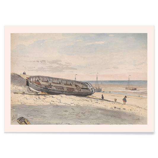
Barges on the beach Poster
Willem Anthonie van Deventer · 1870 · Quiet coastal art print with beached barges and muted beige grey blue tones
Poster from €9 · Framed from €16
Regular price From €6,00Regular price -
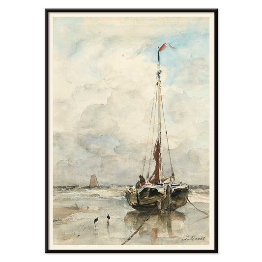
Sail boat Poster
Jacob Hendricus Maris · 1876 · Quiet sailboat art print with wide sky and soft coastal light
Poster from €9 · Framed from €16
Regular price From €6,00Regular price -
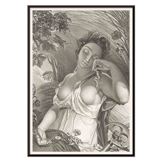
Sleeping Woman Poster
Salvatore Tresca · 1755 · Quiet figurative art print of a sleeping woman framed by delicate natural motifs
Poster from €9 · Framed from €16
Regular price From €6,00Regular price -
Egyptian dancer Poster
Willem de Famars Testas · 1870 · Intimate Orientalist art print of an Egyptian dancer with musicians and spectators
Poster from €9 · Framed from €16
Regular price From €6,00Regular price -
Flowers and Watch Poster
Abraham Mignon · 1671 · Baroque still life art print pairing a lush flower bouquet with a pocket watch
Poster from €9 · Framed from €16
Regular price From €6,00Regular price -
La Guirlande de Julie Poster
Nicolas Robert · 1641 · Romantic cherub and flower garland poster in soft pink and ivory tones
Poster from €9 · Framed from €16
Regular price From €6,00Regular price -
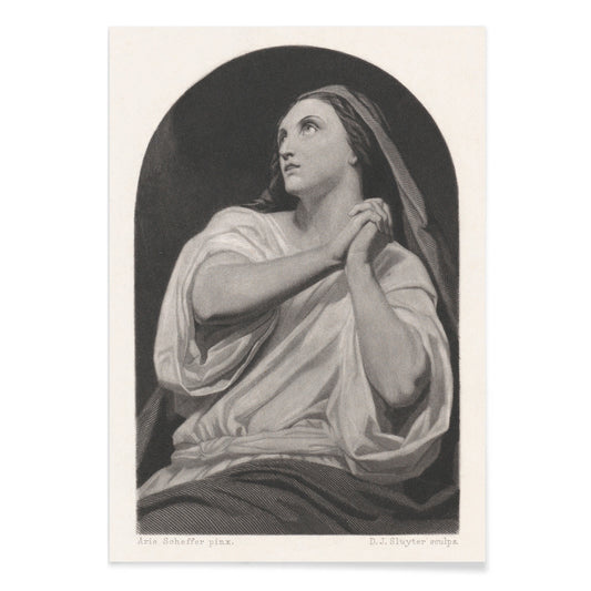
Praying woman Poster
Dirk Jurriaan Sluyter · 1843 · Quiet devotional print of a headscarved woman gazing upward in soft greys
Poster from €9 · Framed from €16
Regular price From €6,00Regular price -
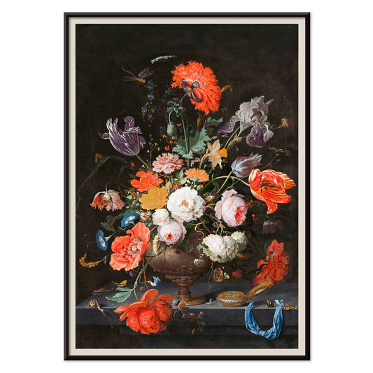
Flowers, Fruit and Birds Poster
Jan van Os · 1777 · Opulent still life art print pairing garden blooms, ripe fruit, and small birds
Poster from €9 · Framed from €16
Regular price From €6,00Regular price -
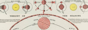
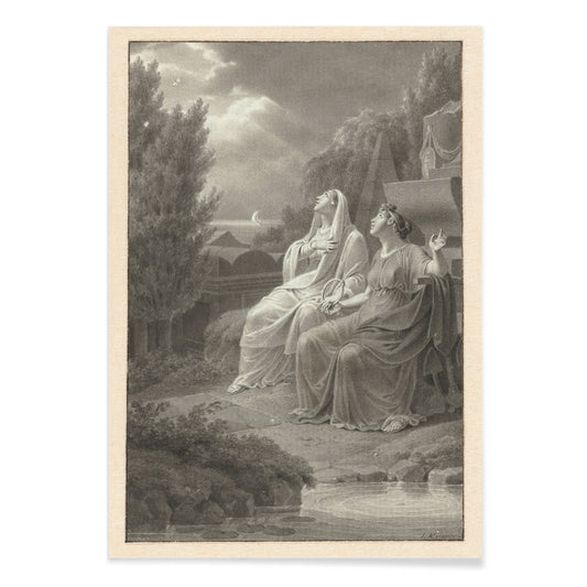
Night sky Poster
Jacobus Kuyper · 1794 · Elegant scientific print of two women observing constellations beneath a calm nocturnal sky
Poster from €9 · Framed from €16
Regular price From €6,00Regular price


- No bestsellers in this collection
When classic art still feels alive
Classic art is not a single look so much as a set of decisions about how to see: how to build form with brushwork, how to let line carry emotion, how to hold a horizon steady. In late nineteenth- and early twentieth-century Europe and America, studios, salons, and independent ateliers coexisted with faster travel, new pigments, and a public hungry for images. The result is a field where observation and invention overlap, and where a vintage poster can preserve the cadence of a hand moving across paper.
Brushwork, line, and emotional weather
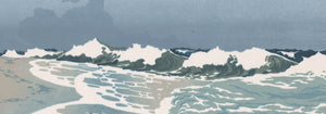
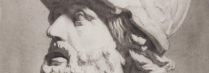
Vincent van Gogh used directional strokes to make still life feel physical rather than decorative, and that intensity remains legible in Roses (1890) by Vincent van Gogh, where pale petals are threaded with greens and cool shadows. Gustav Klimt approaches figure and allegory through pattern, and Beethoven Frieze (1919) by Gustav Klimt shows how ornament can become narrative architecture. Winslow Homer, by contrast, lets atmosphere do the work: Fishing Boats, Key West (1903) by Winslow Homer reduces hulls and masts to quick notes so the sky and distance set the tone. For a sharper register, Egon Schiele turns contour into psychology in Mädchenakt, Gertrude by Egon Schiele, where the line feels both exposed and controlled.
Placing classic prints in contemporary rooms
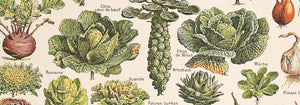
Rooms that already carry texture, such as linen curtains, oak shelving, or plaster walls, often benefit from restraint in color. In those settings, drawings and tonal studies from Black & White create contrast without competing with materials. For bedrooms and quiet corners, water and distance work like visual breathing space; pairing coastal scenes with Sea & Ocean or broader vistas from Landscape helps slow the eye. Kitchens and dining areas can take more visual density, especially when food, ceramics, and wood grain are already part of the scene; still lifes and florals echo naturally with Botanical and make the wall read as part of daily ritual.
Curating a gallery wall with tension and harmony
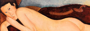
A convincing gallery wall mixes temperatures and mark-making: a watery wash beside a hard contour, ornament beside negative space. Schiele’s nervous precision pairs well with the elongated calm of Nu couché (1917) by Amedeo Modigliani because both simplify anatomy while keeping it unmistakably human. If you want to push the palette toward clearer modern color, a side step into Henri Matisse can introduce cut-paper clarity without breaking the historical thread. To keep varied subjects coherent, repeat one frame finish across the set and keep spacing consistent; thin black frames emphasize line, while light oak softens nudes and seascapes.
Slow looking as a form of decoration
What makes these posters durable as wall art is their invitation to return: how a highlight is placed, where paper is left open, how silence is staged. That attention sits comfortably alongside the broader range of Famous Artists and the more museum-like focus of Classic Art, where home decor becomes a way of living with choices rather than themes.