


- Uien Poster
- Radijzen Poster
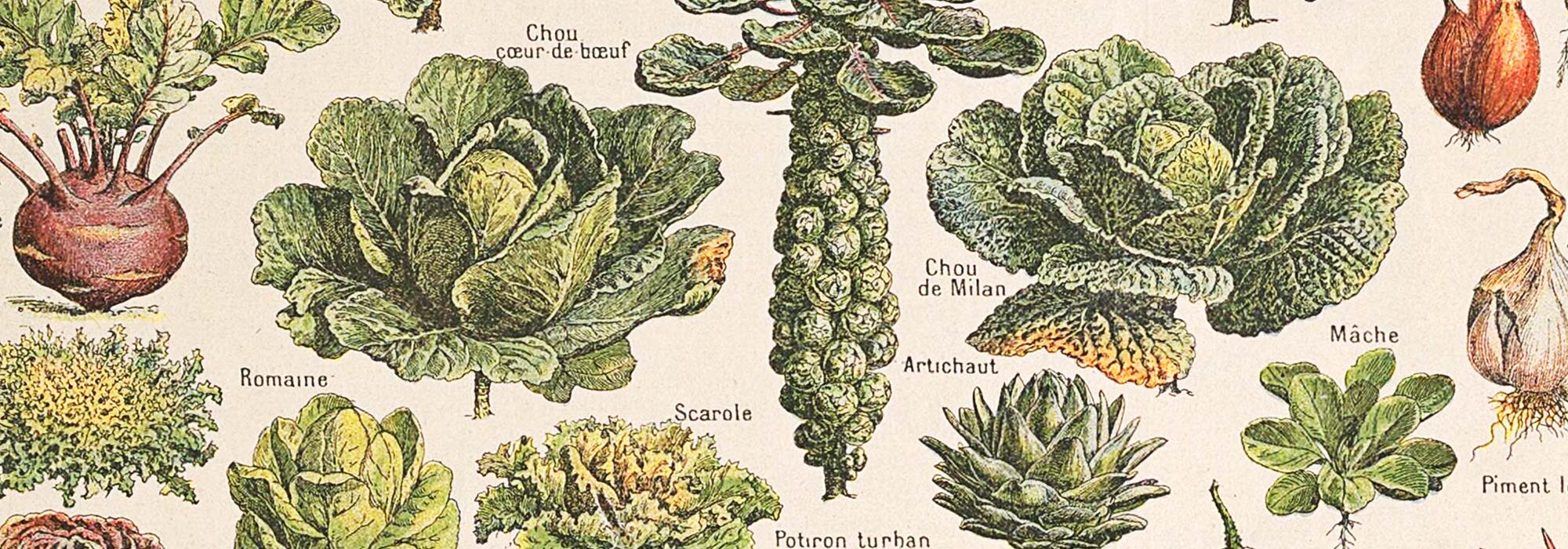
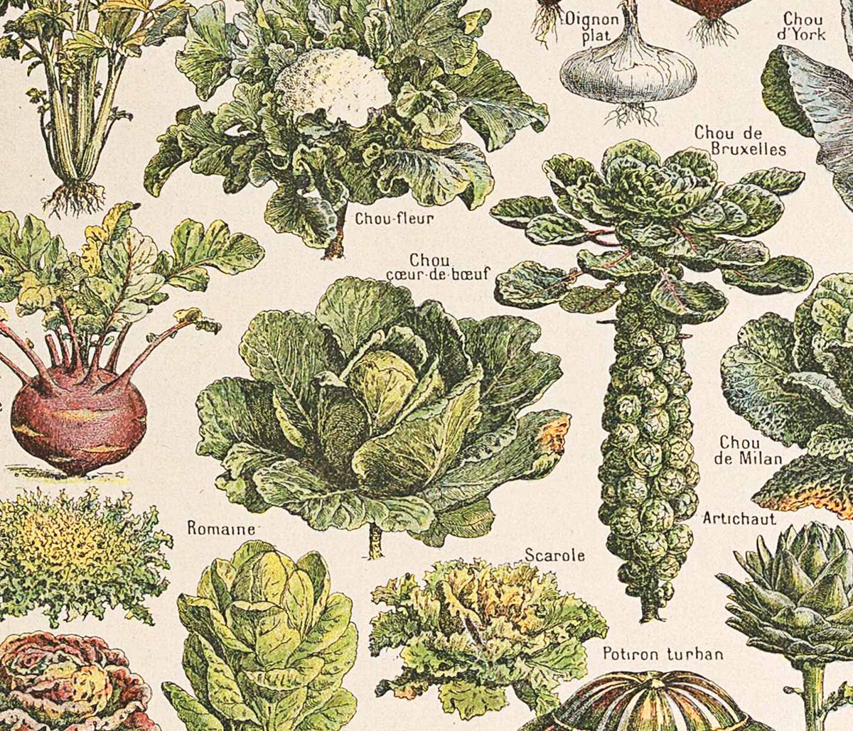
- Wortelen Poster
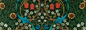
- Strawberry Thief Poster
- Bezoek Puerto Rico Poster
- El Maestro 1 Poster
- Botanische cannabisplaat 2 Poster
- Hibiscus Poster
- Mexicaanse Art & Life 1 Poster
- Mexican Art & Life 3 Poster
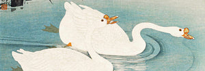
- De ornamentale kunsten van Japan IX Poster
- Prunus avium Poster
- Le Floral poster
- Tropische Bloemen II Poster
- Bloemenmarkt Valencia Poster
- Bloemenmarkt Lissabon Poster
- Bloemenmarkt Barcelona Poster
- Championpruim Poster
- The Vegetabull poster
- Coffea arabica Poster
- Coffea arabica Poster
- Coffea Arabica Poster
- Rode en groene tomaten Poster
- Groene boombibliotheek Poster
-
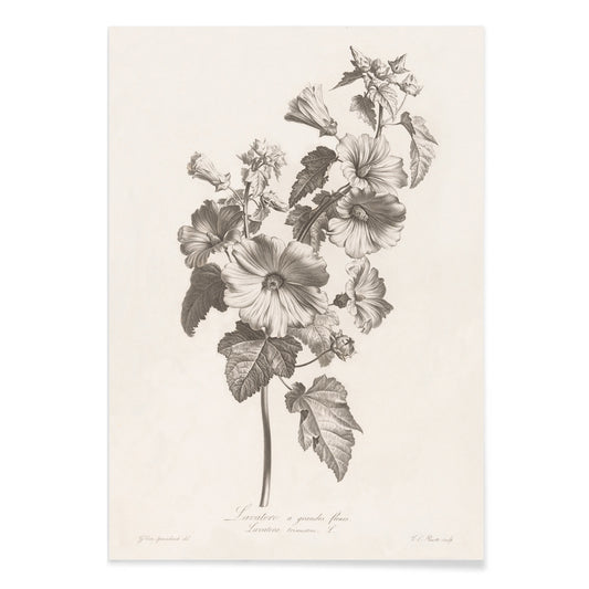
Lavatera Poster
Louis Charles Ruotte · 1819 · Fijne botanische print van lavatera met heldere lijnen en luchtige bloemen op lichte achtergrond
Poster vanaf €9 · Ingelijst vanaf €16
Normale prijs Vanaf €6,00Normale prijs -
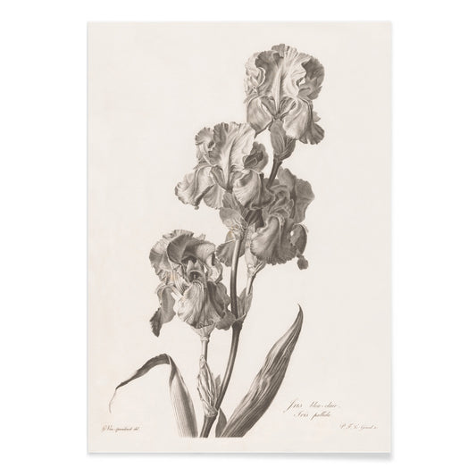
Dalmatische iris Poster
Pierre François Legrand · 2021 · Elegante botanische print van iris met luchtige stengels en zachte tonen
Poster vanaf €9 · Ingelijst vanaf €16
Normale prijs Vanaf €6,00Normale prijs -
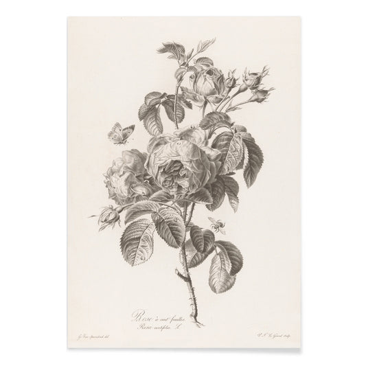
Honderdbladige roos Poster
Pierre François Legrand · 1782 · Fijne botanische print van een roos met subtiele lijnschaduw en serene naturaliteit
Poster vanaf €9 · Ingelijst vanaf €16
Normale prijs Vanaf €6,00Normale prijs -
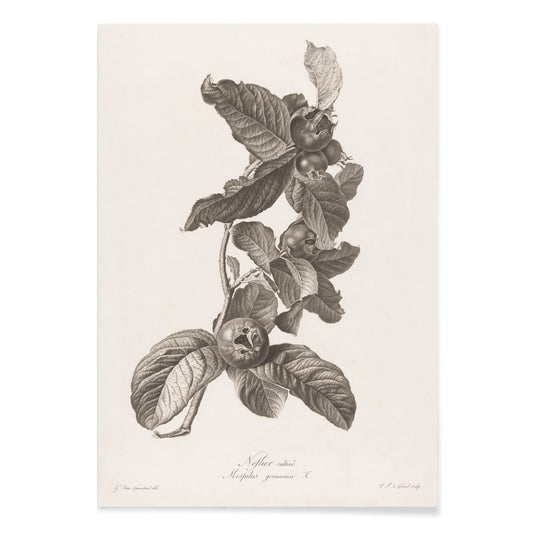
Mispel poster
Pierre François Legrand · 2017 · Minimalistische zwart-wit botanische kunstprint van mispel met fijn gearceerde bladeren
Poster vanaf €9 · Ingelijst vanaf €16
Normale prijs Vanaf €6,00Normale prijs -
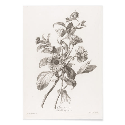
Goudsbloem Poster
Pierre François Legrand · 2014 · Fijne zwart-wit goudsbloem kunstprint met frisse lijnvoering en veel negatieve ruimte
Poster vanaf €9 · Ingelijst vanaf €16
Normale prijs Vanaf €6,00Normale prijs -
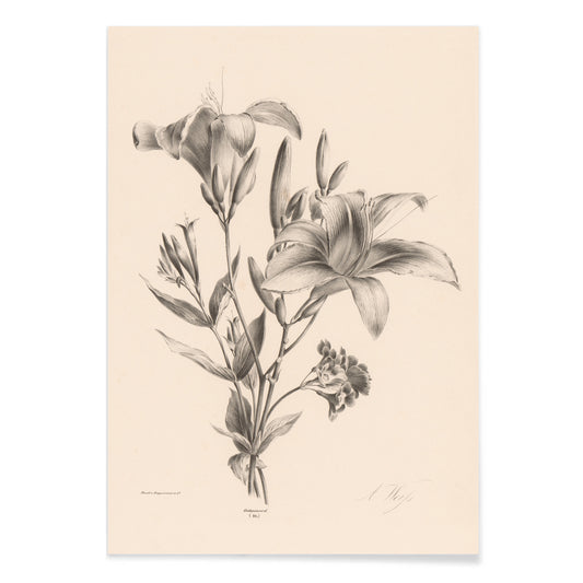
Twee lelies Poster
Anton Weiss · 2006 · monochroom lelie kunstprint met twee bloemen en elegante stelen op warme beige achtergrond
Poster vanaf €9 · Ingelijst vanaf €16
Normale prijs Vanaf €6,00Normale prijs -
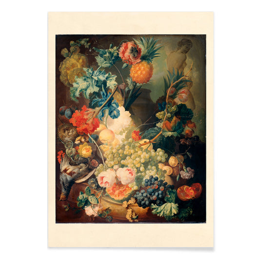
Bloemen, fruit en vogels Poster
Jan van Os · 1777 · Weelderige kunstprint met tuinbloemen, rijp fruit en kleine vogels
Poster vanaf €9 · Ingelijst vanaf €16
Normale prijs Vanaf €6,00Normale prijs -
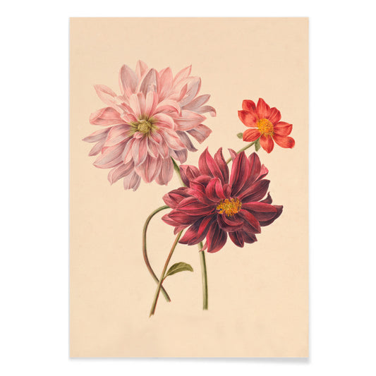
Dahlia Poster
Willem Hekking Jr. · 1838 · Fijne dahlia kunstprint met gelaagde bloemblaadjes en zachte groene en beige tonen
Poster vanaf €9 · Ingelijst vanaf €16
Normale prijs Vanaf €6,00Normale prijs -
Rode bloem Poster
Margaretha de Gijselaar · 1917 · Elegante botanische kunstprint van een rode bloem met frisse groene bladeren op beige
Poster vanaf €9 · Ingelijst vanaf €16
Normale prijs Vanaf €6,00Normale prijs -
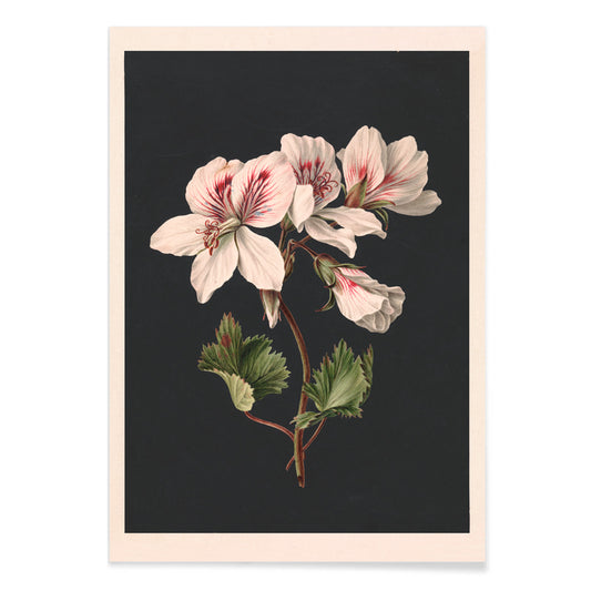
Pelargonium Poster
Maria de Gijselaar · 1815 · Fijne pelargonium print met witte bloesems op diepzwart vlak voor sterk contrast
Poster vanaf €9 · Ingelijst vanaf €16
Normale prijs Vanaf €6,00Normale prijs -
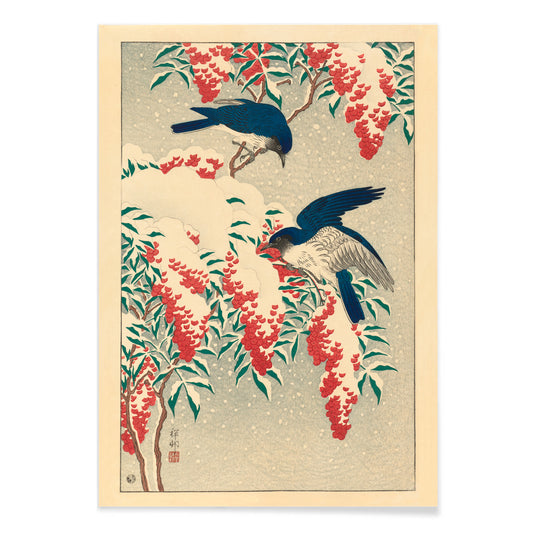
Nandina-bloemen Poster
Ohara Koson · 1910 · Elegante kunstprint met twee blauwe vliegenvangers tussen sneeuwbezette nandina-bessen en takken
Poster vanaf €9 · Ingelijst vanaf €16
Normale prijs Vanaf €6,00Normale prijs -
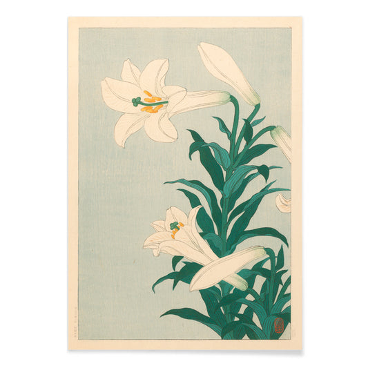
Lelies Poster
Ohara Koson · 1927 · Sereen botanische print van witte lelies tegen een kalme blauwe achtergrond
Poster vanaf €9 · Ingelijst vanaf €16
Normale prijs Vanaf €6,00Normale prijs -
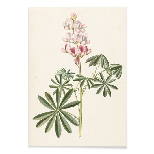
Lupinebloemen poster
Alida Withoos · 1695 · Fijne lupine kunstprint met luchtige stengels en zachte roze bloemen
Poster vanaf €9 · Ingelijst vanaf €16
Normale prijs Vanaf €6,00Normale prijs -
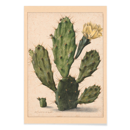
Peercactus in bloei Poster
Herman Saftleven the Younger · 1650 · peercactusprint met gegolfde groene kussentjes en een fijngele bloem
Poster vanaf €9 · Ingelijst vanaf €16
Normale prijs Vanaf €6,00Normale prijs -
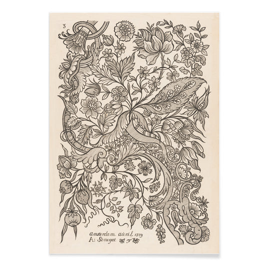
Textielontwerp 2 Poster
Alexander Senegat · 1926 · Elegant vintage print met krullende bladeren in zwarte lijnvoering op beige
Poster vanaf €9 · Ingelijst vanaf €16
Normale prijs Vanaf €6,00Normale prijs -
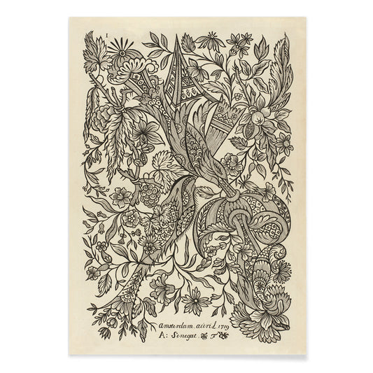
Ontwerp voor textiel 1 Poster
Alexandre Sénégať · 1905 · Ornamentale bloemmotief kunstprint met slingerende stengels en rustige negatieve ruimte
Poster vanaf €9 · Ingelijst vanaf €16
Normale prijs Vanaf €6,00Normale prijs -
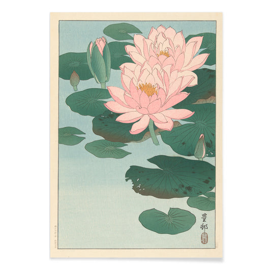
Bloeiende waterlelie Poster
Ohara Koson · 1910 · Sereen botanische print van roze waterlelies drijvend tussen ronde bladeren
Poster vanaf €9 · Ingelijst vanaf €16
Normale prijs Vanaf €6,00Normale prijs -
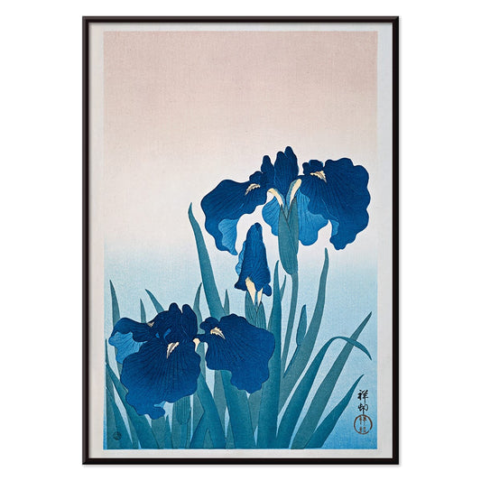
Blauwe irissen Poster
Ohara Koson · 1925 · Zachte blauwe irissen botanische print met slanke bladeren en luchtige Japanse compositie
Poster vanaf €9 · Ingelijst vanaf €16
Normale prijs Vanaf €6,00Normale prijs -
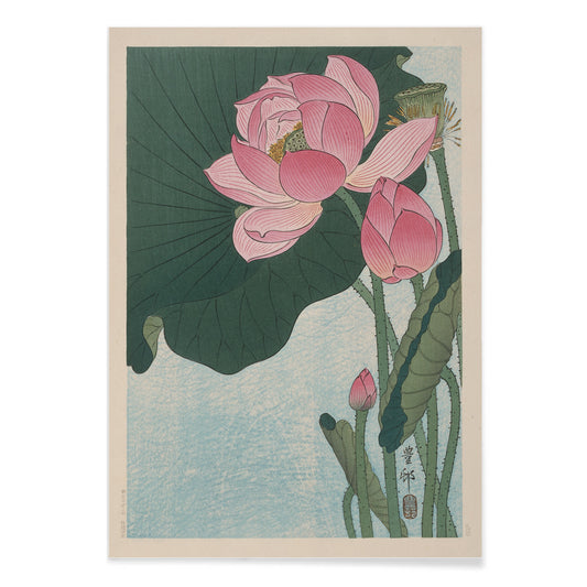
Bloeiende lotusbloemen Poster
Ohara Koson · 1923 · Serene lotusbloemenprint met zachte roze bloemen en rustige blauwe tonen
Poster vanaf €9 · Ingelijst vanaf €16
Normale prijs Vanaf €6,00Normale prijs -
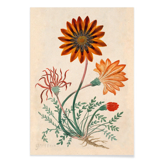
Gorteria diffusa Poster
Robert Jacob Gordon · 1779 · Levendige botanische kunstprint met madeliefachtige bloemen in oranje-rode tinten en helder groen blad
Poster vanaf €9 · Ingelijst vanaf €16
Normale prijs Vanaf €6,00Normale prijs -
Vetplant Poster
Herman Saftleven the Younger · 1655 · Fijne botanische print van een sculpturale vetplant met zacht gearceerde ronde bladeren
Poster vanaf €9 · Ingelijst vanaf €16
Normale prijs Vanaf €6,00Normale prijs -
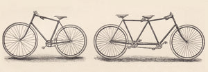
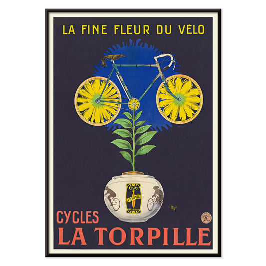
Cycles La Torpille Poster
Michel Liebeaux · 1923 · speelse fietsposter met bloemrijke humor en krachtige Art Deco kleuren
Poster vanaf €9 · Ingelijst vanaf €16
Normale prijs Vanaf €6,00Normale prijs -
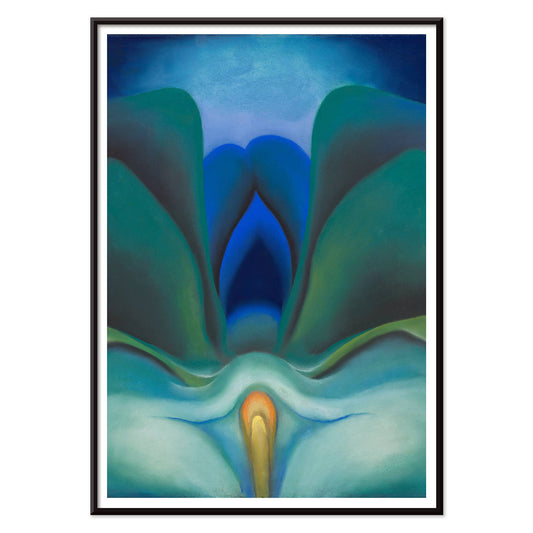
Blauwe bloem Poster
Georgia O'Keeffe · 1919 · blauwe bloem als botanische print met lichtgevende blauwe bladen en een gloeiend hart
Poster vanaf €9 · Ingelijst vanaf €16
Normale prijs Vanaf €6,00Normale prijs


Van herbariumbladen tot decoratieve tuinen
Deze Botanische collectie verzamelt vintage posters en kunstprints waarin planten worden waargenomen, geclassificeerd en gevierd als decoratie. Het loopt van negentiende-eeuwse florilegia tot uitgevergrotingen van stengels, peulen en bladeren, weergegeven met bijna architectonische rust. Botanische wandkunst beweegt zich vaak tussen wetenschap en genot: een citrustak leest tegelijk als specimen, stilleven en kleurtoon. Aan de muur suggereren deze prints een binnenkas, geven ze het interieur een rustiger tempo en voegen ze een tactiele tegenhanger toe aan hardere materialen.
Patronen, pigmenten en vroege fotografie
Ornamenteel ontwerp verschijnt in De aardbeiendief (1883) van William Morris, waar verstrengelde bladeren en kleine vogels het tuinleven omzetten in herhaling, ideaal voor kamers die al ritme hebben door tapijten of tegels. Aan het andere uiterste gebruikt Varen (1850) van Anna Atkins cyanotypie om een plantensilhouet vast te leggen in Pruisisch blauw, een mijlpaal in vroege fotografische technieken en tegelijk een botanisch document. Tussen deze polen verfijnde botanische illustratie aquareltechnieken voor glans, rijpheid en doorschijnendheid van bloemblaadjes; later duwde nauwkeurige plantfotografie vormen richting modernisme. Wie van die analytische scherpte houdt, vindt via de aangrenzende stemming van Wetenschap een andere invalshoek op beeldvorming die onderzoekdriven is.
Waar botanische prints het beste tot hun recht komen
Botanische posters functioneren het beste waar dagelijkse rituelen al textuur en geur bevatten: keukens, eethoeken en entreeruimtes met hout, linnen of riet. Een serie fruitplaten kan keramiek en de ruggen van kookboeken echoën; voor dat huiselijke stillevengevoel combineer met Keuken. Koelere blauwe cyaanprints staan helder bij witte tegels of licht natuursteen, terwijl bladgroenen gegrond lijken naast eiken en walnoot. Voor smallere gangen kies verticale varens die de muur verlengen; boven een lage dressoir kan een enkele tak iets off-center hangen om de asymmetrie van een schaal of lamp te spiegelen.
Een galeriewand samenstellen met contrast
Bij het mixen van botanische prints streef je naar dialoog in plaats van matchen. Een Japanse kachō-ga zoals Pioenen en kanarie (1834) van Katsushika Hokusai brengt gedisciplineerde lijnvoering en open ademruimte en sluit natuurlijk aan bij Oosters. Om de compositie aan te scherpen voeg je één geometrische partner toe uit Abstract, waarbij cirkels en rasters reageren op het krulend van bloemblaadjes. Wil je dat de samenstelling scherp blijft, voeg dan een rustiger tonaal stuk toe uit Zwart-wit. Houd één lijstafwerking aan over de hele wand voor continuïteit en gebruik Lijsten als verbindende materiaalaantekening.
Het plezier van goed kijken
Bekende bloemen tonen iets anders wanneer een kunstenaar vertraagt en ze als structuur en weersgesteldheid behandelt. In Irissen (1890) van Vincent van Gogh wordt verf energie, veranderen bloemblaadjes in vlammen van violet en zwavelgeel in plaats van keurig botanisch. Dat spectrum, van taxonomie tot penseelwerk, van patroon tot fotografie, voorkomt dat vintage botanische wandkunst louter decoratief aanvoelt. Samen vormen de posters een kleine oefening in aandacht: hoe lijn groei beschrijft, hoe kleur seizoen suggereert en hoe een kamer natuur kan bevatten zonder die te imiteren.