


- Vernietig deze woeste bruut Poster
- Shaw van ironie Poster
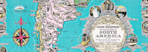
- De goede buur van Zuid-Amerika Poster
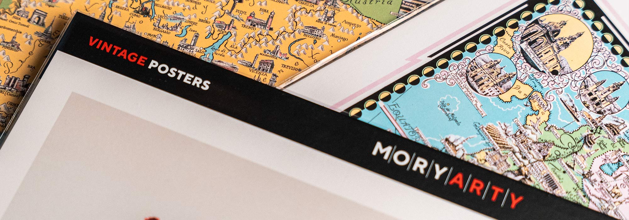
- Italië met Vaticaanstad Poster
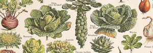
- Uien Poster
- Radijzen Poster
- Wortelen Poster
- Les Lalanne Poster
- Punch Boutique Poster
- Dansend stel in de sneeuw Poster
- Jodendom en paganisme — standpunt Poster
- Jet Clipper naar Hawaii poster
- Campari Soda Poster
- Bec-Kina Poster
- Kohler Chocolat Poster
- Strawberry Thief Poster
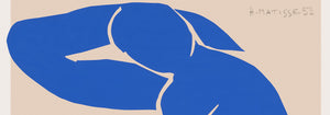
- Matisse Dansende figuren Poster
- Tom Krojer Tentoonstellingsposter
- Berlijnse Straatscène Poster
- Ernst Kirchner Tentoonstelling Poster
- Tour Eiffel 2 Poster
- Vrouw met de rug naar de kijker Poster
- Rood haar, blauwe hoed Poster
- Park nabij Lu Poster
- El Comienzo Poster
- Parler Seul 2 Poster
- The Current Standpoint of the Mahatmas Poster
- Twilight’s Ring Poster
- Parler Seul Poster
- Faun en nimf Poster
- The Dream poster
- Le Concert Poster
- Vogel vliegend door een wolk Poster
-
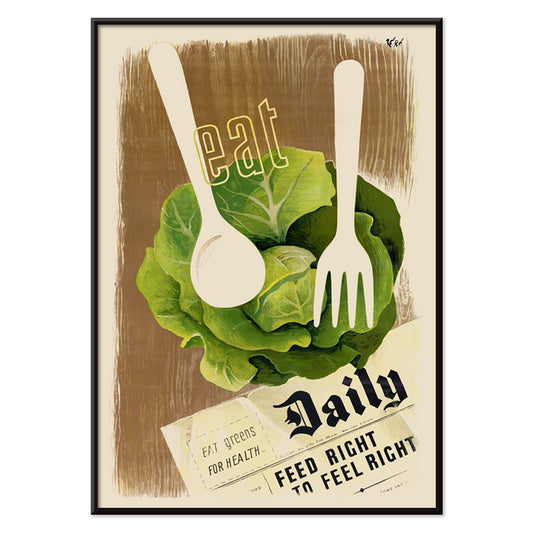
Eet groenten voor je gezondheid Poster
Hans Schleger · 1943 · Modernistische voedingsposter met krachtige groentinten, scherpe vormen en strakke oorlogstypografie
Poster vanaf €9 · Ingelijst vanaf €16
Normale prijs Vanaf €6,00Normale prijs -
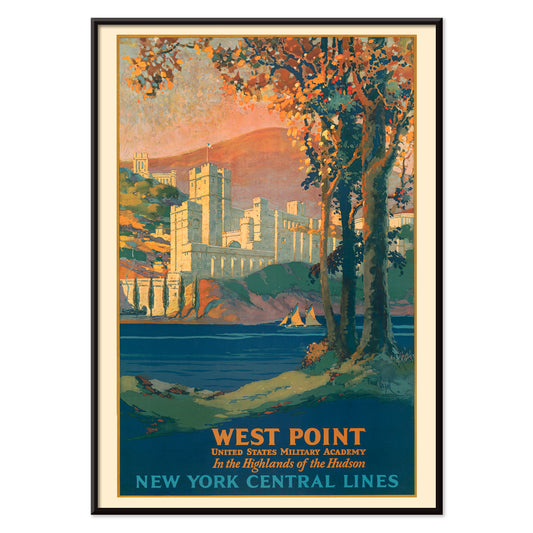
West Point Poster
Frank Hazell · 1920 · Pittoresk West Point-poster uit de Hudson Highlands met majestueuze architectuur en herfstig loof
Poster vanaf €9 · Ingelijst vanaf €16
Normale prijs Vanaf €6,00Normale prijs -
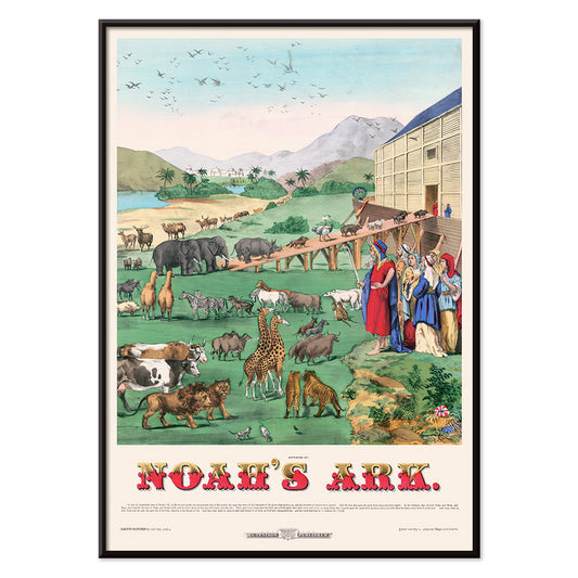
Ark van Noach Poster
H. C. Tunison · 1899 · Sprookjesachtig poster met paren dieren die naar een houten ark onder palmen lopen
Poster vanaf €9 · Ingelijst vanaf €16
Normale prijs Vanaf €6,00Normale prijs -
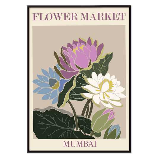
Bloemenmarkt van Mumbai Poster
MORYARTY · 2022 · Levendig waterlelies poster die de bloemenmarkt van Mumbai oproept in paars, groen en blauw
Poster vanaf €9 · Ingelijst vanaf €16
Normale prijs Vanaf €6,00Normale prijs -
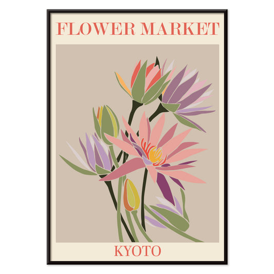
Bloemenmarkt Kyoto Poster
MORYARTY · 2021 · Levendige Kyoto bloemenmarkt poster met gestileerde bloesems en strakke grafische lijnen
Poster vanaf €9 · Ingelijst vanaf €16
Normale prijs Vanaf €6,00Normale prijs -
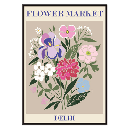
Bloemenmarkt Delhi Poster
MORYARTY · 2023 · Levendige Delhi bloemenmarkt poster met gelaagde bloemen en een pittige grafische sfeer
Poster vanaf €9 · Ingelijst vanaf €16
Normale prijs Vanaf €6,00Normale prijs -
Bloemenmarkt Kaapstad Poster
MORYARTY · 2013 · Levendige paradijsvogelposter in abstracte vormen met tropische energie en krachtige kleuren
Poster vanaf €9 · Ingelijst vanaf €16
Normale prijs Vanaf €6,00Normale prijs -
Bloemenmarkt - Cardiff Poster
MORYARTY · 2010 · Grafische narcissenposter in diep paars en helder geel als vrolijk seizoensaccent
Poster vanaf €9 · Ingelijst vanaf €16
Normale prijs Vanaf €6,00Normale prijs -
Bloemenmarkt - Amsterdam 2 Poster
MORYARTY · 2023 · Vintage tulpenposter met witte bloemen en groene stelen op rustige blauwgroene achtergrond
Poster vanaf €9 · Ingelijst vanaf €16
Normale prijs Vanaf €6,00Normale prijs -
Bloemenmarkt Seoul 2 Poster
MORYARTY · 2021 · Energiek bloemenmarkt-poster met krachtig oranje veld en grafische bloemen in roze en paars
Poster vanaf €9 · Ingelijst vanaf €16
Normale prijs Vanaf €6,00Normale prijs -
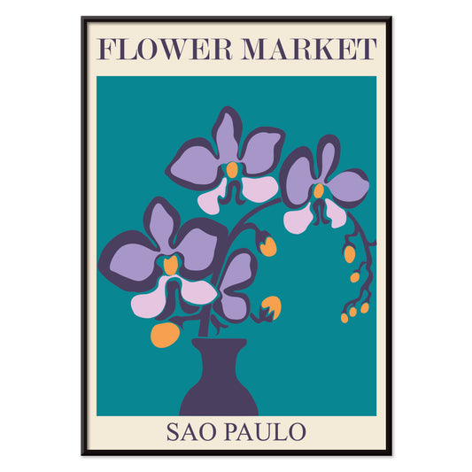
Bloemenmarkt São Paulo Poster
MORYARTY · 2017 · Levendige orchideeënposter met strakke vaasvorm op diep blauwgroene achtergrond en frisse accenten
Poster vanaf €9 · Ingelijst vanaf €16
Normale prijs Vanaf €6,00Normale prijs -
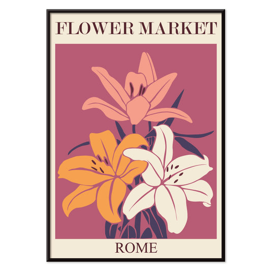
Bloemenmarkt - Rome Poster
MORYARTY · 2019 · Levendige poster met lelieboeket geïnspireerd op Romeinse bloemenmarkten in warme roze en oranje tinten
Poster vanaf €9 · Ingelijst vanaf €16
Normale prijs Vanaf €6,00Normale prijs -
Bloemenmarkt Milano Poster
MORYARTY · 2022 · Kleurrijk bloemenboeket-poster die de levendige sfeer van een Milaanse bloemenmarkt vastlegt
Poster vanaf €9 · Ingelijst vanaf €16
Normale prijs Vanaf €6,00Normale prijs -
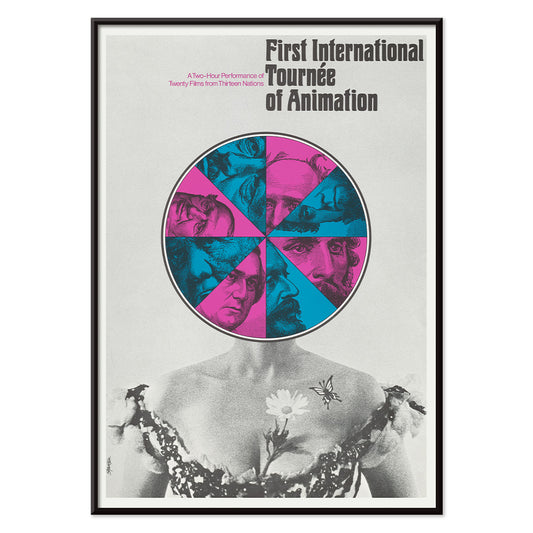
Eerste internationale animatietournee Poster
Paul Showalter · 1970 · Surrealistisch gezicht en geometrische poster in koele blauw- en grijstonen met levendig roze accenten
Poster vanaf €9 · Ingelijst vanaf €16
Normale prijs Vanaf €6,00Normale prijs -
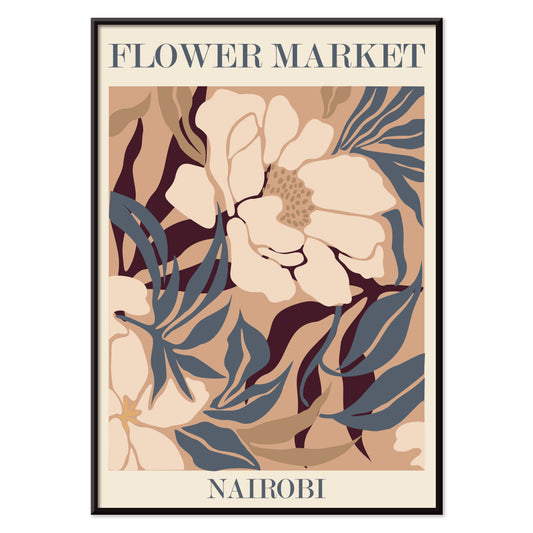
Bloemenmarkt - Nairobi Poster
MORYARTY · 2019 · Abstracte bloemige kunstprint in beige, bruin en blauw met levendige marktsfeer en subtiele energie
Poster vanaf €9 · Ingelijst vanaf €16
Normale prijs Vanaf €6,00Normale prijs -
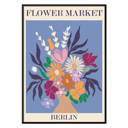
Bloemenmarkt Berlijn Poster
MORYARTY · 2019 · Kleurrijke poster met boeket en opvallende Berlijnletters vol levendige marktsfeer
Poster vanaf €9 · Ingelijst vanaf €16
Normale prijs Vanaf €6,00Normale prijs -
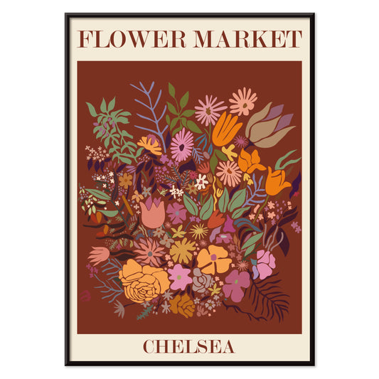
Bloemenmarkt Chelsea Poster
MORYARTY · 2023 · Levendig bloemenmarktposter met stevige letters, frisse botanische silhouetten en nostalgische sfeer
Poster vanaf €9 · Ingelijst vanaf €16
Normale prijs Vanaf €6,00Normale prijs -
Bloemenmarkt Jamaica Poster
MORYARTY · 2016 · Tropische bloemenmarkt poster met gelaagde botanische elementen en warme Caribische kleuren
Poster vanaf €9 · Ingelijst vanaf €16
Normale prijs Vanaf €6,00Normale prijs -
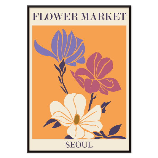
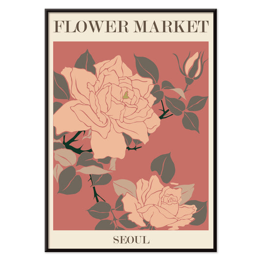
Bloemenmarkt Seoul Poster
MORYARTY · 2021 · Grafische poster met marktbloemen in roze en weelderig groen op beige
Poster vanaf €9 · Ingelijst vanaf €16
Normale prijs Vanaf €6,00Normale prijs -
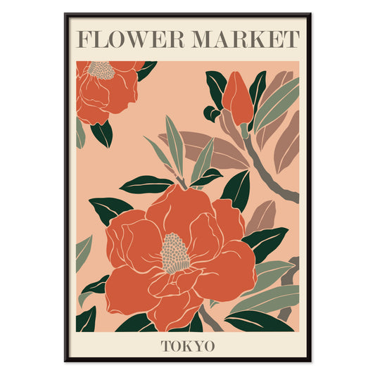
Bloemenmarkt - Tokio poster
MORYARTY · 2021 · Levendige bloemenposter met krachtige marktbloemen, strakke vormen en frisse groene accenten
Poster vanaf €9 · Ingelijst vanaf €16
Normale prijs Vanaf €6,00Normale prijs -
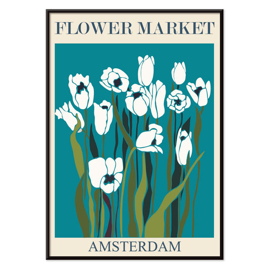
Bloemenmarkt Amsterdam Poster
MORYARTY · 2019 · Retro tulpenmarkt poster die de energie van Amsterdam vangt met aardse tinten en grafische eenvoud
Poster vanaf €9 · Ingelijst vanaf €16
Normale prijs Vanaf €6,00Normale prijs -
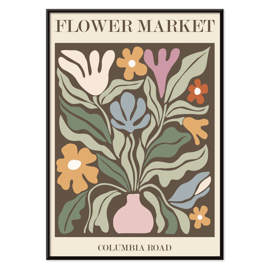
Bloemenmarkt Columbia Road Poster
MORYARTY · 2017 · Levendige bloemposter met gestileerde vaas en boeket in sterke moderne kleuren
Poster vanaf €9 · Ingelijst vanaf €16
Normale prijs Vanaf €6,00Normale prijs -
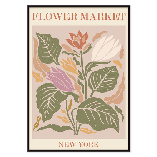
Bloemenmarkt New York Poster
MORYARTY · 2019 · Vrolijke botanische poster met gestileerde marktbloemen en strakke New York-letters op beige
Poster vanaf €9 · Ingelijst vanaf €16
Normale prijs Vanaf €6,00Normale prijs -
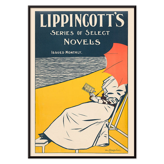
Lippincott poster
William Carqueville · 1895 · Sereen Belle Époque poster van een vrouw lezend bij het water in blauwtinten
Poster vanaf €9 · Ingelijst vanaf €16
Normale prijs Vanaf €6,00Normale prijs -
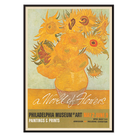
Een wereld van bloemen Poster
Onbekende kunstenaar · 1964 · Vrolijke bloemenposter in zonnige jaren 60-stijl met gedurfde bloemblaadjes
Poster vanaf €9 · Ingelijst vanaf €16
Normale prijs Vanaf €6,00Normale prijs -
Leeg bord Poster
James Fitton · 1950 · Midden 20e-eeuwse poster met opvallende schotel en boodschap tegen verspilling
Poster vanaf €9 · Ingelijst vanaf €16
Normale prijs Vanaf €6,00Normale prijs -
Oosterse danseres Poster
Cesare Biseo · 1876 · Lyrische oosterse danseres poster met verfijnde textielen en een serene waterpijp
Poster vanaf €9 · Ingelijst vanaf €16
Normale prijs Vanaf €6,00Normale prijs -
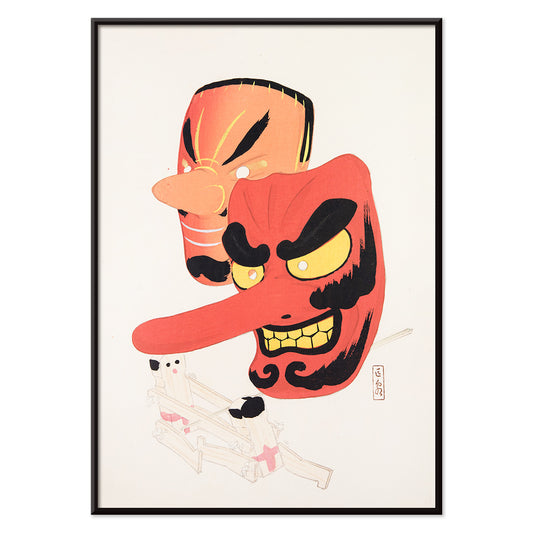
Japanse speelgoedmaskers Poster
Kawasaki Kyosen · 1919 · Speels festivalmasker vintage print met krachtige lijnen en vrolijk volkskarakter
Poster vanaf €9 · Ingelijst vanaf €16
Normale prijs Vanaf €6,00Normale prijs -
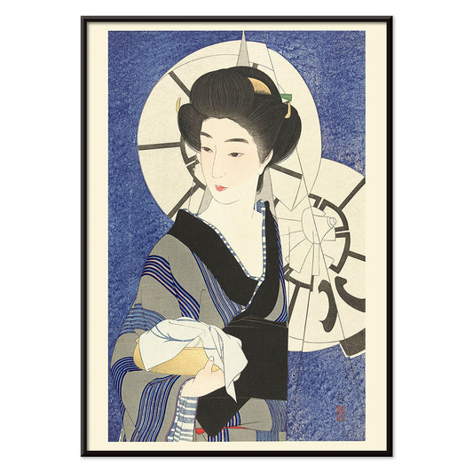
Na een bezoek aan het badhuis Poster
Kotondo Torii · 1933 · Fijne shin-hanga poster met vrouw in kimono en paraplu in zachte regen
Poster vanaf €9 · Ingelijst vanaf €16
Normale prijs Vanaf €6,00Normale prijs -
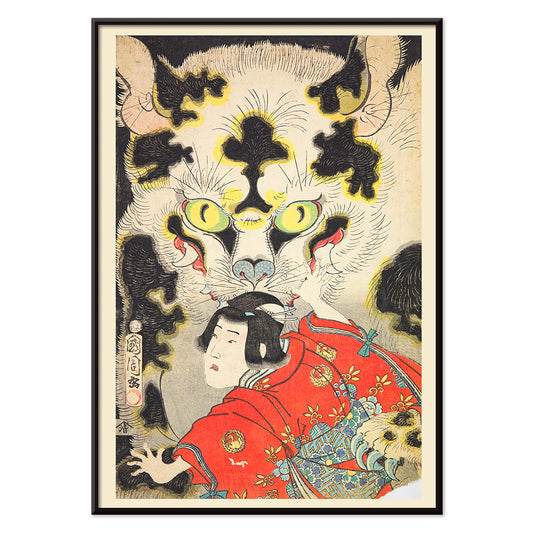
Azuma Nishikie Poster
Onbekende kunstenaar · 1860 · Pakkende Ukiyo-e kunstprint met kimono-figuur in confrontatie met een dramatische tijgerkop
Poster vanaf €9 · Ingelijst vanaf €16
Normale prijs Vanaf €6,00Normale prijs -
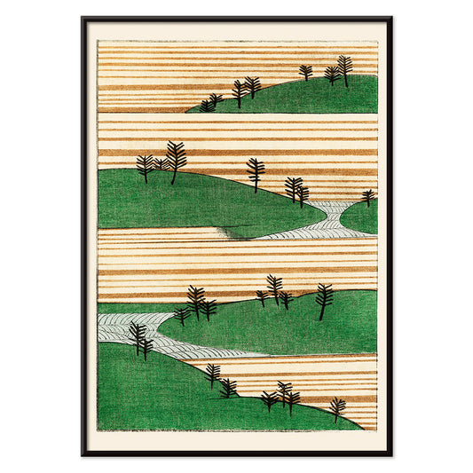
Groen landschap Poster
Watanabe Seitei · 1900 · Rustige Japanse kunstprint met gelaagde groene heuvels en ruime, kalme sfeer
Poster vanaf €9 · Ingelijst vanaf €16
Normale prijs Vanaf €6,00Normale prijs -
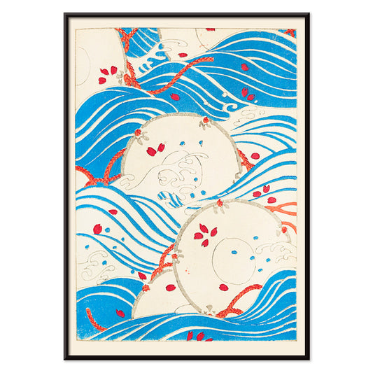
Bijutsukai 175 Poster
Korin Furuya · 1901 · Japanse golfposter met stevige blauwe golven en subtiele rode accenten
Poster vanaf €9 · Ingelijst vanaf €16
Normale prijs Vanaf €6,00Normale prijs -
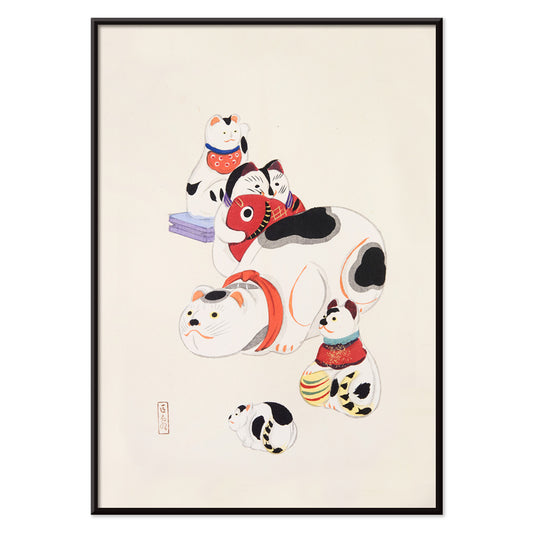
Japanse speelgoedkatten 2 Poster
Kawasaki Kyosen · 1919 · Speelse speelgoedkat poster met heldere lijnen en feestelijke accenten in rood, geel en paars
Poster vanaf €9 · Ingelijst vanaf €16
Normale prijs Vanaf €6,00Normale prijs -
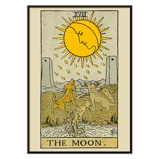
Tarot: De Maan Poster
Lauron William de Laurence · 1918 · Mystiek poster van De Maan met huilende honden, dubbele torens en een kronkelend pad
Poster vanaf €9 · Ingelijst vanaf €16
Normale prijs Vanaf €6,00Normale prijs -
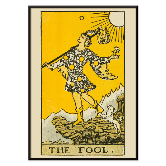
Tarot de Dwaas Poster
Lauron William de Laurence · 1918 · Vrolijke Tarot de Dwaas poster met krachtige lijnen, zonnige gele achtergrond en trouwe hond
Poster vanaf €9 · Ingelijst vanaf €16
Normale prijs Vanaf €6,00Normale prijs -
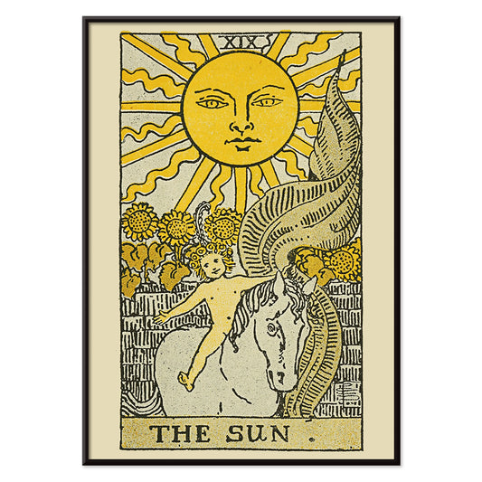
De Zon Tarot Poster
Lauron William de Laurence · 1918 · Stralende Zon tarotposter met kind op wit paard
Poster vanaf €9 · Ingelijst vanaf €16
Normale prijs Vanaf €6,00Normale prijs


36/1749 items
- Eet groenten voor je gezondheid Poster
- Ark van Noach Poster
- Bloemenmarkt van Mumbai Poster
- Bloemenmarkt Kyoto Poster
- Bloemenmarkt Delhi Poster
- Bloemenmarkt Kaapstad Poster
- Bloemenmarkt - Cardiff Poster
- Bloemenmarkt - Amsterdam 2 Poster
- Bloemenmarkt Seoul 2 Poster
- Bloemenmarkt São Paulo Poster
- Bloemenmarkt - Rome Poster
- Bloemenmarkt Milano Poster
- Eerste internationale animatietournee Poster
- Bloemenmarkt - Nairobi Poster
- Bloemenmarkt Berlijn Poster
- Bloemenmarkt Chelsea Poster
- Bloemenmarkt Jamaica Poster
- Bloemenmarkt Seoul Poster
- Bloemenmarkt - Tokio poster
- Bloemenmarkt Amsterdam Poster
- Bloemenmarkt Columbia Road Poster
- Bloemenmarkt New York Poster
- Japanse speelgoedmaskers Poster
- Na een bezoek aan het badhuis Poster
- Groen landschap Poster
- Bijutsukai 175 Poster
- Japanse speelgoedkatten 2 Poster
- Tarot: De Maan Poster
- Tarot de Dwaas Poster
- De Zon Tarot Poster
Een archief van beelden, geen enkele stijl
Alle Posters leest als een kabinet van curiositeiten: klassieke kunstprints naast reisscènes, grafische experimenten naast rustige natuurobservaties. In plaats van één beweging suggereert de selectie een sociale geschiedenis van kijken, waar inkt op papier samenkwam met menigten, winkels, salons en stations. Door de tijd heen keren bepaalde instincten terug: gedurfde typografie, expressieve lijnvoering en de manier waarop een poster de sfeer van een ruimte kan verleggen van caféwarmte naar museale stilte. Voor een gerichtere ervaring navigeer tussen Reclame en Klassieke Kunst om te voelen hoe publieke beelden en privé-smaak vaak van elkaar lenen.
Hoe posters werden gedrukt en waarom dat ertoe doet
Veel werken in deze verzameling waren ontworpen om snel gelezen te worden. Steendruk maakte brede kleurvelden mogelijk, met fluwelige zwarten en een zachte rand die nog steeds menselijk aanvoelt. Latere technieken, waaronder offset, scherpten contouren en maakten grotere oplages mogelijk, wat veranderde hoe kleur op papier zit. Je herkent vaak de techniek aan het oppervlak: halftone-dotjes, overdrukken en lichte misregistratie die vintage kleur een zachte vibratie geven. Die details zijn geen gebreken maar bewijs van ambacht. Wie houdt van zorgvuldig negatief ruimtegebruik en lijn, zal de rustige structuur van Oosters waarderen naast de zuivere eenvoud van Minimalistisch, waar stilte onderdeel wordt van het ontwerp.
Wandkunst gebruiken om een ruimte te vormen
Omdat dit een breed spectrum is, begin met de materialen en het licht van de ruimte. In een keuken met eiken, steengoed of terrazzo kan een botanische poster nerf en geurherinnering echoën; Botanisch brengt groenen die goed samengaan met warme neutrale tonen. In een woonkamer van chroom, glas en strakke meubels houdt de geometrie van Abstract de sfeer fris, zeker als je één accentkleur herhaalt in textiel. Slaapkamers reageren vaak op terughoudendheid: Zwart-wit prints lezen als een rustig gesprek en voelen prettig aan bij linnen, wol en lage warme lampen.
Cureren, combineren en omlijsten door de periodes heen
Een galeriewand werkt het beste als er tempo is. Combineer één tekstgerichte sheet met één beeldgedreven compositie en laat marges het ritme bepalen. Meng je periodes, houd dan een gedeeld element aan zoals papiertoon, herhaald rood of consistente lijndikte. Dunne zwarte lijsten duwen grafische posters naar voren; licht eiken verzacht hoog contrast en past bij een Scandinavisch georiënteerd interieur. Hang grotere posters iets lager dan verwacht zodat het beeld het oog ontmoet en clust kleinere prints dichter bij planken zodat objecten vormen op papier echoën. Wil je dat de wand bewust geredigeerd oogt, kies dan één hero-werk met twee ondersteunende stukken in plaats van een dicht raster.
Het genoegen van breed bladeren
Wat de Alle Posters-collectie bij elkaar houdt, is haar democratische oorsprong: beelden bedoeld om opgeprikt, verhandeld en geleefd te worden. Kies één print die je blik langer vasthoudt dan verwacht en bouw daar vanuit op met aangrenzende kleuren en verwante lijnen. Wil je structuur tijdens het bladeren, wissel tussen Verticale Posters en Horizontale Posters om te zien hoe formaat alleen al de beleving van een wand verandert. Voor ideeën over lijsten kan het rustigere profiel van Lijsten helpen gemengde periodes te verenigen zonder hun verschillen te nivelleren.