

- Uien Poster
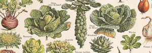
- Radijzen Poster
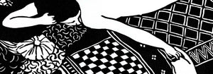
- Dansend stel in de sneeuw Poster
- Jet Clipper naar Hawaii poster
- Campari Soda Poster
- Bec-Kina Poster
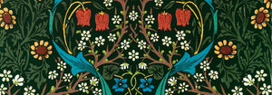
- Strawberry Thief Poster
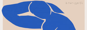
- Matisse Dansende figuren Poster
- Tom Krojer Tentoonstellingsposter
- Berlijnse Straatscène Poster
- Ernst Kirchner Tentoonstelling Poster
- Park nabij Lu Poster
- El Comienzo Poster
- Twilight’s Ring Poster
- Parler Seul Poster
- Faun en nimf Poster
- The Dream poster
- Le Concert Poster
- Vrouw en vogel 's nachts Poster
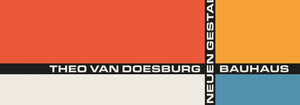
- Bauhaus 20 Poster
- Bauhaus 21 Poster
- Eet meer fruit Poster
- Snoopy Come Home Poster
- Naar Londen met Jet Clipper Poster
- Kyushu-Okinawa Poster
- Xerez Pedro Domecq Poster
- Balsam Aperitief Poster
- Boter Poster
- Crans-sur-Sierre Poster
- Monte Carlo Poster
- Pacific Vibrations Poster
- Continental Hawaii Airline Poster
- Zwarte kat 4 Poster
- Zwarte kat 3 Poster
- Bier en Sigaret Poster
-
Vrouw met klaprozen Poster
Alphonse Mucha · 1899 · Elegante art-nouveau poster met een rustige vrouw omringd door helderrode klaprozen
Poster vanaf €9 · Ingelijst vanaf €16
Normale prijs Vanaf €6,00Normale prijs -
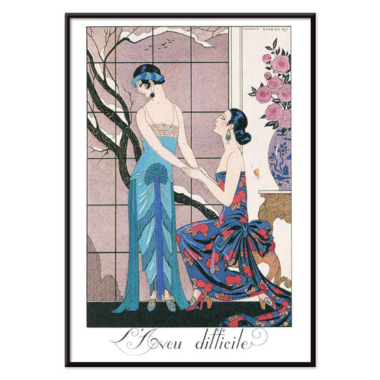
L’aveu Difficile Poster
George Barbier · 1924 · Elegant Art Deco poster met twee elegante figuren en theatrale juweeltinten
Poster vanaf €9 · Ingelijst vanaf €16
Normale prijs Vanaf €6,00Normale prijs -
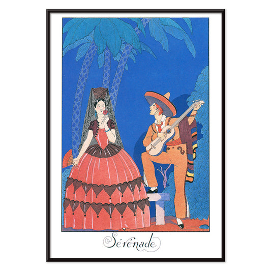
Sérénade Poster
George Barbier · 1924 · Elegant Art Deco poster met een blauwe muzikant die een vrouw in oranje serenadeert
Poster vanaf €9 · Ingelijst vanaf €16
Normale prijs Vanaf €6,00Normale prijs -
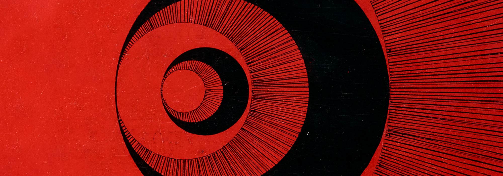
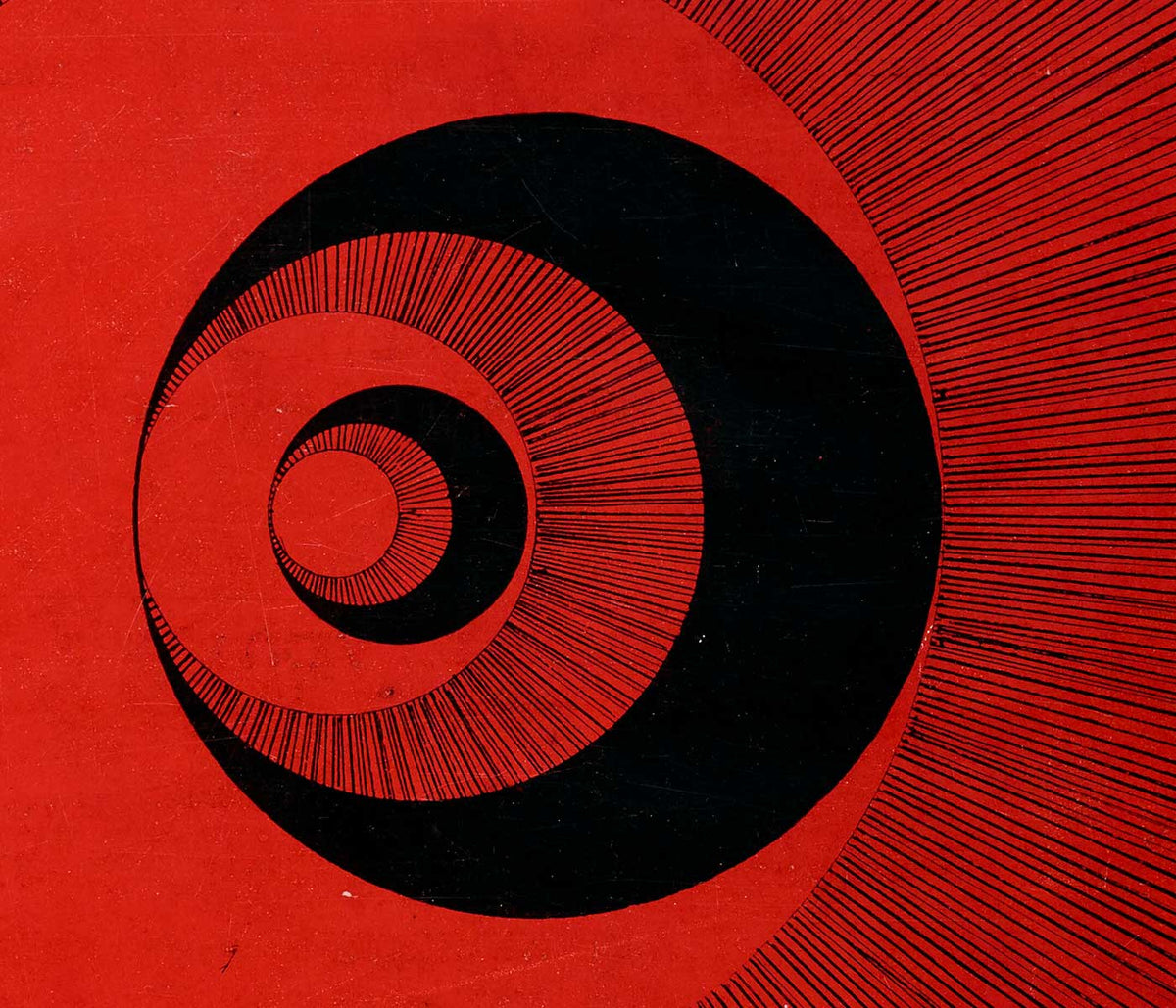
Het reagerende oog Poster
Patrick Blackwell · 1965 · Op-art poster met rode concentrische cirkels en een starend oog op blauw
Poster vanaf €9 · Ingelijst vanaf €16
Normale prijs Vanaf €6,00Normale prijs -
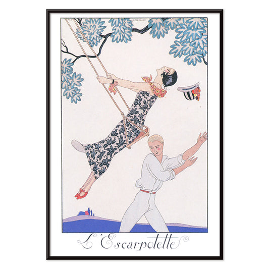
L’Escarpotette Poster
George Barbier · 1924 · Speelse Art Deco poster met chique figuur op een schommel in blauwtinten
Poster vanaf €9 · Ingelijst vanaf €16
Normale prijs Vanaf €6,00Normale prijs -
Big Bingo Poster
Onbekende kunstenaar · 1916 · Levendige circusposter met een torenhoge olifant naast zijn keurig geposeerde dierentrainer
Poster vanaf €9 · Ingelijst vanaf €16
Normale prijs Vanaf €6,00Normale prijs -
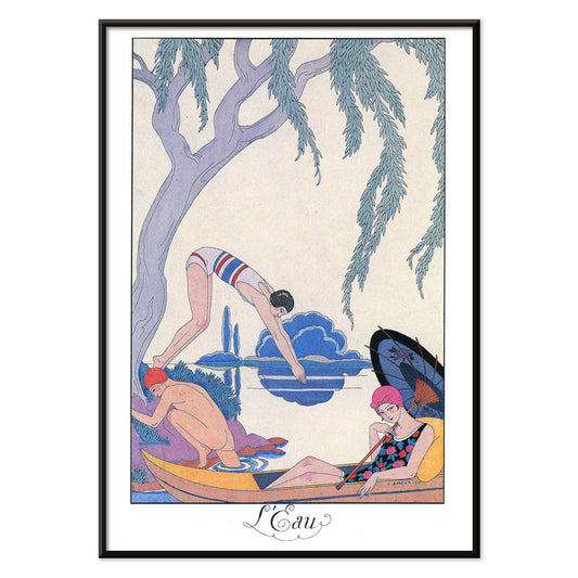
L’Eau Poster
George Barbier · 1924 · Elegant Art Deco poster van ontspanning aan de waterkant in levendig blauw met roze accenten
Poster vanaf €9 · Ingelijst vanaf €16
Normale prijs Vanaf €6,00Normale prijs -
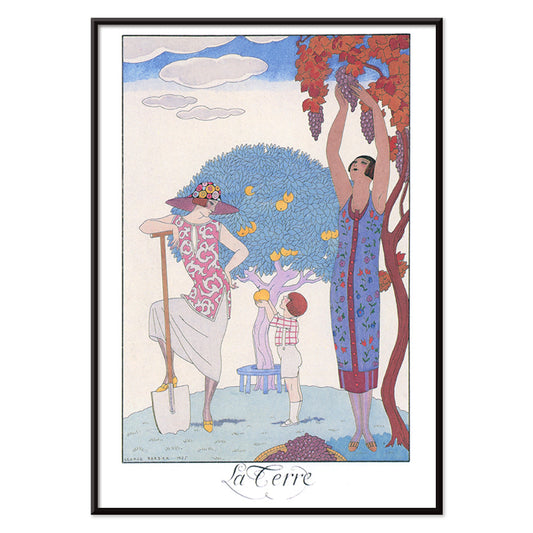
La Terre Poster
George Barbier · 1924 · Elegant Art Deco poster van vrouwen en kind die fruit oogsten in een gestileerde tuin
Poster vanaf €9 · Ingelijst vanaf €16
Normale prijs Vanaf €6,00Normale prijs -
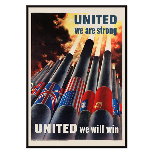
Verenigd staan we sterk Poster
Henry Koerner · 1943 · Oorlogsposter met geallieerde vlaggen boven kanonnen in krachtige grafische stijl
Poster vanaf €9 · Ingelijst vanaf €16
Normale prijs Vanaf €6,00Normale prijs -
Las Vegas – TWA-vlucht Poster
David Klein · 1962 · Levendige Las Vegas-reisposter met showdanseres, iconische neonreclame en TWA-stijl
Poster vanaf €9 · Ingelijst vanaf €16
Normale prijs Vanaf €6,00Normale prijs -
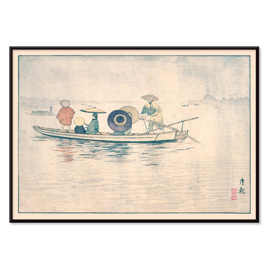
Souvenirs van mijn reizen Poster
Kawase Hasui · 1940 · Sereen kustposter met grot in donkere kliffen boven helder opslaand schuim
Poster vanaf €9 · Ingelijst vanaf €16
Normale prijs Vanaf €6,00Normale prijs -
Graaf voor Overvloed Poster
Mary Le Bon · 1942 · Pakkend oorlogsposter met kleurrijke oogst van groenten en duidelijke typografie
Poster vanaf €9 · Ingelijst vanaf €16
Normale prijs Vanaf €6,00Normale prijs -
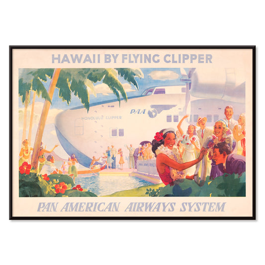
Hawaii met vliegende Clipper Poster
Onbekende kunstenaar · 1938 · Iconische Hawaii reisposter met Pan American clipper en welkomstlei-motief
Poster vanaf €9 · Ingelijst vanaf €16
Normale prijs Vanaf €6,00Normale prijs -
Torrefazione F.Kluzer poster
Carlo Piquillo Pandolfi · 1930 · Italiaans Art Deco poster met krachtige kopmotief en geometrische kleurvlakken
Poster vanaf €9 · Ingelijst vanaf €16
Normale prijs Vanaf €6,00Normale prijs -
Gemeentelijke luchthavens van New York Poster
Onbekende kunstenaar · 1938 · Gestroomlijnde Art Deco poster van New Yorkse luchthavens boven gestileerd water en skyline
Poster vanaf €9 · Ingelijst vanaf €16
Normale prijs Vanaf €6,00Normale prijs -
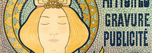
Quartier Latin Poster
Louis Rhead · 1890 · Levendig Art Nouveau-poster met een zelfverzekerde vrouwelijke kunstenaar en gedurfde Parijse typografie
Poster vanaf €9 · Ingelijst vanaf €16
Normale prijs Vanaf €6,00Normale prijs -
Cie.Cle Transatlantique Poster
Fernand Le Quesne · 1901 · Elegant Algiers poster van stoomschip met krachtige typografie en mediterrane havenstemming
Poster vanaf €9 · Ingelijst vanaf €16
Normale prijs Vanaf €6,00Normale prijs -
Overlandroute naar China Poster
Onbekende kunstenaar · 1950 · Midcentury China-reisposter met tempelmotief, duidelijke routemap en levendige kleuren
Poster vanaf €9 · Ingelijst vanaf €16
Normale prijs Vanaf €6,00Normale prijs -
Eldorado Poster
Jules Chéret · 1894 · Vrolijke cabaretdanseres poster met wervelende gele rok en gedurfde Belle Époque-letters
Poster vanaf €9 · Ingelijst vanaf €16
Normale prijs Vanaf €6,00Normale prijs -
De boottrein Poster
Charles W. Holmes · 1925 · Dynamische Art Deco poster met een denderende trein naast een oceaanstomer
Poster vanaf €9 · Ingelijst vanaf €16
Normale prijs Vanaf €6,00Normale prijs -
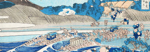
Ōkawa riv ierbrug Poster
Kobayashi Kiyochika · 1884 · Regenachtige rivieroeverposter met brugsilhouetten en fonkelende reflecties in diepe blauwtinten
Poster vanaf €9 · Ingelijst vanaf €16
Normale prijs Vanaf €6,00Normale prijs -
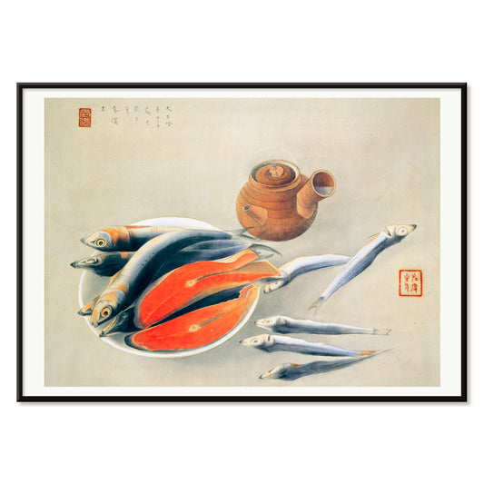
Plakjes zalm en sardines Poster
Tsuchida Bakusen · 1924 · Rustige kunstprint van zeevruchten met karmozijnzalm en koele blauwe keramiek
Poster vanaf €9 · Ingelijst vanaf €16
Normale prijs Vanaf €6,00Normale prijs -
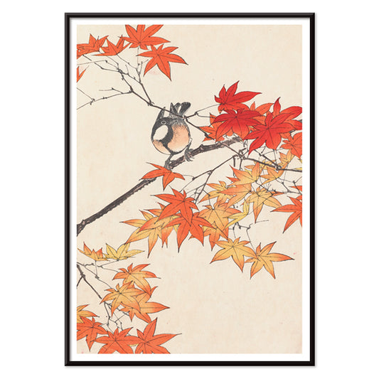
Keinen kachō gafu Poster
Imao Keinen · 1892 · Fijne print met vogel tussen herfstbladeren in warme rood‑ en beige tonen
Poster vanaf €9 · Ingelijst vanaf €16
Normale prijs Vanaf €6,00Normale prijs -
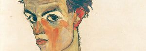
Moa Poster
Egon Schiele · 1911 · Intieme kunstprint van een vrouw in een patroonige japon, rustig in zichzelf gekeerd
Poster vanaf €9 · Ingelijst vanaf €16
Normale prijs Vanaf €6,00Normale prijs -
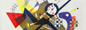
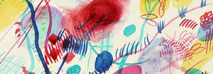
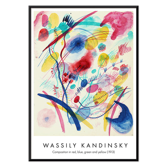
Compositie in rood, blauw, groen en geel Poster
Wassily Kandinsky · 1913 · Energieke abstracte kunstprint met gelaagde cirkels, hoeken en felle primaire kleuraccenten
Poster vanaf €9 · Ingelijst vanaf €16
Normale prijs Vanaf €6,00Normale prijs -
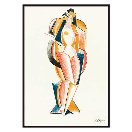
Abstract Naakt Poster
Auguste Rodin · 1875 · Expressieve abstracte naakt kunstprint met vloeiende contouren en gedurfde primaire kleuraccenten
Poster vanaf €9 · Ingelijst vanaf €16
Normale prijs Vanaf €6,00Normale prijs -
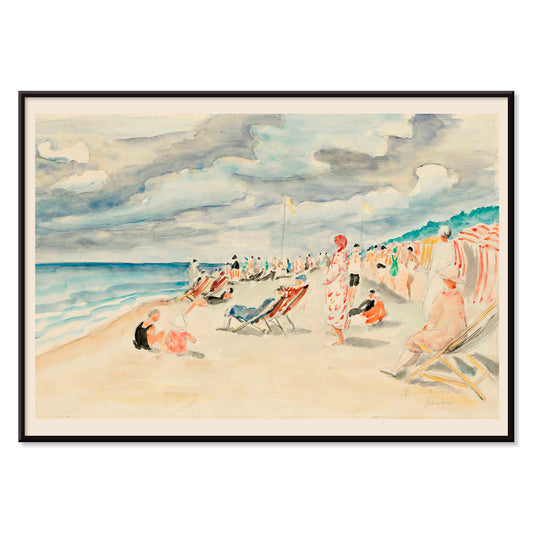
Het strand van Deauville Poster
Henri Lebasque · 1928 · Luchtige Deauville-poster met levendig zomerpubliek, parasols en zonovergoten strand
Poster vanaf €9 · Ingelijst vanaf €16
Normale prijs Vanaf €6,00Normale prijs -
Geometrische en golvende lijnen Poster
Myriam Thyes · 2014 · Dynamische geometrische poster met golvende lijnen en stevig zwart lijnenspel op warm beige
Poster vanaf €9 · Ingelijst vanaf €16
Normale prijs Vanaf €6,00Normale prijs -
Compositie Poster
Georges Valmier · 1921 · Dynamische kunstprint met ineengrijpende vormen en levendige kleurvlakken in beweging
Poster vanaf €9 · Ingelijst vanaf €16
Normale prijs Vanaf €6,00Normale prijs -
Berührung Poster
Wassily Kandinsky · 1924 · Dynamische abstracte poster met elkaar snijdende cirkels, hoeken en felle rood‑oranje accenten
Poster vanaf €9 · Ingelijst vanaf €16
Normale prijs Vanaf €6,00Normale prijs -
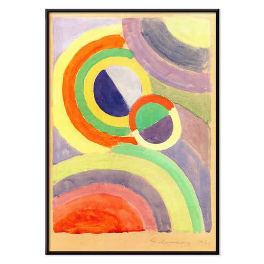
Compositie Poster
Robert Delaunay · 1930 · Stralende abstracte kunstprint met in elkaar grijpende cirkels en schuine kleurvlakken
Poster vanaf €9 · Ingelijst vanaf €16
Normale prijs Vanaf €6,00Normale prijs -
11 Tableaux et 7 Poèmes Poster
Wassily Kandinsky · 1945 · Ritmische geometrische poster met heldere primaire vormen en verfijnde modernistische typografie
Poster vanaf €9 · Ingelijst vanaf €16
Normale prijs Vanaf €6,00Normale prijs -
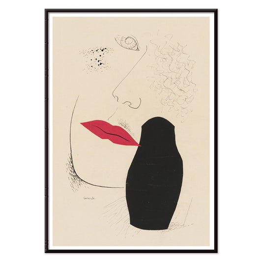
Verlangen Poster
Mikuláš Galanda · 1927 · Modernistisch poster met een gesluierde profielschets en vurige rode lippen op beige
Poster vanaf €9 · Ingelijst vanaf €16
Normale prijs Vanaf €6,00Normale prijs -
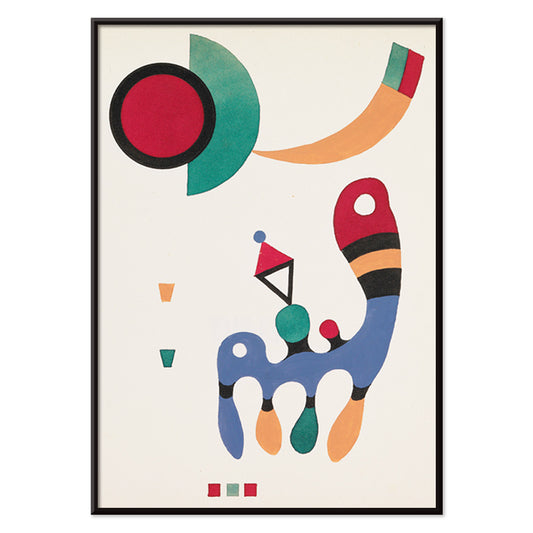
Staand Poster
Wassily Kandinsky · 1930 · Energiek abstract poster met evenwicht tussen cirkels, lijnen en vlakken in primaire tinten
Poster vanaf €9 · Ingelijst vanaf €16
Normale prijs Vanaf €6,00Normale prijs -
Blauw, rond en puntig Poster
Wassily Kandinsky · 1933 · Abstracte geometrische kunstprint in balans met blauwe cirkels, scherpe hoeken en rode accenten
Poster vanaf €9 · Ingelijst vanaf €16
Normale prijs Vanaf €6,00Normale prijs -
Klein Warm Poster
Wassily Kandinsky · 1928 · Warm abstract poster met zwevende cirkels en scherpe zwarte lijnen
Poster vanaf €9 · Ingelijst vanaf €16
Normale prijs Vanaf €6,00Normale prijs


36/761 items
- Het reagerende oog Poster
- Las Vegas – TWA-vlucht Poster
- Souvenirs van mijn reizen Poster
- Graaf voor Overvloed Poster
- Hawaii met vliegende Clipper Poster
- Gemeentelijke luchthavens van New York Poster
- De boottrein Poster
- Moa Poster
- Compositie in rood, blauw, groen en geel Poster
- Abstract Naakt Poster
- Geometrische en golvende lijnen Poster
- Compositie Poster
- Compositie Poster
- 11 Tableaux et 7 Poèmes Poster
- Klein Warm Poster
Rood, het meest doelbewuste accent
In de Roodcollectie werkt kleur minder als onderwerp dan als sein: een klaproosvlek, een gelakte kopregel, een warme blos op papier. Deze posters bewegen tussen illustratie, modernisme, reisgrafiek en diagramachtige prints, en toch vertrouwt elk stuk op rood om aandacht te sturen. Vermiljon tegen crème, baksteen tegen grafiet, of een enkele karmozijnvlek in een rustige ruimte kan bepalen hoe een kamer gelezen wordt. Als wandkunst gedraagt rood zich als kruiding in de inrichting: een klein accent geeft een galeriewand energie, terwijl een groter vlak een focuspunt en een richting in de decoratie vestigt.
Ambacht, pigment en de kunst van overtuigen
Rood droeg technische en culturele betekenis door de geschiedenis van de druk. Vroege kleurstoffen en pigmenten zoals cochenille en meekrap bepaalden textiel en decoratieve kunsten, terwijl lithografie gedurfde rode letters en vlakke kleurvelden centraal stelde in de openbare visuele cultuur. William Morris De aardbeiendief (1883) van William Morris gebruikt rood als structurele noot binnen het patroon, waardoor vogels en fruit in ritmische spanning blijven. In Hygieia (1907) van Gustav Klimt leest de mantel zowel als embleem als waarschuwing; karmozijn fungeert er als grens rond de figuur. Wassily Kandinsky Heavy Red (1924) van Wassily Kandinsky toont rood als massa, een vlak dat aangrenzende vormen in beweging duwt en geometrie lichamelijk laat voelen.
Waar rode posters het beste wonen
Rode accenten voelen zich het meest natuurlijk naast eerlijke materialen: walnoot, terracotta, messing, linnen en afgerond steen. In keukens en eethoeken roepen studiobeelden van fruit en planten de tinten van servies en tafels op, waardoor Botanische prints uitstekende metgezellen zijn bij roodgedreven inrichting. In gangen en entreezones helpt één gedurfd rood element het oog door een smalle ruimte te trekken; de grafische logica van Reclame werkt goed met spiegels, kapstokken en donkere vloeren. Voor slaapkamers is het verstandig rood kleiner en warmer te houden, neigend naar baksteen of roos in plaats van primair karmozijn, en te balanceren met licht beddengoed en zacht amberlicht. Als de kamer uitkijkt op groen, wordt rood een duidelijk tegenwicht; stillere taferelen uit Landschappen houden het palet gegrond.
Combineren, lijsten en een galeriewand bouwen
Om te voorkomen dat rood domineert, behandel het als één stem binnen een weloverwogen palet. Een witte passe-partout geeft rood ruimte, terwijl een smalle zwarte lijst verzadigde vlakken verscherpt en de discipline van Zwart-wit echoot. Voor gestructureerde combinaties plaats je een roodgeleide poster naast geometrisch werk uit Bauhaus, waar rood vaak verschijnt als gecontroleerd blok in plaats van opsmuk. Voor een meer theatrale sfeer speelt Leonetto Cappiello Cachou Lajaunie (1920) van Leonetto Cappiello als straatlantaarn tegen diepe houttinten en gedempte muren. Bij het rangschikken van een galeriewand herhaal rood twee keer: éénmaal als groter vlak en eenmaal als klein accent, zodat het oog een heldere route tussen prints volgt.
Een afsluitende gedachte over rood
Rood is ook een handig hulpmiddel bij het lezen van beelden: in reisgrafiek signaleert het hitte, nachtleven en eetlust; in modernistische composities markeert het het punt waarop dwalende aandacht in scherpte omslaat. Daarom kan deze selectie springen van patroon naar symbolistische figuur naar scherpzinnige abstractie zonder samenhang te verliezen. Laat ademruimte rond het luidste rode vlak en laat aangrenzende prints stillere tonen dragen zoals zand, inkt en zeeglasgroen. Zo wordt rood ritme in plaats van ruis, en voelt decoratie doelbewust zonder streng te worden.