


- Vernietig deze woeste bruut Poster
- Shaw van ironie Poster
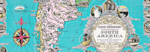
- De goede buur van Zuid-Amerika Poster
- Italië met Vaticaanstad Poster
- Uien Poster
- Radijzen Poster
- Wortelen Poster
- Les Lalanne Poster
- Punch Boutique Poster
- Dansend stel in de sneeuw Poster
- Jodendom en paganisme — standpunt Poster
- Jet Clipper naar Hawaii poster
- Campari Soda Poster
- Bec-Kina Poster
- Kohler Chocolat Poster
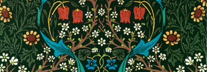
- Strawberry Thief Poster
- Matisse Dansende figuren Poster
- Tom Krojer Tentoonstellingsposter
- Berlijnse Straatscène Poster
- Ernst Kirchner Tentoonstelling Poster
- Tour Eiffel 2 Poster
- Vrouw met de rug naar de kijker Poster
- Rood haar, blauwe hoed Poster
- Park nabij Lu Poster
- El Comienzo Poster
- Parler Seul 2 Poster
- The Current Standpoint of the Mahatmas Poster
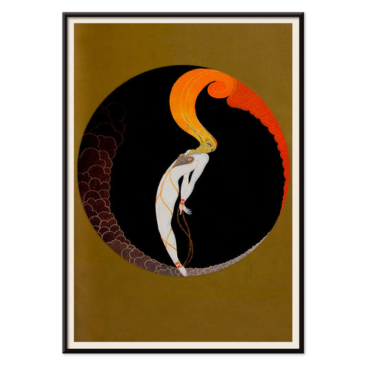
- Twilight’s Ring Poster
- Parler Seul Poster
- Faun en nimf Poster
- The Dream poster
- Le Concert Poster
- Vrouwelijke kunstenares Poster
-
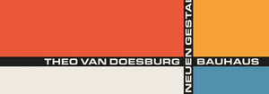
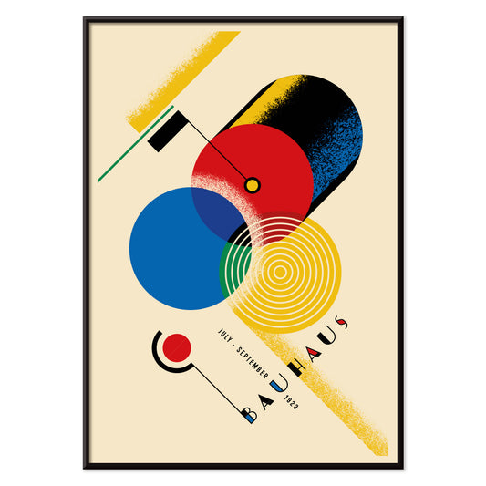
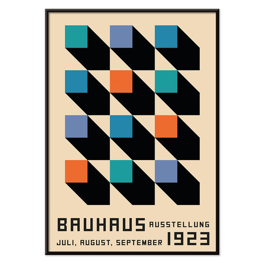
Bauhaus 12 Poster
MORYARTY · 1923 · Geometrische Bauhausposter met in balans gebrachte cirkels en rechthoeken in rood, blauw, geel en zwart
Poster vanaf €9 · Ingelijst vanaf €16
Normale prijs Vanaf €6,00Normale prijs -
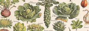
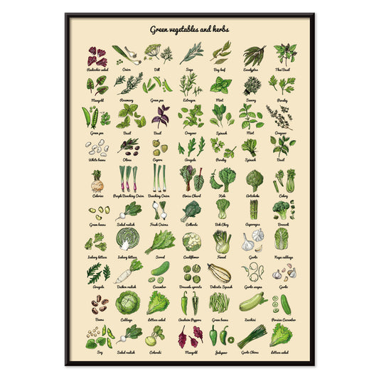
Groenten en kruiden Poster
MORYARTY · 2012 · Frisse groenten- en kruidenkunstprint vormgegeven als een heldere, hedendaagse botanische studie
Poster vanaf €9 · Ingelijst vanaf €16
Normale prijs Vanaf €6,00Normale prijs -
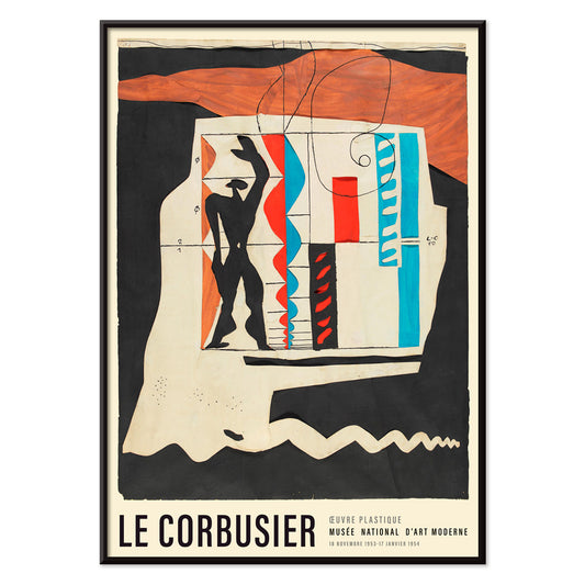
Arbalète I Poster
Le Corbusier · 1953 · Geometrische modernistische kunstprint met kruisboogachtige vormen in rood, blauw en zwart
Poster vanaf €9 · Ingelijst vanaf €16
Normale prijs Vanaf €6,00Normale prijs -
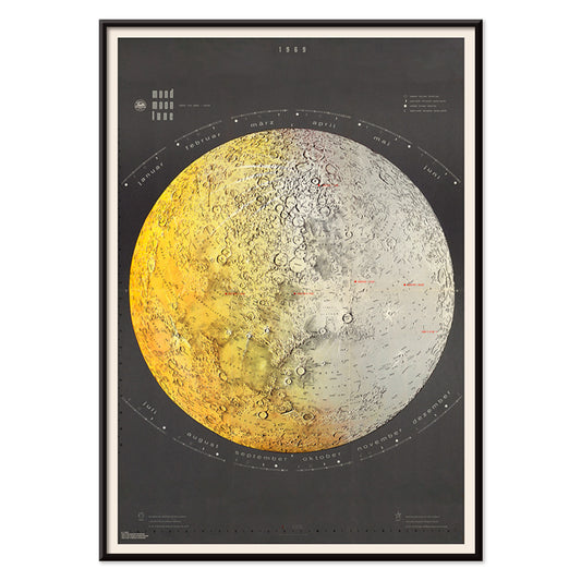
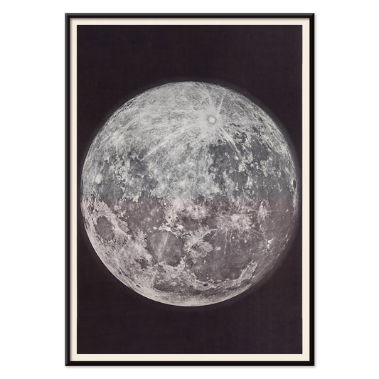
Maankaart Poster
Falk-Verlag · 1969 · Gedetailleerde maankaart als kunstprint met wetenschappelijke labels en koele midcentury-clariteit
Poster vanaf €9 · Ingelijst vanaf €16
Normale prijs Vanaf €6,00Normale prijs -
Maanfotografie Poster
Gerard Kuiper · 1950 · Scherpe maanfotografie poster met kraterdetail tegen diepzwarte ruimteachtergrond
Poster vanaf €9 · Ingelijst vanaf €16
Normale prijs Vanaf €6,00Normale prijs -
Le Modulor Poster
Le Corbusier · 1950 · Iconisch proportiemensdiagram poster met zwarte lijnvoering en rode en blauwe accenten
Poster vanaf €9 · Ingelijst vanaf €16
Normale prijs Vanaf €6,00Normale prijs -
Métamorphose du violon Poster
Le Corbusier · 1920 · Modernistisch vioolposter die instrumentkrommen omzet in strakke geometrische ritmes in primaire tinten
Poster vanaf €9 · Ingelijst vanaf €16
Normale prijs Vanaf €6,00Normale prijs -
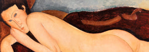
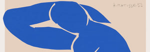
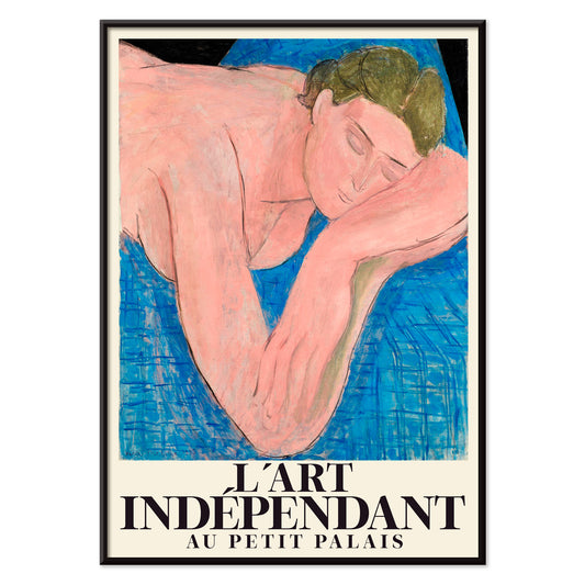
Le rêve Poster
Henri Matisse · 1935 · Dromerige liggende naakt kunstprint met vloeiende zwarte lijnen en zachte roze en blauwe vlakken
Poster vanaf €9 · Ingelijst vanaf €16
Normale prijs Vanaf €6,00Normale prijs -
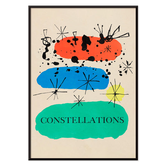
Sterrenbeelden Poster
Joan Miró · 1941 · Dromerige poster met constellaties, speelse sterren en biomorfe symbolen in felle primaire tonen
Poster vanaf €9 · Ingelijst vanaf €16
Normale prijs Vanaf €6,00Normale prijs -
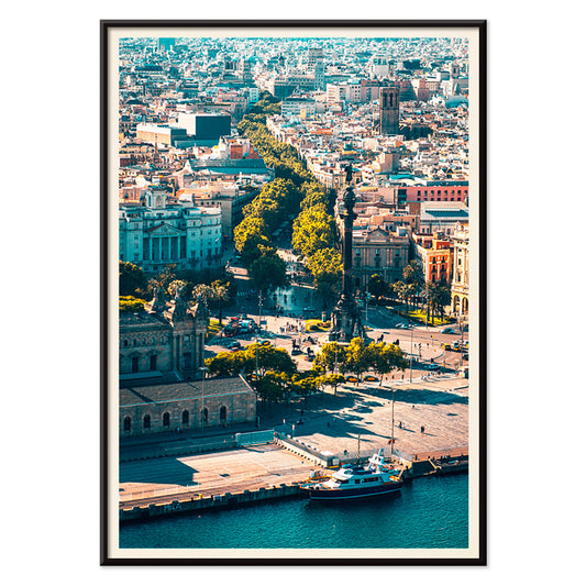
La Rambla poster
MORYARTY · 1977 · Gestileerd poster van de Barcelona-boulevard met strakke geometrie en koele blauwgroene tonen
Poster vanaf €9 · Ingelijst vanaf €16
Normale prijs Vanaf €6,00Normale prijs -
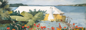
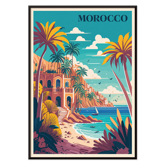
Reis naar Marokko Poster
MORYARTY · 1930 · Zonovergoten Marokko-reisposter met palmen, witte villa en kalme blauwe zee
Poster vanaf €9 · Ingelijst vanaf €16
Normale prijs Vanaf €6,00Normale prijs -
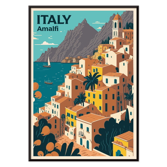
Reis naar Italië Poster
MORYARTY · 1920 · Zonovergoten Amalfikust poster met klifdorpssfeer, fonkelende zee en sereen zeezicht
Poster vanaf €9 · Ingelijst vanaf €16
Normale prijs Vanaf €6,00Normale prijs -
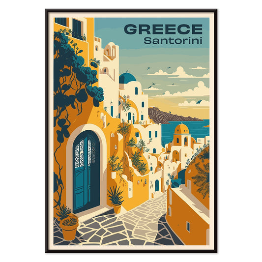
Reis naar Santorini Poster
MORYARTY · 2023 · Vintage-geïnspireerde Santorini reisposter met wit klifdorp en diepe Egeïsche blauwtinten
Poster vanaf €9 · Ingelijst vanaf €16
Normale prijs Vanaf €6,00Normale prijs -
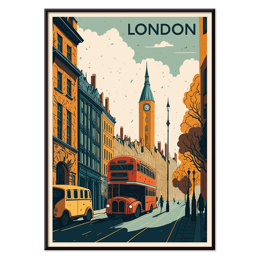
Reis naar Londen Poster
MORYARTY · 1930 · Klassieke Londen-reisposter met rode dubbeldekkerbus en kloktoren in krachtige kleuren
Poster vanaf €9 · Ingelijst vanaf €16
Normale prijs Vanaf €6,00Normale prijs -
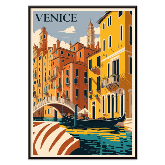
Reis naar Venetië Poster
MORYARTY · 1930 · Romantische Venetië-reisposter met een gondel op een zonverlicht blauw kanaal
Poster vanaf €9 · Ingelijst vanaf €16
Normale prijs Vanaf €6,00Normale prijs -
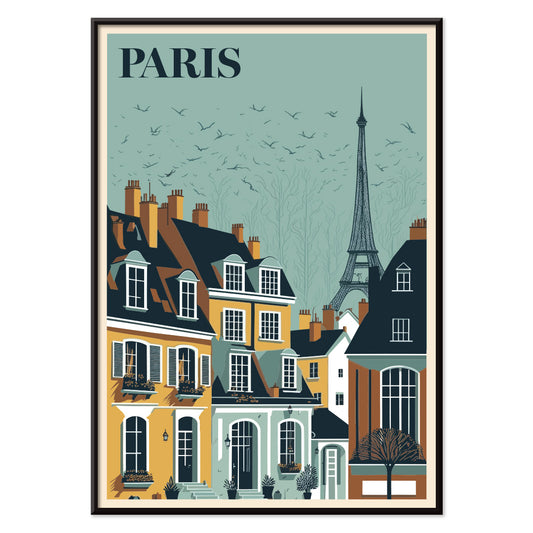
Reis naar Parijs Poster
MORYARTY · 1929 · Elegant poster van de Eiffeltoren boven Parijse daken in warme zonsondergangtonen
Poster vanaf €9 · Ingelijst vanaf €16
Normale prijs Vanaf €6,00Normale prijs -
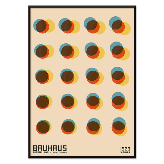
Yayoi zwart-wit Poster
Yayoi Kusama · 1965 · Hoogcontrast polkadot-poster die een hypnotiserend gevoel van oneindigheid in monochroom oproept
Poster vanaf €9 · Ingelijst vanaf €16
Normale prijs Vanaf €6,00Normale prijs -
Bauhaus Poster 11 poster
MORYARTY · 2023 · Geometrische poster met gedurfde cirkels en diagonalen in primaire kleuren op wit
Poster vanaf €9 · Ingelijst vanaf €16
Normale prijs Vanaf €6,00Normale prijs -
Bauhaus 10 Poster
MORYARTY · 1923 · Geometrische Bauhaus poster met cirkels en balken in opvallende primaire kleuraccenten
Poster vanaf €9 · Ingelijst vanaf €16
Normale prijs Vanaf €6,00Normale prijs -
Bauhaus Poster 9 poster
MORYARTY · 2023 · Geometrische poster met cirkels in primaire kleuren en strakke zwarte lijnen
Poster vanaf €9 · Ingelijst vanaf €16
Normale prijs Vanaf €6,00Normale prijs -
Bauhaus 8 Poster
MORYARTY · 1923 · Geometrische Bauhaus poster met gedurfde kruisvorm van cirkels en vierkanten op warm beige
Poster vanaf €9 · Ingelijst vanaf €16
Normale prijs Vanaf €6,00Normale prijs -
Bauhaus 7 Poster
MORYARTY · 1923 · geometrische cirkels poster in primaire kleuren met scherpe Bauhaus-balans en ritmische overlapping
Poster vanaf €9 · Ingelijst vanaf €16
Normale prijs Vanaf €6,00Normale prijs -
Bauhaus 6 Poster
MORYARTY · 1923 · Bauhaus-geïnspireerde abstracte poster met zwarte lijnen, oranje accenten en strakke blauwe geometrie
Poster vanaf €9 · Ingelijst vanaf €16
Normale prijs Vanaf €6,00Normale prijs -
Bauhaus 4 Poster
MORYARTY · 1923 · Geometrische Bauhaus poster met oranje en zwarte vormen op warm beige achtergrond
Poster vanaf €9 · Ingelijst vanaf €16
Normale prijs Vanaf €6,00Normale prijs -
Bauhaus 5 Poster
MORYARTY · 1923 · Geometrische Bauhaus poster met gedurfde cirkels en balken op een warm beige vlak
Poster vanaf €9 · Ingelijst vanaf €16
Normale prijs Vanaf €6,00Normale prijs -
Bauhaus 2 Poster
MORYARTY · 1923 · Bauhaus-geïnspireerde geometrische poster met krachtige zwarte, oranje en blauwe vlakken en strakke lijnen
Poster vanaf €9 · Ingelijst vanaf €16
Normale prijs Vanaf €6,00Normale prijs -
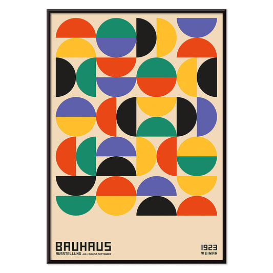
Bauhaus 1 Poster
MORYARTY · 1923 · Geometrische Bauhaus poster met gelaagde vormen en krachtige modernistische kleurcontrasten
Poster vanaf €9 · Ingelijst vanaf €16
Normale prijs Vanaf €6,00Normale prijs -
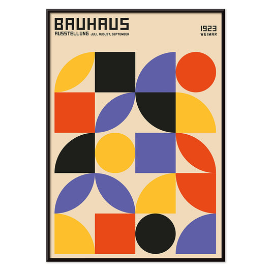
Bauhaus 3 Poster
MORYARTY · 1923 · Geometrische Bauhaus poster met primaire kleuren en heldere modernistische balans
Poster vanaf €9 · Ingelijst vanaf €16
Normale prijs Vanaf €6,00Normale prijs -
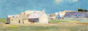
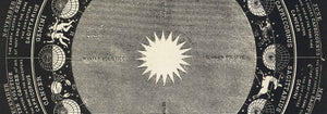
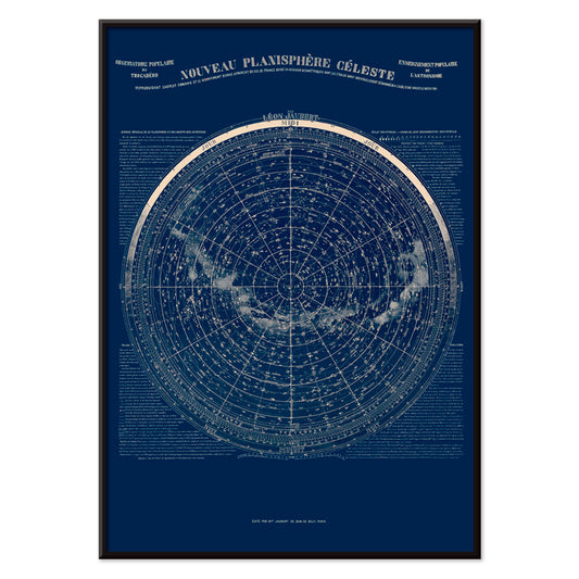
Observatorium van Trocadéro Poster
Léon Jaubert · 1889 · Gedetailleerde hemelkaart poster met heldere sterrenbeeldlijnen op diepblauwe ondergrond en klassieke typografie
Poster vanaf €9 · Ingelijst vanaf €16
Normale prijs Vanaf €6,00Normale prijs -
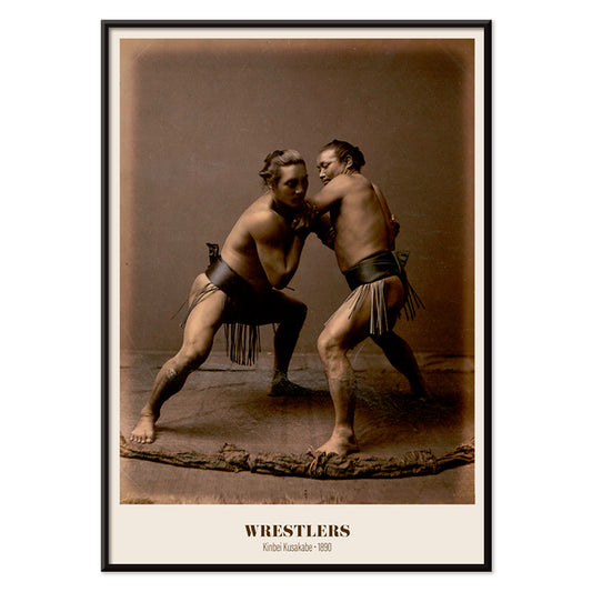
Worstelaars Poster
Kinbei Kusakabe · 1890 · Handgekleurde sumo-print met twee geposeerde worstelaars in warme sepia tonen
Poster vanaf €9 · Ingelijst vanaf €16
Normale prijs Vanaf €6,00Normale prijs -
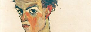
Japanse Tattoo 2 Poster
Raimund von Stillfried · 1877 · Japanse tatoeageportret poster met handgekleurde accenten en serene studiocompositie
Poster vanaf €9 · Ingelijst vanaf €16
Normale prijs Vanaf €6,00Normale prijs -
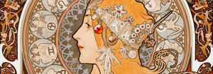
Le Gaulois artistique Poster
Onbekende kunstenaar · 1929 · Opvallende vintage poster met vlammenhaar en zwarte typografie op geel
Poster vanaf €9 · Ingelijst vanaf €16
Normale prijs Vanaf €6,00Normale prijs -
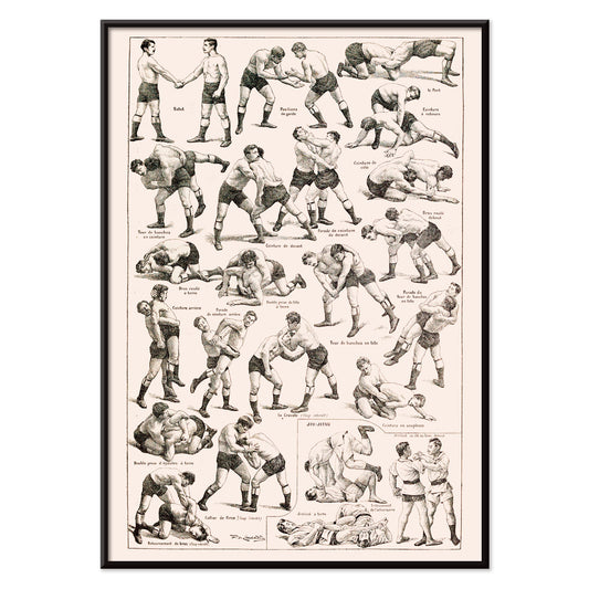
Worstelen Poster
Claude Augé · 1908 · Instructieve vintage print met worstelgrepen in heldere lijntekening op warm papier
Poster vanaf €9 · Ingelijst vanaf €16
Normale prijs Vanaf €6,00Normale prijs -
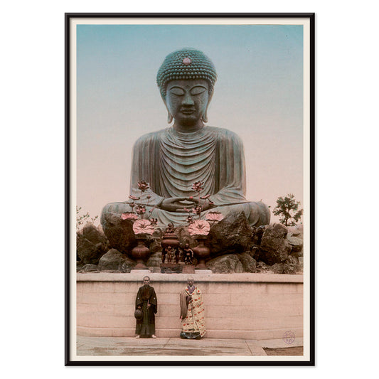
Grote Boeddha Poster
Kinbei Kusakabe · 1890 · Handgekleurde fotografie als kunstprint van een monumentale Boeddha in serene mineraaltinten
Poster vanaf €9 · Ingelijst vanaf €16
Normale prijs Vanaf €6,00Normale prijs -
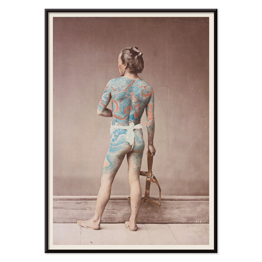
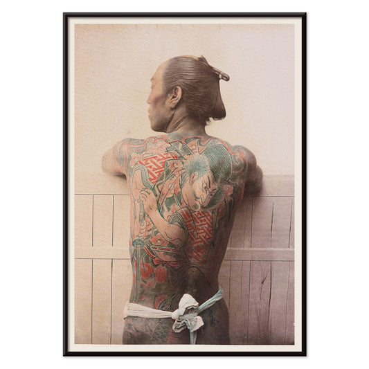
Japanse tatoeage 1 Poster
Raimund von Stillfried · 1877 · Handgekleurde studioposter die verfijnde Japanse irezumi over een blote rug toont
Poster vanaf €9 · Ingelijst vanaf €16
Normale prijs Vanaf €6,00Normale prijs -
Peinture et Teinture Poster
Claude Augé · 1908 · Educatieve kleurkaart poster met Franse benamingen en ordelijke pigmentstalen en verftinten
Poster vanaf €9 · Ingelijst vanaf €16
Normale prijs Vanaf €6,00Normale prijs


36/1512 items
- Bauhaus 12 Poster
- Groenten en kruiden Poster
- Arbalète I Poster
- Le Modulor Poster
- Métamorphose du violon Poster
- Le rêve Poster
- Sterrenbeelden Poster
- La Rambla poster
- Reis naar Marokko Poster
- Reis naar Italië Poster
- Reis naar Santorini Poster
- Reis naar Londen Poster
- Reis naar Venetië Poster
- Reis naar Parijs Poster
- Yayoi zwart-wit Poster
- Bauhaus Poster 11 poster
- Bauhaus 10 Poster
- Bauhaus Poster 9 poster
- Bauhaus 7 Poster
- Bauhaus 6 Poster
- Bauhaus 4 Poster
- Bauhaus 5 Poster
- Bauhaus 2 Poster
- Bauhaus 1 Poster
- Bauhaus 3 Poster
- Observatorium van Trocadéro Poster
- Japanse Tattoo 2 Poster
- Worstelen Poster
- Japanse tatoeage 1 Poster
Waarom verticale posters een kamer veranderen
Een verticale poster werkt als een architectonisch element: hij leidt de blik omhoog, vermindert visuele ruis en geeft kleine ruimtes een helderder gevoel van proportie. Portretformaten worden al lang gebruikt voor theateraffiches, boekomslagen en straataankondigingen, waar het hoge rechthoekige vlak een rustige boven-naar-beneden lezing ondersteunt. Als wandkunst kan diezelfde structuur een druk interieur stabiliseren en circulatieruimtes geordend laten aanvoelen. Het is een onmisbaar formaat voor entrees, gangen en de smalle strook tussen raam en kast, waar een horizontale print onderbroken zou lijken.
Grafische erfenis en wat het oog leert
Het verticale formaat groeide op in publieke zichtbaarheid. Reisadvertenties, bioscoopprogramma's en commerciële lithografie leerden ontwerpers hiërarchie met precisie te beheren: kop, beeld, kleine letter, allemaal getemd door marges. De beste vintage posters brengen die discipline naar nu, of ze nu typografisch of puur beeldend zijn. Platte kleurvlakken en scherpe contouren laten een compositie van afstand lezen, terwijl papierreliëf en inktdichtheid nader bekijken belonen. Diezelfde logica sluit natuurlijk aan bij de helderheid van Bauhaus, bij de gereduceerde vormen van Minimalistisch ontwerp, en bij het sterke tonaal kader dat je vindt in Zwart-wit beeld.
Portretwandkunst kamer voor kamer plaatsen
In woonkamers werkt een hoge print goed naast een boekenkast, kast of vloerlamp, waar hij de verticale lijnen in het meubilair echoot. In slaapkamers passen portretposters comfortabel op de smalle strook tussen kast en deur, of als enkel accent naast het bed in plaats van er direct boven. Keukens en eetniches lenen zich vaak voor grafische vintage stukken, vooral etiketgeïnspireerde lay-outs uit Reclame, terwijl rustiger botanische studies uit Botanisch harde oppervlakken zoals tegels en staal verzachten. Behandel de poster als uw accenttoon: neem een inktkleur terug in textiel of keramiek en houd de muur- en lijstafwerkingen ingetogen zodat het rechthoekige vlak zuiver leest.
Combineren, lijsten en het ritme van een galeriewand
Verticale prints zijn het prettigst als ze in paren worden samengesteld: één beeldrijke bladzijde naast een rustiger vlak zodat de wand afwisselt tussen detail en pauze. Een derde element kan de compositie verruimen, bijvoorbeeld een horizontale tegenhanger uit Landschappen, maar houd de tussenruimtes consistent zodat de opstelling bewust aanvoelt. Dunne zwarte lijsten verscherpen grafische ontwerpen; eiken of walnoot voegt warmte toe aan archiefbeelden, en gecoördineerde opties vindt u bij Lijsten. Gebruik een smalle passe-partout om donkere prints ademruimte te geven, zeker in kleinere formaten, en hang alles op een gedeelde middenlijn op ooghoogte terwijl de bovenzijden subtiel opschuiven om het verticale ritme te behouden.
De rustige logica van een hoge rechthoek
Formatgestuurde collecties blijven flexibel: een portretoriëntatie kan architectuurfoto's, symbolische studies, abstractie of vintage typografie dragen zonder een enkele sfeer af te dwingen. Wat deze posters verbindt, is de manier waarop de hoge uitsnede een scène redigeert en gebaar en negatieve ruimte in balans houdt. Als woondecoratie te druk begint te voelen, kan één doordacht verticale kunstprint de orde herstellen veel effectiever dan een cluster. Als een enkele, stille opening in de wand laat hij de kamer ademen en geeft toch een duidelijk focuspunt.