


- Vernietig deze woeste bruut Poster
- Shaw van ironie Poster
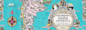
- De goede buur van Zuid-Amerika Poster
- Italië met Vaticaanstad Poster
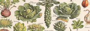
- Uien Poster
- Radijzen Poster
- Wortelen Poster
- Les Lalanne Poster
- Punch Boutique Poster
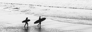
- Dansend stel in de sneeuw Poster
- Jodendom en paganisme — standpunt Poster
- Jet Clipper naar Hawaii poster
- Campari Soda Poster
- Bec-Kina Poster
- Kohler Chocolat Poster
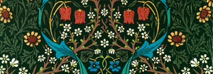
- Strawberry Thief Poster
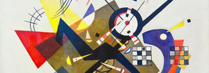
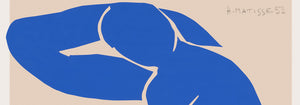
- Matisse Dansende figuren Poster
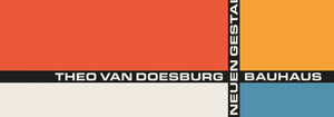
- Tom Krojer Tentoonstellingsposter
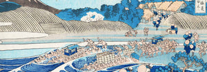
- Berlijnse Straatscène Poster
- Ernst Kirchner Tentoonstelling Poster
- Tour Eiffel 2 Poster
- Vrouw met de rug naar de kijker Poster
- Rood haar, blauwe hoed Poster
- Park nabij Lu Poster
- El Comienzo Poster
- Parler Seul 2 Poster
- The Current Standpoint of the Mahatmas Poster
- Twilight’s Ring Poster
- Parler Seul Poster
- Faun en nimf Poster
- The Dream poster
- Le Concert Poster
- Vrouwelijke kunstenares Poster
-
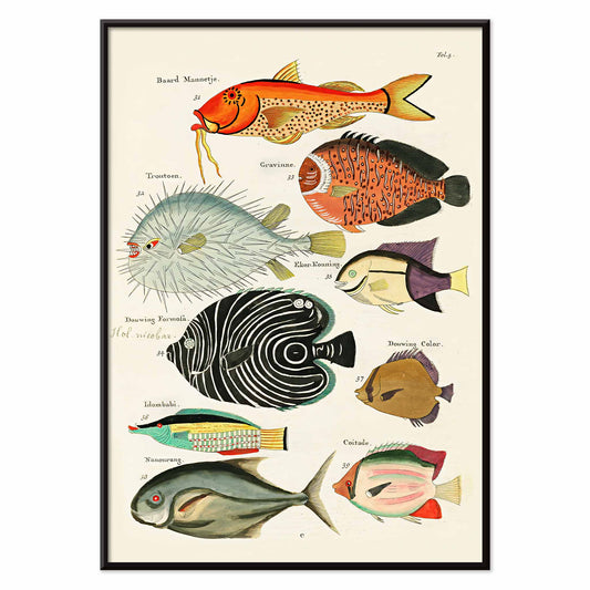
Surrealistische vissenillustraties Poster
Louis Renard · 1754 · Levendige exotische vissenprint met handgekleurde details en theatraal naturalistisch karakter
Poster vanaf €9 · Ingelijst vanaf €16
Normale prijs Vanaf €6,00Normale prijs -
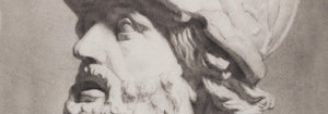
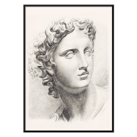
Antiek borstbeeld Poster
Johannes Tavenraat · 1888 · Academische studie van een klassiek hoofd als subtiele kunstprint met zachte grafietschaduwen
Poster vanaf €9 · Ingelijst vanaf €16
Normale prijs Vanaf €6,00Normale prijs -
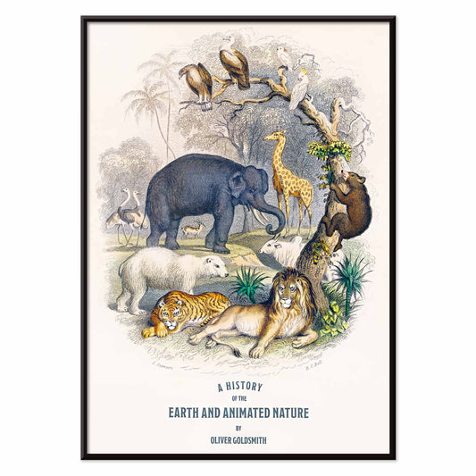
De aarde en de levende natuur Poster
Oliver Goldsmith · 1820 · Gedetailleerde poster met dieren en vogels rondom een centrale globe
Poster vanaf €9 · Ingelijst vanaf €16
Normale prijs Vanaf €6,00Normale prijs -
Bladvormen Poster
Marcius Willson · 1890 · Educatieve bladanatomie kunstprint met benoemde vormen en zachte groene tonen
Poster vanaf €9 · Ingelijst vanaf €16
Normale prijs Vanaf €6,00Normale prijs -
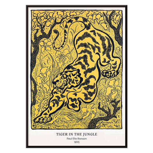
Tijger in de jungle Poster
Paul Ranson · 1893 · Decoratieve kunstprint met een tijger tussen patroonachtig loof in Nabis-stijl
Poster vanaf €9 · Ingelijst vanaf €16
Normale prijs Vanaf €6,00Normale prijs -
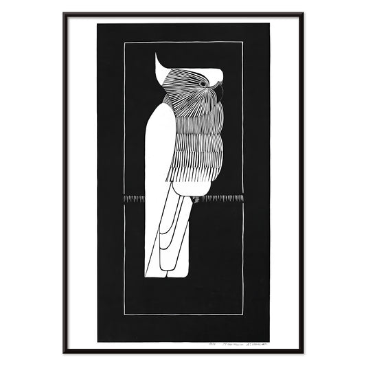
Kroonkaketoe Poster
Samuel Jessurun de Mesquita · 1924 · Krachtige contrastposter van kaketoe in zuivere zwart-witlijnen met art-deco-uitstraling
Poster vanaf €9 · Ingelijst vanaf €16
Normale prijs Vanaf €6,00Normale prijs -
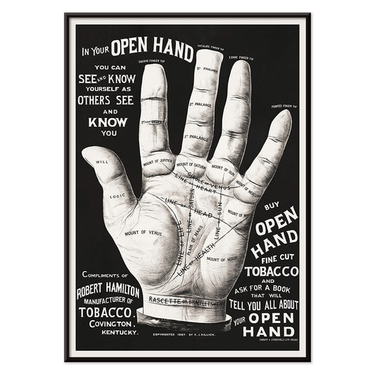
Handlezen Poster
Onbekende kunstenaar · 2015 · vintage-geïnspireerde poster over handlezen met open hand en fijne zwarte lijnen
Poster vanaf €9 · Ingelijst vanaf €16
Normale prijs Vanaf €6,00Normale prijs -
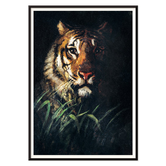
Tijgerkop Poster
Abbott Handerson Thayer · 1911 · Expressieve kunstprint van tijgerkop met donkere strepen en warme bruine vacht
Poster vanaf €9 · Ingelijst vanaf €16
Normale prijs Vanaf €6,00Normale prijs -
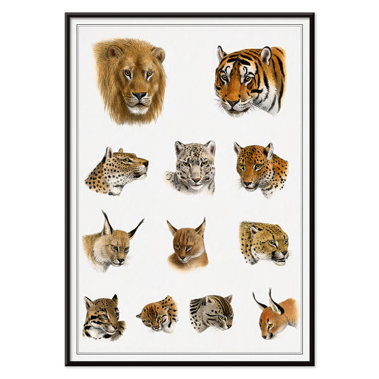
Wilde dieren Poster
Richard Lydekker · 1900 · Vintage print van grote katten in profiel met warme oker- en bruintinten
Poster vanaf €9 · Ingelijst vanaf €16
Normale prijs Vanaf €6,00Normale prijs -
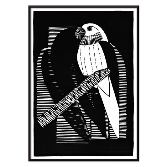
Parkieten Poster
Samuel Jessurun de Mesquita · 1927 · Indrukwekkend poster met parkieten in helder zwart-wit en geometrisch Art Deco-ritme
Poster vanaf €9 · Ingelijst vanaf €16
Normale prijs Vanaf €6,00Normale prijs -
Natuurlijke krachten Poster
Bill Mayer · 1995 · Surrealistische poster met gestreept figuur, kinetische zwarte banden en felgele achtergrond
Poster vanaf €9 · Ingelijst vanaf €16
Normale prijs Vanaf €6,00Normale prijs -
Blokdruk Poster
Rachael Romero · 1953 · Grafische zwart-witte poster van een gevlochten figuur omringd door ritmische abstracte motieven
Poster vanaf €9 · Ingelijst vanaf €16
Normale prijs Vanaf €6,00Normale prijs -
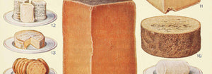
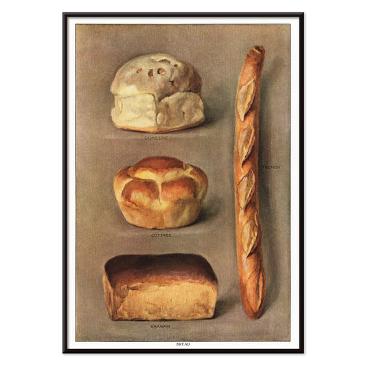
Gebakken broden Poster
Onbekende kunstenaar · 1911 · Gedetailleerde vintage print van diverse gebakken broden met zorgvuldige schaduwwerking
Poster vanaf €9 · Ingelijst vanaf €16
Normale prijs Vanaf €6,00Normale prijs -
Red de walvissen Poster
Lawrence Vint · 1973 · Grafische oceaanbeschermingsposter met gestileerde witte walvis op intens blauw en krachtige typografie
Poster vanaf €9 · Ingelijst vanaf €16
Normale prijs Vanaf €6,00Normale prijs -
Rose Fried Gallery Poster
José Guerrero · 1963 · Energetische abstracte poster met zwarte, rode en blauwe gebaren op wit vlak
Poster vanaf €9 · Ingelijst vanaf €16
Normale prijs Vanaf €6,00Normale prijs -
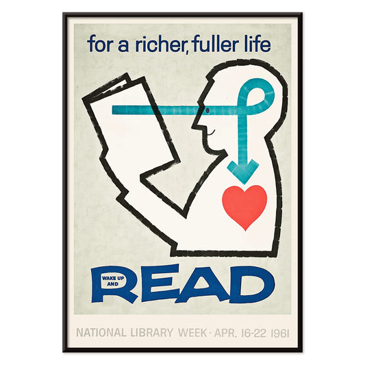
Word wakker en lees Poster
Onbekende kunstenaar · 1961 · Modernistisch leescampagneposter met gedurfde typografie en helder rood-wit-blauw contrast
Poster vanaf €9 · Ingelijst vanaf €16
Normale prijs Vanaf €6,00Normale prijs -
Gebakken broden 2 Poster
Onbekende kunstenaar · 1911 · Gedetailleerde vintage kunstprint van diverse broden in klassieke referentiestijl, ideaal voor keukenwand
Poster vanaf €9 · Ingelijst vanaf €16
Normale prijs Vanaf €6,00Normale prijs -
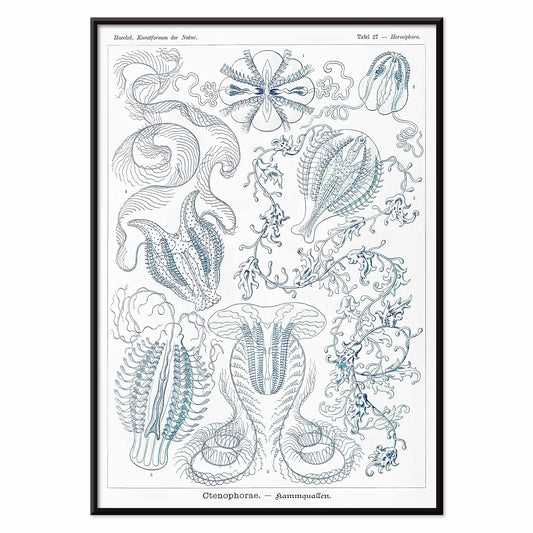
Ctenophorae Poster
Ernst Haeckel · 1904 · Etherische kamkwallen wetenschappelijke kunstprint met subtiele blauwe transparantie en nauwkeurige zoologische details
Poster vanaf €9 · Ingelijst vanaf €16
Normale prijs Vanaf €6,00Normale prijs -
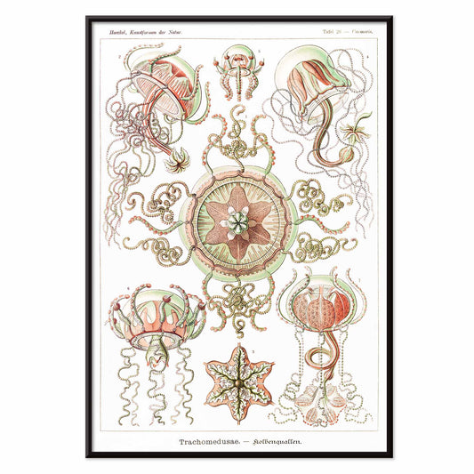
Trachomedusae Poster
Ernst Haeckel · 1904 · Gedetailleerde wetenschappelijke kunstprint van kwallen met vloeiende tentakels en zeeachtige transparantie
Poster vanaf €9 · Ingelijst vanaf €16
Normale prijs Vanaf €6,00Normale prijs -
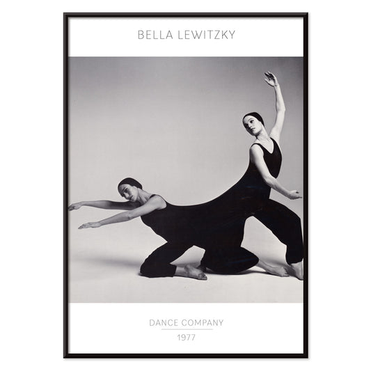
Bella Lewitzky Dance Company Poster
Onbekende kunstenaar · 1977 · Krachtig zwart-wit poster met dynamische danserfoto's en strakke, elegante typografie
Poster vanaf €9 · Ingelijst vanaf €16
Normale prijs Vanaf €6,00Normale prijs -
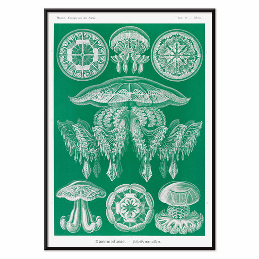
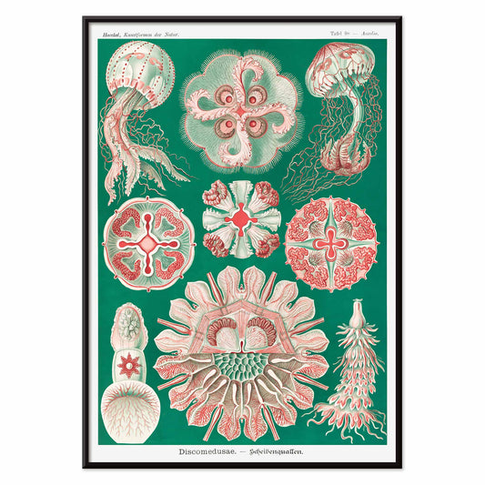
Discomedusae Poster
Ernst Haeckel · 1904 · Gedetailleerde wetenschappelijke kunstprint van kwallen met radiële klokken en krullende tentakels in groen
Poster vanaf €9 · Ingelijst vanaf €16
Normale prijs Vanaf €6,00Normale prijs -
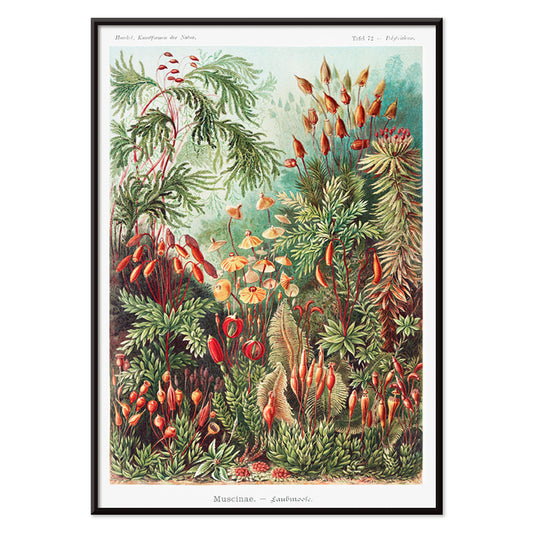
Muscinae–Laubmoose Poster
Ernst Haeckel · 1904 · Gedetailleerde wetenschappelijke print van bladmossen, gerangschikt als een natuurlijk kabinetonderzoek
Poster vanaf €9 · Ingelijst vanaf €16
Normale prijs Vanaf €6,00Normale prijs -
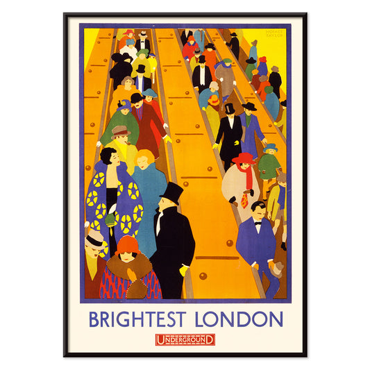
Brightest London 2 Poster
Horace Taylor · 1924 · Dynamische London Underground poster van menigten op roltrappen in gedurfde Art Deco kleurvlakken
Poster vanaf €9 · Ingelijst vanaf €16
Normale prijs Vanaf €6,00Normale prijs -
Filicinae–Laubfarne Poster
Ernst Haeckel · 1904 · Gedetailleerde botanische kunstprint van varens, met wetenschappelijke precisie en artnouveau-elegantie
Poster vanaf €9 · Ingelijst vanaf €16
Normale prijs Vanaf €6,00Normale prijs -
Jantzen 2 Poster
Joseph Binder · 1952 · Dynamisch skiposter met gestileerd paar en gedurfde blauwe, witte en rode vlakken
Poster vanaf €9 · Ingelijst vanaf €16
Normale prijs Vanaf €6,00Normale prijs -
Jantzen Poster
Joseph Binder · 1952 · Energiek poster van skiënd paar in dynamische, gestileerde alpine vormen
Poster vanaf €9 · Ingelijst vanaf €16
Normale prijs Vanaf €6,00Normale prijs -
Ammonitida Poster
Ernst Haeckel · 1904 · Gedetailleerde ammonietenprint met spiraalschelpen, precieze wetenschappelijke lijnvoering en architectonische symmetrie
Poster vanaf €9 · Ingelijst vanaf €16
Normale prijs Vanaf €6,00Normale prijs -
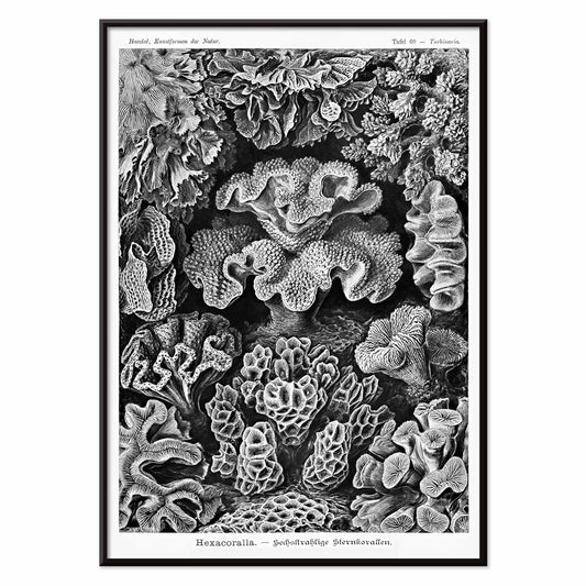
Hexacoralla Poster
Ernst Haeckel · 1904 · Gedetailleerde wetenschappelijke kunstprint van zesstraalige koralen met fijn zwart lijnwerk
Poster vanaf €9 · Ingelijst vanaf €16
Normale prijs Vanaf €6,00Normale prijs -
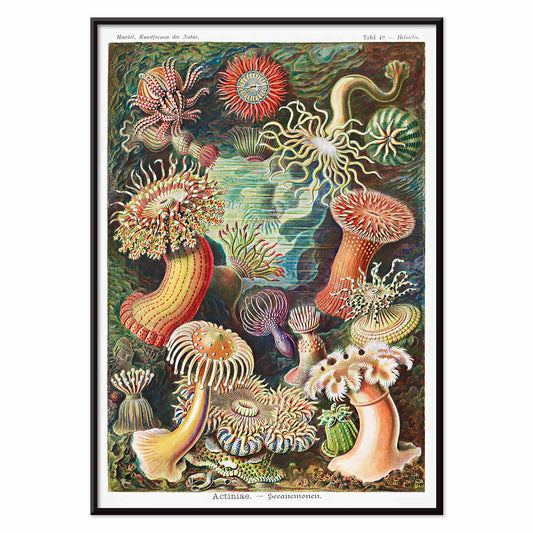
Actiniae Poster
Ernst Haeckel · 1904 · Gedetailleerde wetenschappelijke print van zeeanemonen met stralende tentakels gerangschikt als juweelachtige zeebloemen
Poster vanaf €9 · Ingelijst vanaf €16
Normale prijs Vanaf €6,00Normale prijs -
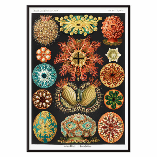
Ascidiae Poster
Ernst Haeckel · 1904 · Gedetailleerde wetenschappelijke print van zeeslokken in een opvallende symmetrische naturalistische compositie
Poster vanaf €9 · Ingelijst vanaf €16
Normale prijs Vanaf €6,00Normale prijs -
Discomedusae Poster
Ernst Haeckel · 1904 · Gedetailleerde wetenschappelijke kunstprint van kwallen met zwevende klokvormen en kantachtige tentakels en subtiele kleuren
Poster vanaf €9 · Ingelijst vanaf €16
Normale prijs Vanaf €6,00Normale prijs -
Magnolia altissima Poster
Mark Catesby · 1754 · Elegante botanische print van magnolia met glanzende groene bladeren en crèmewitte bloem
Poster vanaf €9 · Ingelijst vanaf €16
Normale prijs Vanaf €6,00Normale prijs -
Wilde geranium Poster
Maurice Pillard Verneuil · 1896 · Gestileerde wilde geranium poster met vloeiende art-nouveau lijnen en dessinachtig gebladerte
Poster vanaf €9 · Ingelijst vanaf €16
Normale prijs Vanaf €6,00Normale prijs -
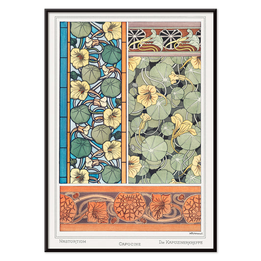
Oost-indische-kers Poster
Maurice Pillard Verneuil · 1896 · Gestileerde oost-indische-kers kunstprint met vloeiende art-nouveau lijnen en frisse groene bladeren
Poster vanaf €9 · Ingelijst vanaf €16
Normale prijs Vanaf €6,00Normale prijs -
Scharlakenbanaan Poster
Pierre-Joseph Redouté · 1805 · Elegante scharlakenbanaan kunstprint met frisse groene bladeren en felrode bloei
Poster vanaf €9 · Ingelijst vanaf €16
Normale prijs Vanaf €6,00Normale prijs -
Paradijsvogel Poster
Pierre-Joseph Redouté · 1805 · Elegante print van paradijsvogel met witte bloemen en slanke groene bladeren
Poster vanaf €9 · Ingelijst vanaf €16
Normale prijs Vanaf €6,00Normale prijs


36/1512 items
- Surrealistische vissenillustraties Poster
- Antiek borstbeeld Poster
- De aarde en de levende natuur Poster
- Bladvormen Poster
- Handlezen Poster
- Tijgerkop Poster
- Wilde dieren Poster
- Parkieten Poster
- Natuurlijke krachten Poster
- Blokdruk Poster
- Gebakken broden Poster
- Red de walvissen Poster
- Rose Fried Gallery Poster
- Word wakker en lees Poster
- Gebakken broden 2 Poster
- Muscinae–Laubmoose Poster
- Ammonitida Poster
- Hexacoralla Poster
- Actiniae Poster
- Wilde geranium Poster
- Oost-indische-kers Poster
Waarom verticale posters een kamer veranderen
Een verticale poster werkt als een architectonisch element: hij leidt de blik omhoog, vermindert visuele ruis en geeft kleine ruimtes een helderder gevoel van proportie. Portretformaten worden al lang gebruikt voor theateraffiches, boekomslagen en straataankondigingen, waar het hoge rechthoekige vlak een rustige boven-naar-beneden lezing ondersteunt. Als wandkunst kan diezelfde structuur een druk interieur stabiliseren en circulatieruimtes geordend laten aanvoelen. Het is een onmisbaar formaat voor entrees, gangen en de smalle strook tussen raam en kast, waar een horizontale print onderbroken zou lijken.
Grafische erfenis en wat het oog leert
Het verticale formaat groeide op in publieke zichtbaarheid. Reisadvertenties, bioscoopprogramma's en commerciële lithografie leerden ontwerpers hiërarchie met precisie te beheren: kop, beeld, kleine letter, allemaal getemd door marges. De beste vintage posters brengen die discipline naar nu, of ze nu typografisch of puur beeldend zijn. Platte kleurvlakken en scherpe contouren laten een compositie van afstand lezen, terwijl papierreliëf en inktdichtheid nader bekijken belonen. Diezelfde logica sluit natuurlijk aan bij de helderheid van Bauhaus, bij de gereduceerde vormen van Minimalistisch ontwerp, en bij het sterke tonaal kader dat je vindt in Zwart-wit beeld.
Portretwandkunst kamer voor kamer plaatsen
In woonkamers werkt een hoge print goed naast een boekenkast, kast of vloerlamp, waar hij de verticale lijnen in het meubilair echoot. In slaapkamers passen portretposters comfortabel op de smalle strook tussen kast en deur, of als enkel accent naast het bed in plaats van er direct boven. Keukens en eetniches lenen zich vaak voor grafische vintage stukken, vooral etiketgeïnspireerde lay-outs uit Reclame, terwijl rustiger botanische studies uit Botanisch harde oppervlakken zoals tegels en staal verzachten. Behandel de poster als uw accenttoon: neem een inktkleur terug in textiel of keramiek en houd de muur- en lijstafwerkingen ingetogen zodat het rechthoekige vlak zuiver leest.
Combineren, lijsten en het ritme van een galeriewand
Verticale prints zijn het prettigst als ze in paren worden samengesteld: één beeldrijke bladzijde naast een rustiger vlak zodat de wand afwisselt tussen detail en pauze. Een derde element kan de compositie verruimen, bijvoorbeeld een horizontale tegenhanger uit Landschappen, maar houd de tussenruimtes consistent zodat de opstelling bewust aanvoelt. Dunne zwarte lijsten verscherpen grafische ontwerpen; eiken of walnoot voegt warmte toe aan archiefbeelden, en gecoördineerde opties vindt u bij Lijsten. Gebruik een smalle passe-partout om donkere prints ademruimte te geven, zeker in kleinere formaten, en hang alles op een gedeelde middenlijn op ooghoogte terwijl de bovenzijden subtiel opschuiven om het verticale ritme te behouden.
De rustige logica van een hoge rechthoek
Formatgestuurde collecties blijven flexibel: een portretoriëntatie kan architectuurfoto's, symbolische studies, abstractie of vintage typografie dragen zonder een enkele sfeer af te dwingen. Wat deze posters verbindt, is de manier waarop de hoge uitsnede een scène redigeert en gebaar en negatieve ruimte in balans houdt. Als woondecoratie te druk begint te voelen, kan één doordacht verticale kunstprint de orde herstellen veel effectiever dan een cluster. Als een enkele, stille opening in de wand laat hij de kamer ademen en geeft toch een duidelijk focuspunt.