


- Vernietig deze woeste bruut Poster
- De goede buur van Zuid-Amerika Poster
- Italië met Vaticaanstad Poster
- Uien Poster
- Bec-Kina Poster
- Kohler Chocolat Poster
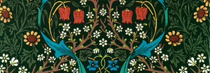
- Strawberry Thief Poster
- Tom Krojer Tentoonstellingsposter
- Ernst Kirchner Tentoonstelling Poster
- El Comienzo Poster
- Parler Seul 2 Poster
- Twilight’s Ring Poster
- Parler Seul Poster
- Faun en nimf Poster
- The Dream poster
- Le Concert Poster
- Vogel vliegend door een wolk Poster
- Vrouwelijke kunstenares Poster
- De wraak van de Pink Panther Poster
- Vrouw en vogel 's nachts Poster
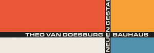
- Bauhaus 20 Poster
- Blauwe Japanse kraanvogel Poster
- Snoopy Come Home Poster
- Naar Londen met Jet Clipper Poster
- Kyushu-Okinawa Poster
- Xerez Pedro Domecq Poster
- Balsam Aperitief Poster
- Boter Poster
- Crans-sur-Sierre Poster
- Monte Carlo Poster
- Bier en Sigaret Poster
- Westkust van Mexico Poster
- Rita Gaufres Poster
- Hibiscus Poster
-
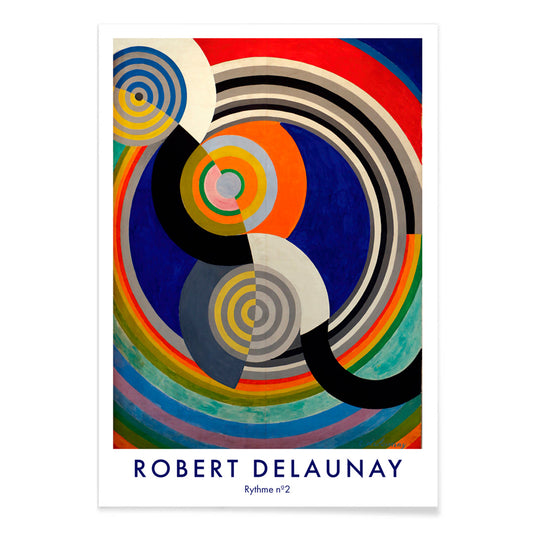
Rythme n°2 Poster
Robert Delaunay · 1938 · abstract ritme kunstprint met ineengrijpende cirkels en bogen in levendige primaire kleuren
Poster vanaf €9 · Ingelijst vanaf €16
Normale prijs Vanaf €6,00Normale prijs -
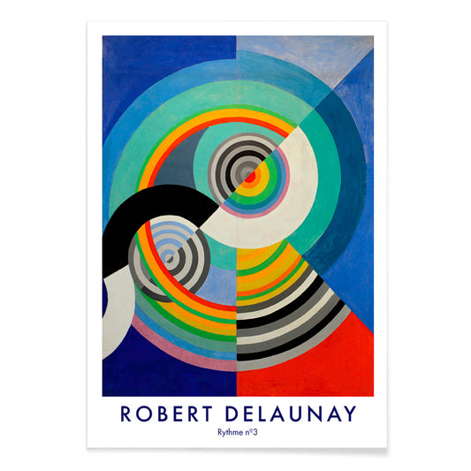
Rythme n°3 Poster
Robert Delaunay · 1938 · Energieke abstracte poster met concentrische cirkels in blauw, rood, geel en groen
Poster vanaf €9 · Ingelijst vanaf €16
Normale prijs Vanaf €6,00Normale prijs -
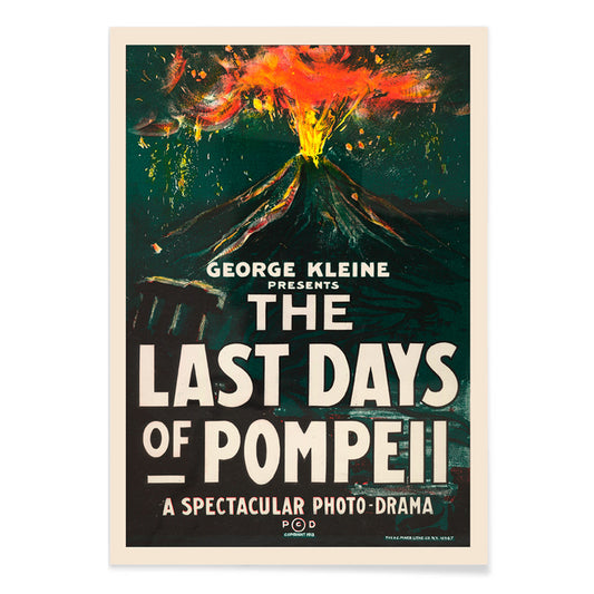
De laatste dagen van Pompeii Poster
H.C. Miner · 1913 · Dramatische filmposter met vulkaanuitbarsting, vet lettertype, gloedende oranje rook en donkere groene accenten
Poster vanaf €9 · Ingelijst vanaf €16
Normale prijs Vanaf €6,00Normale prijs -
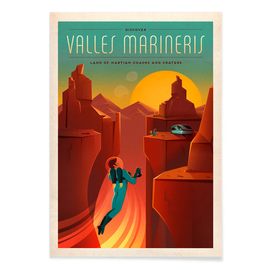
Valles Marineris Poster
SpaceX · 2015 · Vintage-geïnspireerde Marskloof-poster met astronautensilhouet bij zonsondergang
Poster vanaf €9 · Ingelijst vanaf €16
Normale prijs Vanaf €6,00Normale prijs -
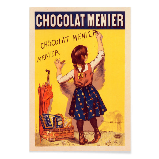
Chocolat Menier Poster
Firmin Bouisset · 1896 · Speelse Franse reclameposter met meisje dat Chocolat Menier op gele muur schrijft
Poster vanaf €9 · Ingelijst vanaf €16
Normale prijs Vanaf €6,00Normale prijs -
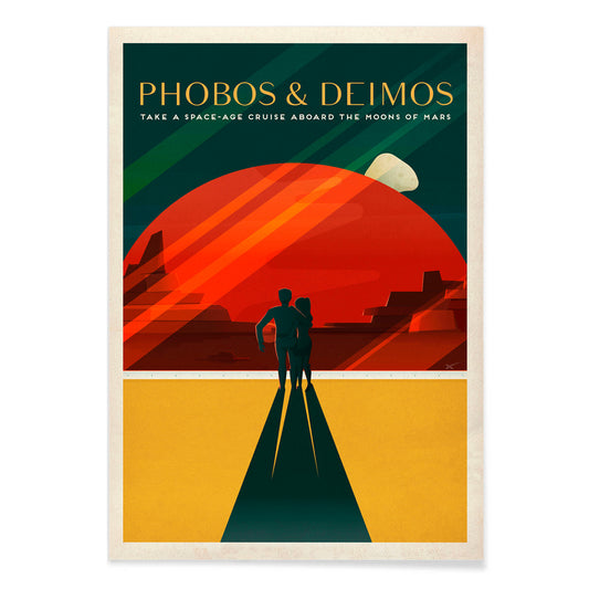
Phobos & Deimos Poster
SpaceX · 2020 · Retro Marsreisposter met een stel onder Phobos en Deimos in roodtinten
Poster vanaf €9 · Ingelijst vanaf €16
Normale prijs Vanaf €6,00Normale prijs -
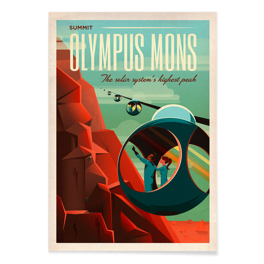
Olympus Mons Poster
SpaceX · 2021 · Retrofuturistisch Marsreisposter met kabelbanen die de roodachtige flanken van Olympus Mons beklimmen
Poster vanaf €9 · Ingelijst vanaf €16
Normale prijs Vanaf €6,00Normale prijs -
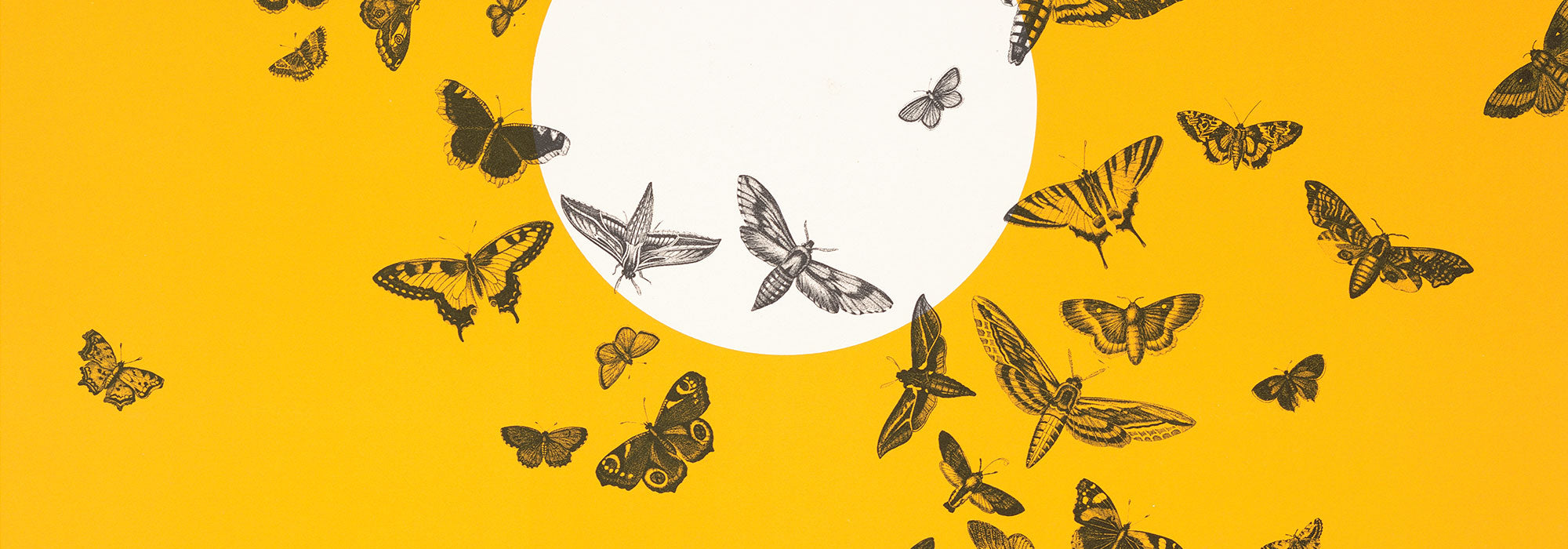
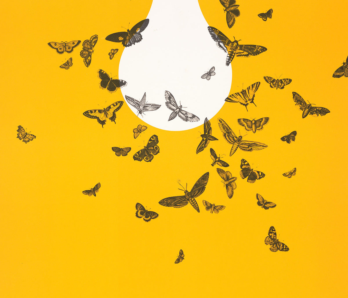
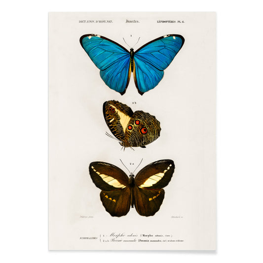
Blauwe en bruine vlinders Poster
Charles Dessalines D' Orbigny · 1806 · Fijne vlinderprint met blauwe vleugels en aardse bruintinten in wetenschappelijke stijl
Poster vanaf €9 · Ingelijst vanaf €16
Normale prijs Vanaf €6,00Normale prijs -
Linum glandulosum Poster
Charles Dessalines D Orbigny · 1847 · Fijne botanische print van gele vlas met precieze lijnen op zacht vergeeld papier
Poster vanaf €9 · Ingelijst vanaf €16
Normale prijs Vanaf €6,00Normale prijs -
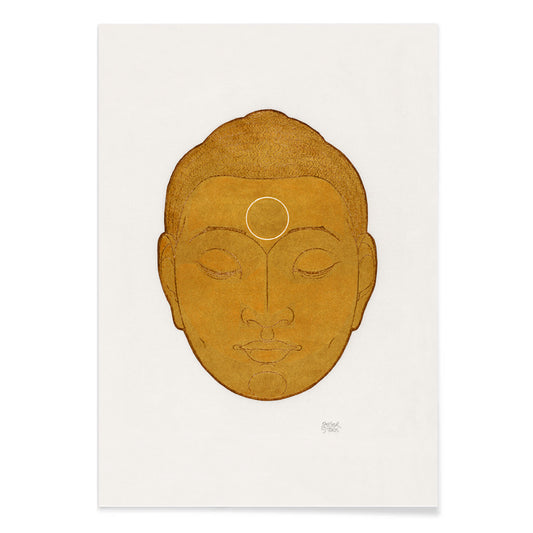
Boeddhahoofd Poster
Reijer Stolk · 1943 · Sereen kunstprint van boeddhahoofd met warme gouden vegen en zachte grafietcontouren
Poster vanaf €9 · Ingelijst vanaf €16
Normale prijs Vanaf €6,00Normale prijs -
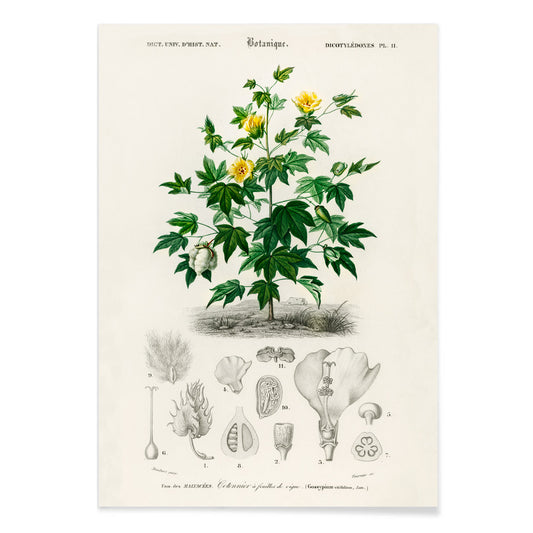
Gossypium vitifolium poster
Charles Dessalines d'Orbigny · 1849 · Fijne botanische print van Sea Island-katoen met gelobde bladeren, zachte bloemen en katoenbollen
Poster vanaf €9 · Ingelijst vanaf €16
Normale prijs Vanaf €6,00Normale prijs -
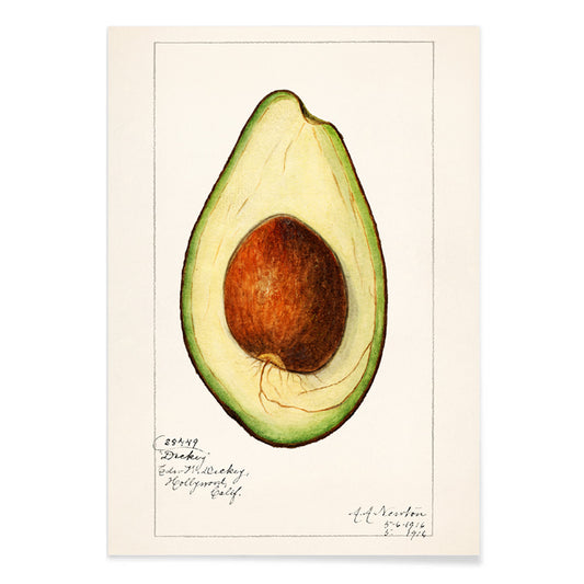
Avocado (Persea) Poster
Amanda Almira Newton · 1916 · Gedetailleerde kunstprint van avocado met doorgesneden vrucht, grote pit en glanzende bladeren
Poster vanaf €9 · Ingelijst vanaf €16
Normale prijs Vanaf €6,00Normale prijs -
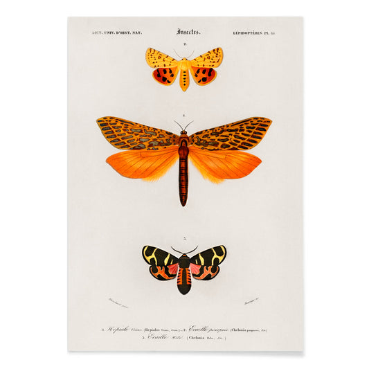
Oranje motten Poster
Charles Dessalines D' Orbigny · 1841 · Levendige oranje wetenschappelijke print van motten in precieze natuurhistorische compositie
Poster vanaf €9 · Ingelijst vanaf €16
Normale prijs Vanaf €6,00Normale prijs -
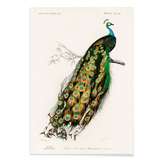
Indische pauw Pavo Cristatus Poster
Charles Dessalines D'Orbigny · 1876 · Elegante Indische pauwprint met juweelachtige verentooi en verfijnde naturalistische details
Poster vanaf €9 · Ingelijst vanaf €16
Normale prijs Vanaf €6,00Normale prijs -
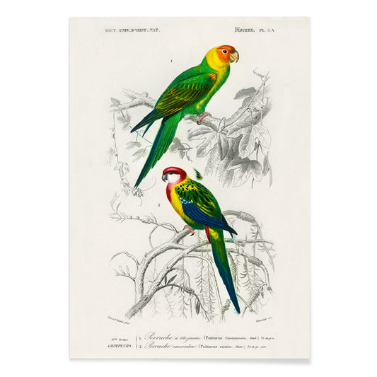
Perruche Poster
Charles Dessalines D'Orbigny · 1806 · Levendige parkietenprint met zittende vogels en heldere naturalistische details
Poster vanaf €9 · Ingelijst vanaf €16
Normale prijs Vanaf €6,00Normale prijs -
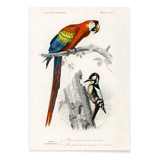
Papegaaien III Poster
Charles Dessalines D' Orbigny · 1876 · Levendige papegaaienprint met sierlijke vogels op een tak en precieze naturalistische details
Poster vanaf €9 · Ingelijst vanaf €16
Normale prijs Vanaf €6,00Normale prijs -
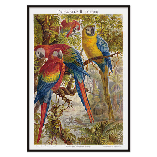
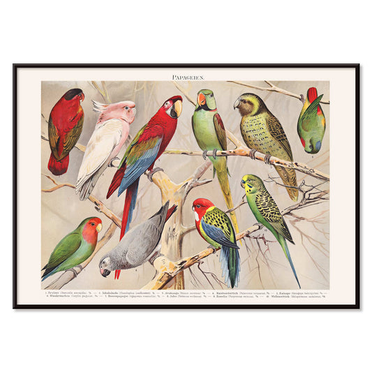
Papegaaien II Poster
Institut of Leipzig · 1895 · Weelderige papegaaienprint met drie aras op tropische takken in levendige kleuren
Poster vanaf €9 · Ingelijst vanaf €16
Normale prijs Vanaf €6,00Normale prijs -
Papegaaien I Poster
Institut of Leipzig · 1972 · Levendige kunstprint van papegaaien in natuurhistorische stijl met nauwkeurige wetenschappelijke details
Poster vanaf €9 · Ingelijst vanaf €16
Normale prijs Vanaf €6,00Normale prijs -
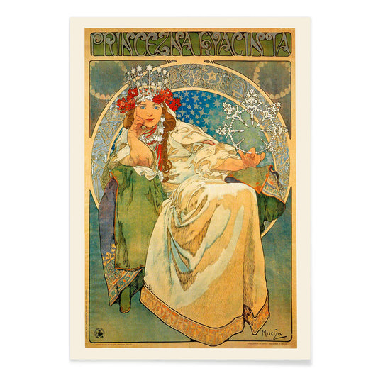
Princezna Hyacinta Poster
Alfons Mucha · 1911 · Elegant Art Nouveau poster van een gekroonde prinses omringd door bloemrijke ornamenten
Poster vanaf €9 · Ingelijst vanaf €16
Normale prijs Vanaf €6,00Normale prijs -
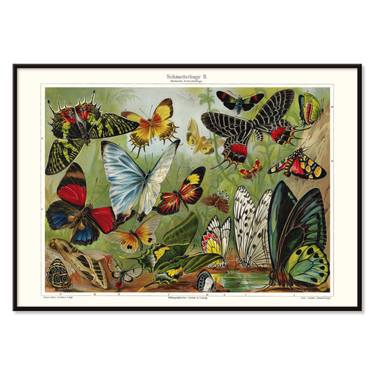
Vlinders II Poster
Institut of Leipzig · 1971 · vintage poster met kleurrijke vlinders in een precieze educatieve weergave
Poster vanaf €9 · Ingelijst vanaf €16
Normale prijs Vanaf €6,00Normale prijs -
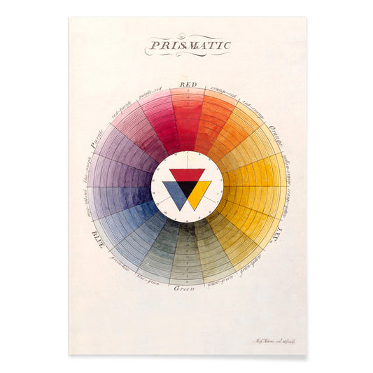
Prismatisch kleurenwiel Poster
Moses Harris · 1766 · Verlichtingskleurenwiel kunstprint met stralende primaire en secundaire tinten
Poster vanaf €9 · Ingelijst vanaf €16
Normale prijs Vanaf €6,00Normale prijs -
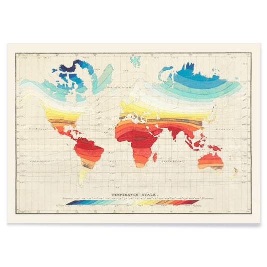
Wereldtemperatuurkaart Poster
Wilhelm Ebel · 1850 · Gedetailleerde wereldtemperatuurprint in vintage-stijl met vloeiende kleurverlopen die klimaatzones weergeven
Poster vanaf €9 · Ingelijst vanaf €16
Normale prijs Vanaf €6,00Normale prijs -
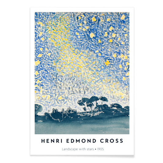
Landschap met sterren Poster
Henri-Edmond Cross · 1907 · Pointillistische nachtlandschap kunstprint met glinsterende sterren en mediterrane rust
Poster vanaf €9 · Ingelijst vanaf €16
Normale prijs Vanaf €6,00Normale prijs -
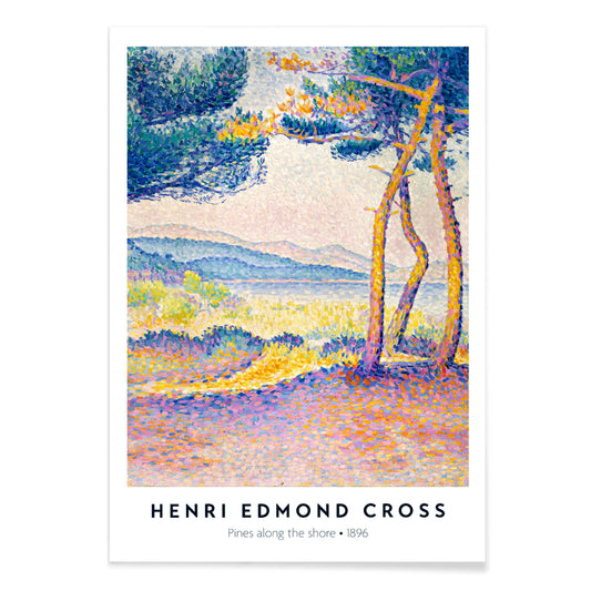
Dennen langs de kust Poster
Henri-Edmond Cross · 1896 · Luchtige pointillistische kunstprint van de kust met dennen, kliffen en fonkelend blauw water
Poster vanaf €9 · Ingelijst vanaf €16
Normale prijs Vanaf €6,00Normale prijs -
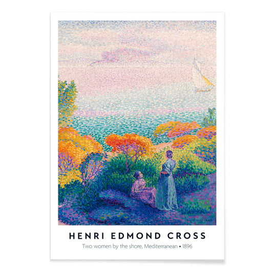
Twee vrouwen aan de kust Poster
Henri-Edmond Cross · 1896 · Stralende kunstprint van de kust met twee vrouwen in glinsterend licht en rustige horizon
Poster vanaf €9 · Ingelijst vanaf €16
Normale prijs Vanaf €6,00Normale prijs -
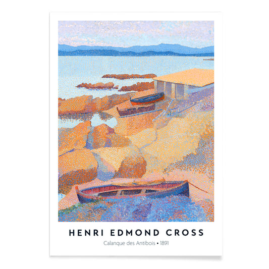
Calanque des Antibois Poster
Henri-Edmond Cross · 1891 · neo-impressionistische kunstprint van de kust met sprankelend blauw zeezicht en zonnig rotslandschap
Poster vanaf €9 · Ingelijst vanaf €16
Normale prijs Vanaf €6,00Normale prijs -
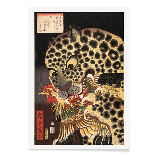
De tijger van Ryōkoku Poster
Utagawa Hirokage · 1860 · Dramatische ukiyo-e kunstprint van een tijger die een haan grijpt onder krachtige kalligrafie
Poster vanaf €9 · Ingelijst vanaf €16
Normale prijs Vanaf €6,00Normale prijs -
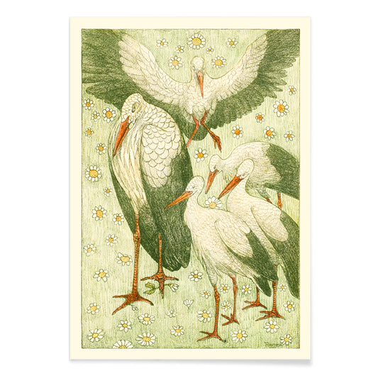
Vijf ooievaars in een weide Poster
Theo van Hoytema · 1898 · Rustige print met ooievaars in een weide, luchtige lijnen en zachte groentinten
Poster vanaf €9 · Ingelijst vanaf €16
Normale prijs Vanaf €6,00Normale prijs -
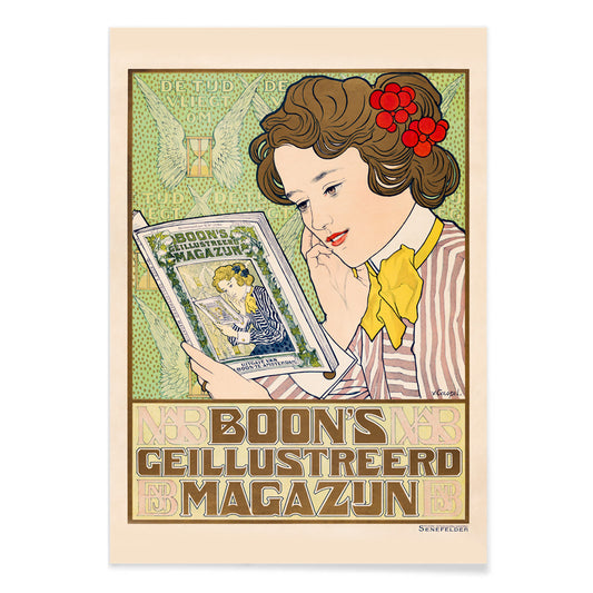
Boon Poster
Johann Georg van Caspel · 1904 · Art Nouveau poster van een vrouw die leest omgeven door sierlijke bloemen
Poster vanaf €9 · Ingelijst vanaf €16
Normale prijs Vanaf €6,00Normale prijs -
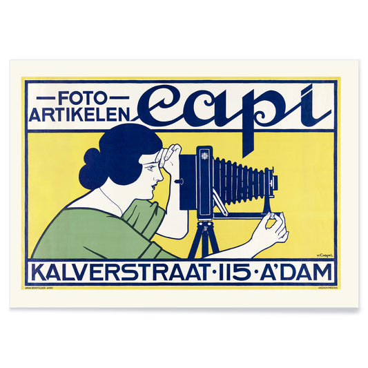
Capi Poster
Johann Georg van Caspel · 1912 · Elegant Art Nouveau poster met vrouw met camera en opvallende blauwe accenten
Poster vanaf €9 · Ingelijst vanaf €16
Normale prijs Vanaf €6,00Normale prijs -
Ivens & Co. Poster
Johann Georg van Caspel · 1899 · Art Nouveau poster met elegante figuur en heldere blauw-geel contrasten
Poster vanaf €9 · Ingelijst vanaf €16
Normale prijs Vanaf €6,00Normale prijs -
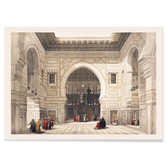
Interieur moskee Sultan Ghoree Poster
David Roberts · 1839 · Sfeervol poster van moskeeinterieur met hoge bogen, zacht licht en rustige figuren
Poster vanaf €9 · Ingelijst vanaf €16
Normale prijs Vanaf €6,00Normale prijs -
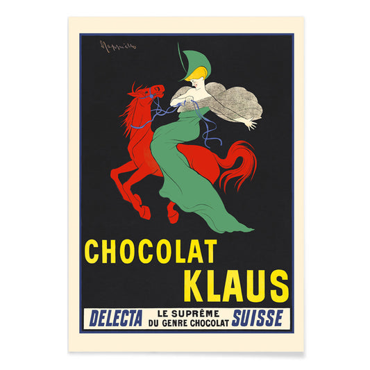
Chocolat Klaus Poster
Leonetto Cappiello · 1903 · Pakkende poster met rood paard en ruiter in groene mantel en krachtig Belle Époque-contrast
Poster vanaf €9 · Ingelijst vanaf €16
Normale prijs Vanaf €6,00Normale prijs -
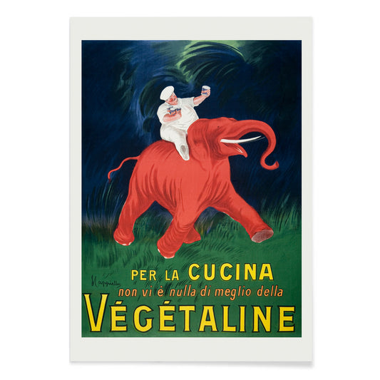
Vegetaline Poster
Leonetto Cappiello · 1910 · Speelse kok op een rood olifantje in een krachtige Franse reclameposter
Poster vanaf €9 · Ingelijst vanaf €16
Normale prijs Vanaf €6,00Normale prijs -
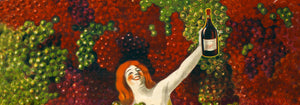
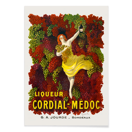
Cordial-Médoc Poster
Leonetto Cappiello · 1907 · Vrolijk levendige likeurposter met een geelgeklede danseres en vallende druiven
Poster vanaf €9 · Ingelijst vanaf €16
Normale prijs Vanaf €6,00Normale prijs -
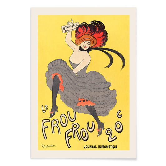
Le Frou Frou Poster
Leonetto Cappiello · 1899 · Levendige cancan-danseres poster met krachtige typografie, opvallend geel en dynamische Belle Époque-energie
Poster vanaf €9 · Ingelijst vanaf €16
Normale prijs Vanaf €6,00Normale prijs


36/706 items
- Rythme n°2 Poster
- Rythme n°3 Poster
- De laatste dagen van Pompeii Poster
- Valles Marineris Poster
- Chocolat Menier Poster
- Phobos & Deimos Poster
- Olympus Mons Poster
- Prismatisch kleurenwiel Poster
- Landschap met sterren Poster
- Dennen langs de kust Poster
- Twee vrouwen aan de kust Poster
- Calanque des Antibois Poster
- De tijger van Ryōkoku Poster
- Boon Poster
- Vegetaline Poster
Een gele draad door de kunstgeschiedenis
Deze collectie draait niet om monochroom minimalisme. Ze volgt hoe geel in een beeld werkt: als licht, als waarschuwing, als versiering, als een snelle oppepper van energie. In vintage postercultuur trekt het vanaf de straat de aandacht; in moderne schilderkunst wordt het onderdeel van structuur; in natuurhistorie suggereert het stuifmeel, schil en zongekleurd papier. Lees deze posters en prints als een woordenschat van warmte, van romige highlights tot scherpe, elektrische tonen die de temperatuur van wandkunst veranderen.
Goud, citrus en de logica van kleur
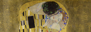
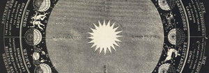
Weinig werken tonen geel als zowel luxe als techniek zo helder als van Gustav Klimt The Kiss (1907–1908) van Gustav Klimt, waar metallic gele tonen zich gedragen als tesserae en verf veranderen in oppervlak en oppervlak in symboliek. Aan de andere kant behandelt Michel Eugène Chevreul Cercle chromatique van Michel Eugène Chevreul tint als meetbare informatie, een wetenschappelijk diagram dat nog altijd leest als decoratief ontwerp. Samen verklaren ze waarom geel eras overstijgt: het kan weelde, verlichting of methode signaleren, waardoor een vintage print zowel direct als intellectueel verankerd aanvoelt.
Gele accenten in interieurdecoratie
In het interieur werkt geel het best wanneer het een taak heeft. Een smalle gang profiteert van een kleine vlam bij een spiegel; een keuken verwelkomt geel dat citrusachtig of graanachtig aanvoelt; een werkkamer kan scherpere, analytische tonen verdragen. Combineer gele posters met krijtachtige witten, notenhout en linnen voor rustige warmte, of zet ze af tegen diepe groenen en inktblauwen voor contrast. Voor terughouding en geometrie beweeg u tussen Minimalistisch en Abstract; voor natuurlijke tegenhangers houdt Botanisch de kleur verankerd aan stengels, zaden en wetenschappelijke observatie.
Een galeriewand cureren met patroon en structuur
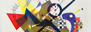
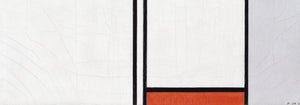
Bij het samenstellen van een galeriewand denkt u in ritmes: patroon, grid, en dan één levendige noot. Strawberry Thief (1883) van William Morris brengt textieldichtheid en een tuinenlogica die modern meubilair verzacht. Leg daar Piet Mondriaan tegenover met Composition in White, Red, and Yellow (1936) van Piet Mondriaan, waar geel een gemeten vlak wordt in plaats van atmosfeer. Voeg gecontroleerde dynamiek toe met Circles in a circle, Bauhaus exhibition (1923) van Wassily Kandinsky, een brug tussen tentoonstellingsposterontwerp en schilderkunst. Om de mix uit te breiden ondersteunt Reclame gedurfder typografie, verstevigt Bauhaus het formele vocabulaire en introduceert Klassieke Kunst stillere tonale ankers.
Waarom geel zo aanwezig voelt
Geel wordt soms weggezet als louter versiering, maar vaak is het een compositorische strategie: het leidt de blik, suggereert zonlicht of kaart een systeem uit. Met intentie opgehangen kan een klein geel element omliggende kleuren helderder of dieper laten lijken, alsof het licht in de kamer subtiel is aangepast zonder aan de lampen te komen.