


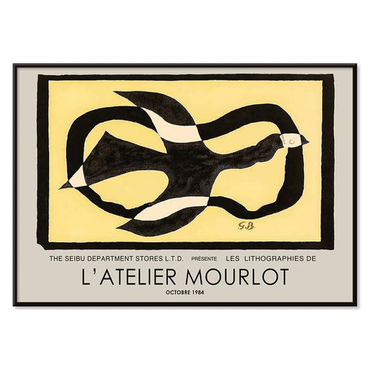
- Bird passing through a Cloud Poster
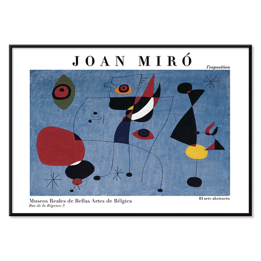
- Woman and Bird at Night Poster
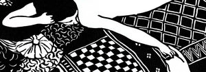
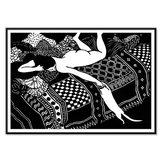
- La Paresse Poster
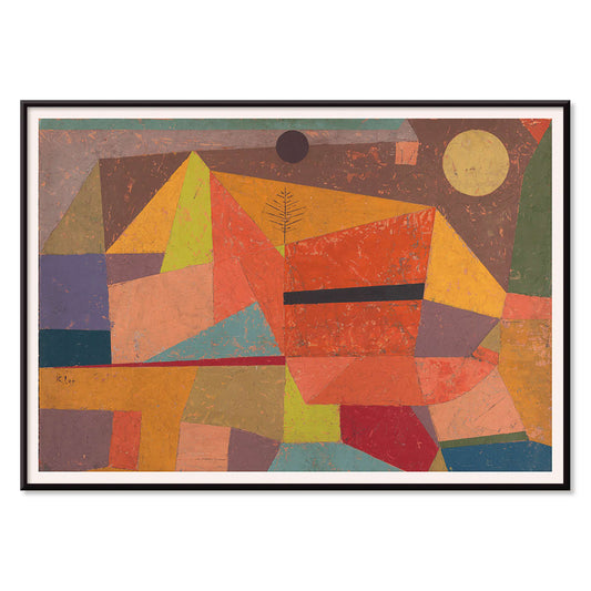
- Joyful Mountain Poster
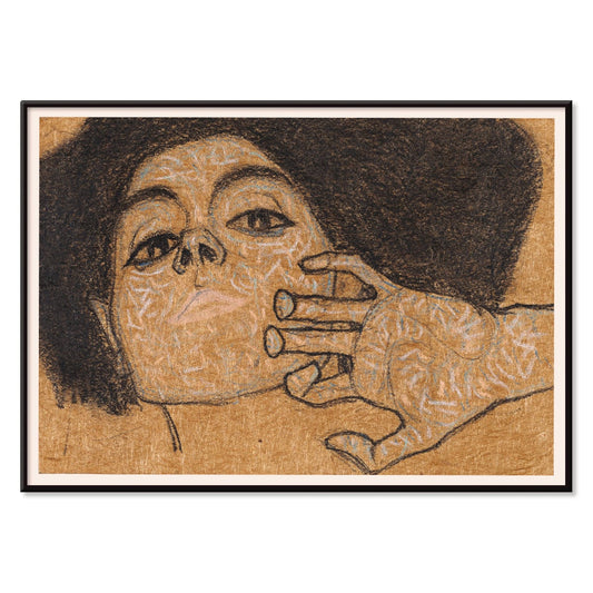
- Head of a Woman Poster
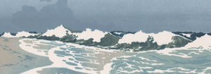
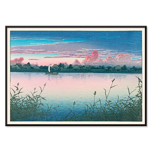
- Early Autumn in Urayasu Poster
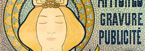
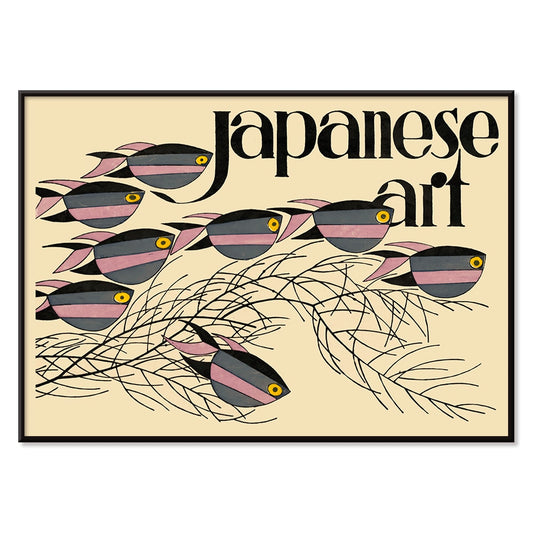
- Japanese Art Poster
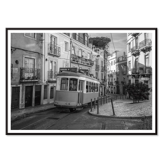
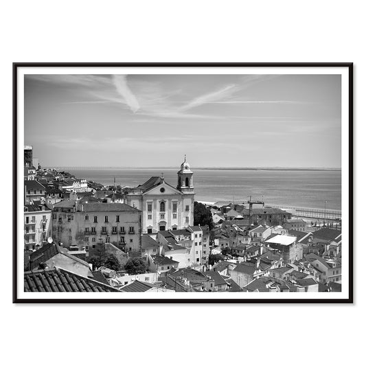
- Lisbon Tramway 28 Poster
- Alfama Poster
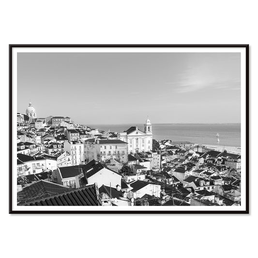
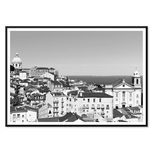
- Lisbon Old City 1 Poster
- Lisbon Old City 2 Poster
- Black Leopard Poster
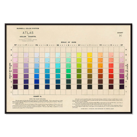
- Atlas of the Munsell color system Poster
- Voyage autour du monde 8 Poster
- Antique map of Barcelone Poster
- Real Club de Barcelona Poster
- Yoshino Poster
- Ryoson Poster
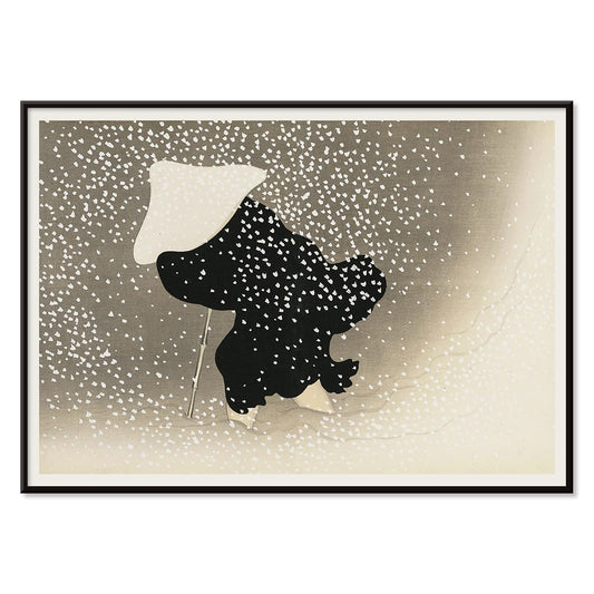
- Tomoe no yuki Poster
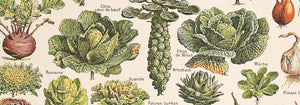
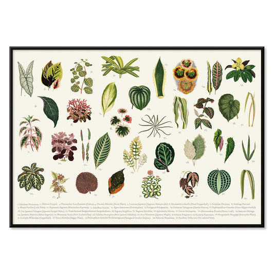
- Collection of leaves Poster
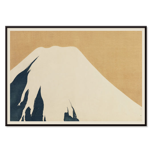
- Mount Fuji Poster
- London Underground Transport Poster
- Design for Dunhall Restaurant Poster
- Tsuru Poster
- Amaryllis Poster
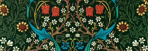
- Green Botanical pattern Poster
- Iceland Political Map Poster
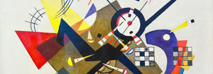
- Der Blaue Reiter Poster
- Climatic Chart of the World Poster
-
Bird passing through a Cloud Poster
George Braque · 1957 · Abstract bird poster drifting through a cloud with crisp black lines on warm yellow
Poster from €9 · Framed from €16
Regular price From €6,00Regular price -
Woman and Bird at Night Poster
Joan Miro · 1947 · Playful surrealist poster with midnight blue field and bright red and yellow signs
Poster from €9 · Framed from €16
Regular price From €6,00Regular price -
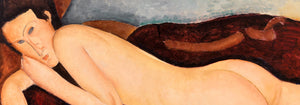
La Paresse Poster
Félix Emile-Jean Vallotton · 1896 · Intimate black and white nude art print featuring a reclining figure and watchful cat
Poster from €9 · Framed from €16
Regular price From €6,00Regular price -
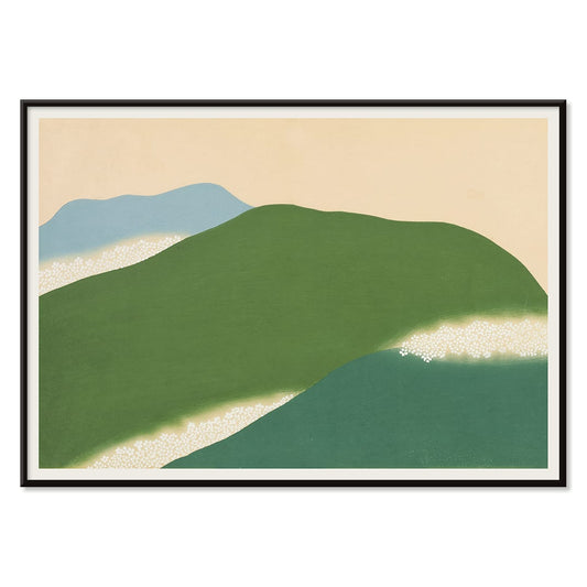
Joyful Mountain Poster
Paul Klee · 1929 · Joyful abstract mountain art print built from rhythmic color blocks and fine black lines
Poster from €9 · Framed from €16
Regular price From €6,00Regular price -
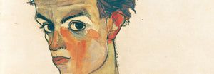
Head of a Woman Poster
Egon Schiele · 1908 · Expressive portrait art print with spare linework and warm brown washes
Poster from €9 · Framed from €16
Regular price From €6,00Regular price -
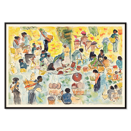
Market scene in the Dutch East Indies Poster
Pierre Jean Apol · 1912 · Sunlit tropical market art print with bustling figures and vivid street color
Poster from €9 · Framed from €16
Regular price From €6,00Regular price -
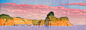
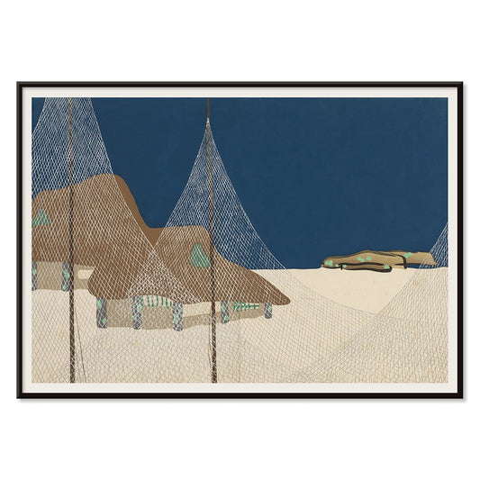
Early Autumn in Urayasu Poster
Kawase Hasui · 1931 · Serene waterfront poster with dusky sky, quiet village silhouettes, and still reflections
Poster from €9 · Framed from €16
Regular price From €6,00Regular price -
Japanese Art Poster
Julius Klinger · 1927 · Delicate fish and seaweed poster balancing Japanese-inspired linework with calm negative space
Poster from €9 · Framed from €16
Regular price From €6,00Regular price -
Lisbon Tramway 28 Poster
MORYARTY · Modern · Monochrome Lisbon Tram 28 poster with crisp city lines and nostalgic travel mood
Poster from €9 · Framed from €16
Regular price From €6,00Regular price -
Alfama Poster
MORYARTY · 1940 · Monochrome Alfama skyline poster capturing Lisbon rooftops in crisp graphic silhouette
Poster from €9 · Framed from €16
Regular price From €6,00Regular price -
Lisbon Old City 1 Poster
MORYARTY · 2017 · Black-and-white Lisbon cityscape poster with layered rooftops and a calm waterfront horizon
Poster from €9 · Framed from €16
Regular price From €6,00Regular price -
Lisbon Old City 2 Poster
MORYARTY · 1950 · Monochrome Lisbon rooftops poster with stacked facades and quiet Old Town atmosphere
Poster from €9 · Framed from €16
Regular price From €6,00Regular price -
Planisphere celeste Poster
Claude-Joseph Drioux · 1886 · Detailed celestial map vintage print with twin hemispheres and delicate constellation linework
Poster from €9 · Framed from €16
Regular price From €6,00Regular price -
Bell Rock Lighthouse Poster
Joseph Mallord William Turner · 1819 · Dramatic seascape art print of Bell Rock Lighthouse amid breaking waves
Poster from €9 · Framed from €16
Regular price From €6,00Regular price -
Black Leopard Poster
Carken · 1936 · Dramatic zoo poster with a prowling black leopard and bold modern lettering
Poster from €9 · Framed from €16
Regular price From €6,00Regular price -
Atlas of the Munsell color system Poster
Albert Henry Munsell · 1915 · Iconic color system poster mapping hues, value, and chroma in a tidy chart
Poster from €9 · Framed from €16
Regular price From €6,00Regular price -
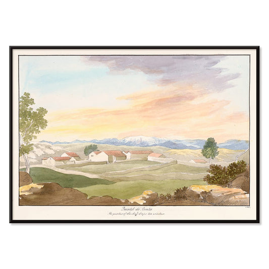
Quintel do Brula Poster
Charles Hamilton Smith · 1835 · Peaceful pastoral art print with sunlit fields, farmhouse silhouettes, and open blue sky
Poster from €9 · Framed from €16
Regular price From €6,00Regular price -
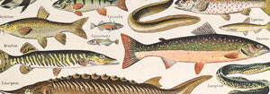
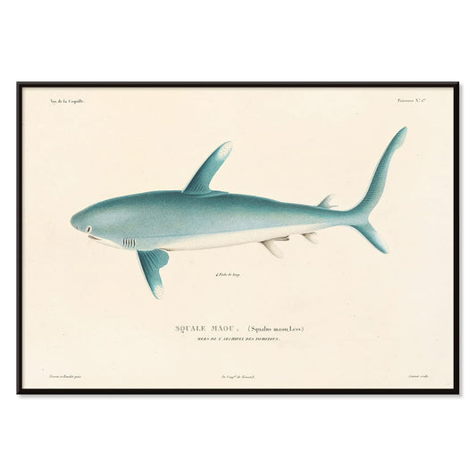
Voyage autour du monde 8 Poster
Louis-Isidore Duperrey · 1825 · Detailed shark scientific print in profile with precise shading and study labels
Poster from €9 · Framed from €16
Regular price From €6,00Regular price -
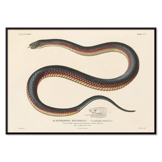
Voyage autour du monde 6 Poster
Louis-Isidore Duperrey · 1825 · Detailed scientific print of a coiled snake rendered with fine engraved linework
Poster from €9 · Framed from €16
Regular price From €6,00Regular price -
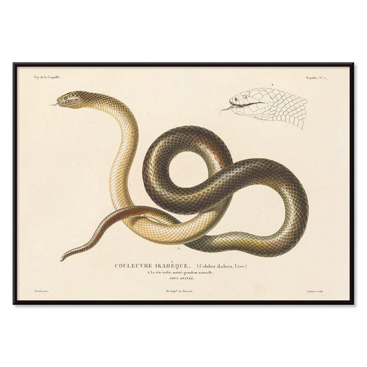
Voyage autour du monde 5 Poster
Louis-Isidore Duperrey · 1825 · Scientific print of a snake with crisp linework on warm beige background
Poster from €9 · Framed from €16
Regular price From €6,00Regular price -
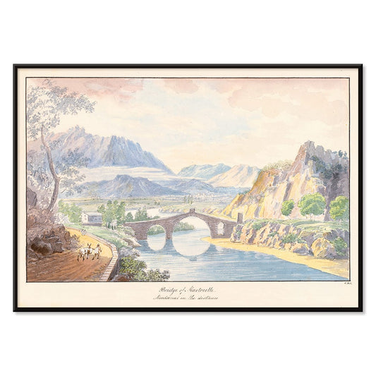
Bridge of Martorelle Poster
Charles Hamilton Smith · 1835 · Romantic landscape poster featuring a stone bridge over a tranquil river and distant hills
Poster from €9 · Framed from €16
Regular price From €6,00Regular price -
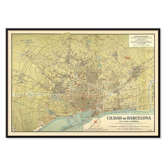
Antique map of Barcelone Poster
Unknown artist · 1858 · Detailed Barcelona city map vintage print with coastal outline and crisp street labels
Poster from €9 · Framed from €16
Regular price From €6,00Regular price -
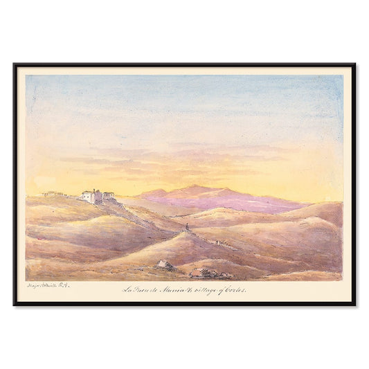
La Fuen de Munia Poster
Charles Hamilton Smith · 1835 · Serene sunset village poster with rolling hills and softly fading Mediterranean sky
Poster from €9 · Framed from €16
Regular price From €6,00Regular price -
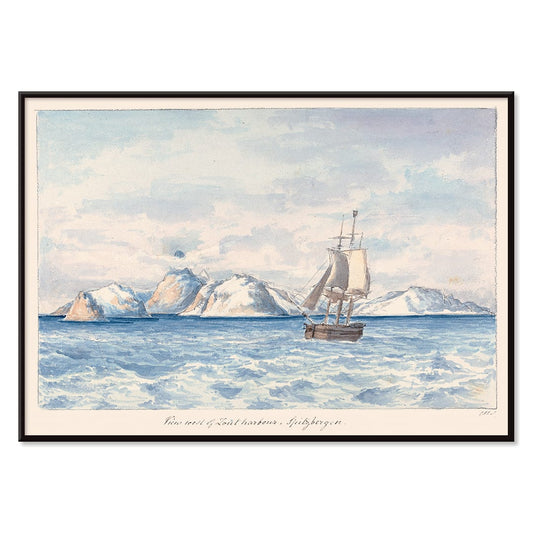
Lout Harbour Poster
Charles Hamilton Smith · 1830 · Quiet Arctic seascape poster with a lone sailboat beneath icy mountain ridges
Poster from €9 · Framed from €16
Regular price From €6,00Regular price -
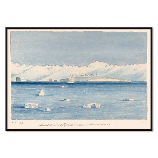
Mount Sabine Poster
Charles Hamilton Smith · 1830 · Dramatic polar seascape vintage print featuring a sailing ship drifting between towering ice
Poster from €9 · Framed from €16
Regular price From €6,00Regular price -
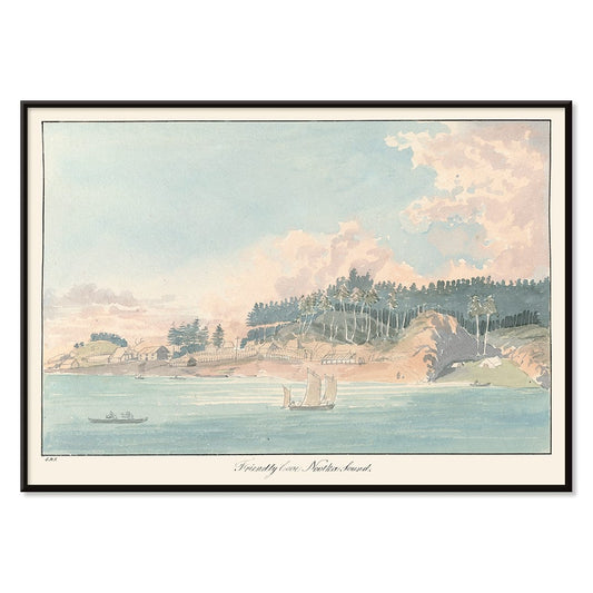
Friendly Cove Poster
Charles Hamilton Smith · 1830 · Serene coastal art print with anchored sailboats, wooded hills, and soft sea light
Poster from €9 · Framed from €16
Regular price From €6,00Regular price -
The Kraken Poster
Unknown artist · 1887 · Dramatic kraken attack vintage print with towering tentacles gripping a sailboat
Poster from €9 · Framed from €16
Regular price From €6,00Regular price -
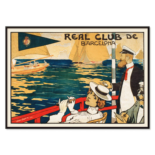
Real Club de Barcelona Poster
Joan Llaverias · 1902 · Refined sailing club poster with rhythmic sails and a breezy Barcelona seaside atmosphere
Poster from €9 · Framed from €16
Regular price From €6,00Regular price -
Yoshino Poster
Kamisaka Sekka · 1909 · Serene Japanese landscape poster with abstract green and blue hills on warm beige
Poster from €9 · Framed from €16
Regular price From €6,00Regular price -
Ryoson Poster
Kamisaka Sekka · 1909 · Serene seascape art print with stylized waves and a quiet coastal silhouette
Poster from €9 · Framed from €16
Regular price From €6,00Regular price -
Tomoe no yuki Poster
Kamisaka Sekka · 1909 · Quiet snowfall art print balancing bold black curves with generous beige negative space
Poster from €9 · Framed from €16
Regular price From €6,00Regular price -
Collection of leaves Poster
Shirley Hibberd · 1855 · Delicate botanical print presenting varied leaf forms with fine veins on warm ivory paper
Poster from €9 · Framed from €16
Regular price From €6,00Regular price -
Mount Fuji Poster
Kamisaka Sekka · 1909 · Minimal Mount Fuji art print with calm blue tones and clean contours
Poster from €9 · Framed from €16
Regular price From €6,00Regular price -
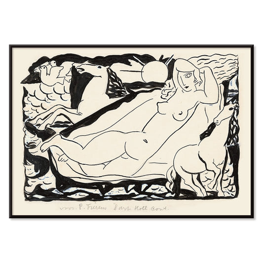
Venus Vignet Poster
Leo Gestel · 1932 · Monochrome Cubist Venus poster with swift horses and angular motion lines
Poster from €9 · Framed from €16
Regular price From €6,00Regular price -
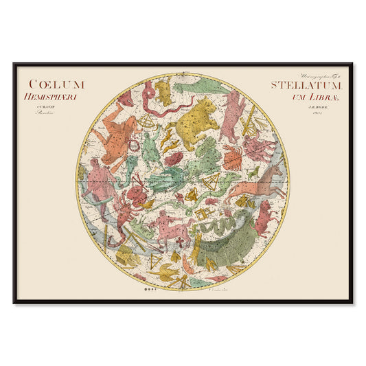
Coelum Stellatum Hemisphaerium Librae Poster
Johann Elert Bode · 1801 · Antique celestial map print centered on Libra with finely labeled stars and figures
Poster from €9 · Framed from €16
Regular price From €6,00Regular price -
Coelum Stellatum Hemisphaerium Arietis Poster
Johann Elert Bode · 1801 · Detailed celestial vintage print showing the Aries hemisphere with constellation figures and star grid
Poster from €9 · Framed from €16
Regular price From €6,00Regular price


36/251 items
- Bird passing through a Cloud Poster
- Woman and Bird at Night Poster
- La Paresse Poster
- Joyful Mountain Poster
- Head of a Woman Poster
- Early Autumn in Urayasu Poster
- Japanese Art Poster
- Lisbon Tramway 28 Poster
- Alfama Poster
- Lisbon Old City 1 Poster
- Lisbon Old City 2 Poster
- Black Leopard Poster
- Atlas of the Munsell color system Poster
- Voyage autour du monde 8 Poster
- Antique map of Barcelone Poster
- Real Club de Barcelona Poster
- Yoshino Poster
- Ryoson Poster
- Tomoe no yuki Poster
- Collection of leaves Poster
- Mount Fuji Poster
Why horizontal changes the room
Horizontal posters carry the quiet authority of a horizon line. The wide format slows the eye, letting an image unfold left to right rather than confronting you head-on. Historically, this proportion echoes travel panoramas, street-level placards, and cinema lobby displays, where distance and pacing mattered. In domestic spaces, a horizontal poster or art print reads as architectural: it extends a wall, ties furniture into one line, and makes negative space feel intentional. For a broader view of wide-format wall art across styles, it often sits naturally beside Landscape scenes or the crisp geometry found in Abstract work.
How wide-format images are built
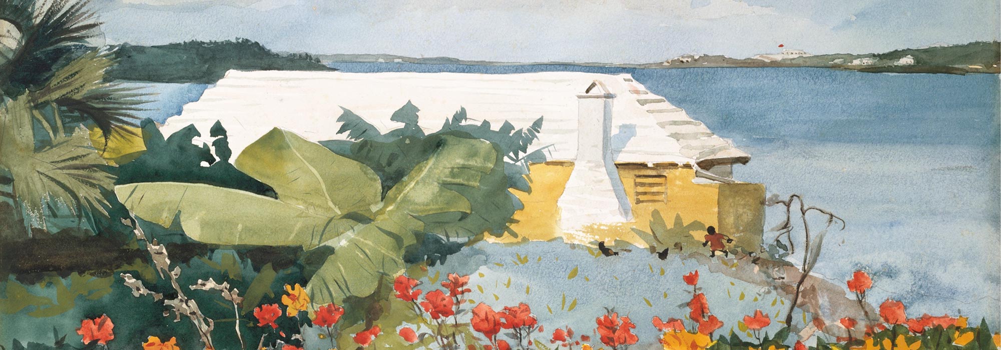
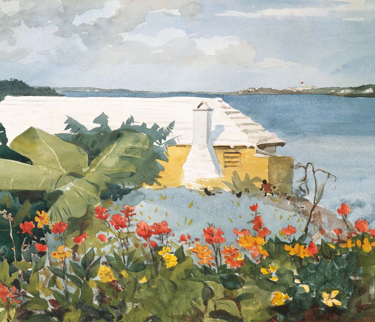
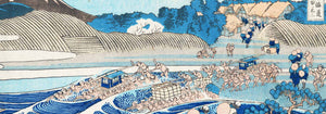
Wide compositions are engineered for balance. Designers distribute visual weight across corners and edges, using typography, a single bold motif, or a band of color to keep the center breathing. Early twentieth-century advertising posters leaned on lithography, where flat color areas and simplified shapes held up at a glance; see related approaches in Advertising. Photographic panoramas solve the same problem differently, guiding attention with lateral light and repeating forms. In Japanese print traditions, the scene is often cropped like a camera, turning bridges, waves, and streetlamps into sequences. A strong example of this lateral rhythm is Kawase Hasui’s Shiba Zoshigaya, where night tones and architecture lead the gaze in measured steps rather than a single focal hit.
Where horizontal wall art works best
In interiors, a horizontal print is most convincing where the room already draws a long line: above a sofa, headboard, sideboard, or a pair of bookcases. If the space is built on warm timber, linen, and chalky paint, choose vintage posters with softened inks and sandy grounds; for cooler rooms, higher contrast can sharpen the structure, especially from Black & White pieces. Minimal rooms benefit from a deliberate pause, which is why Minimalist images often work well in this format. Hang the bottom edge roughly 15–20 cm above the furniture, and aim for a width near two-thirds of what sits below to keep proportions calm.
Curating a gallery wall with an anchor piece
A horizontal poster can act as the anchor of a gallery wall, establishing a baseline that other frames respond to. Pair it with two narrower works from Vertical Posters to make a gentle triptych, or place a small photograph above it to add a second register without competing for width; Photo often provides that quieter, tonal counterpoint. Framing is especially noticeable on wide rectangles: a slim profile keeps the image expansive, while a deeper moulding adds gravity in rooms with heavy textiles. If you prefer a relaxed, modern edge, a magnetic option can suit wide prints; see Magnetic Frame. For a classic, architectural finish, Classic Frame reinforces the long line without over-decorating it.
A wide rectangle as visual pacing
The real advantage of horizontal wall art is pacing. It edits visual noise by connecting separate objects into one composed view: lamp, vase, books, then the image above, all sharing a single rhythm. A good horizontal vintage poster can soften a tall wall by introducing a low, steady beat; in a narrow corridor it can lengthen perspective and make transitions between rooms feel deliberate. Even when the subject is not a landscape, the format encourages long shadows, roomy skies, and extended patterns. In that sense, choosing a wide print is less about filling a space and more about deciding how you want a room to move.